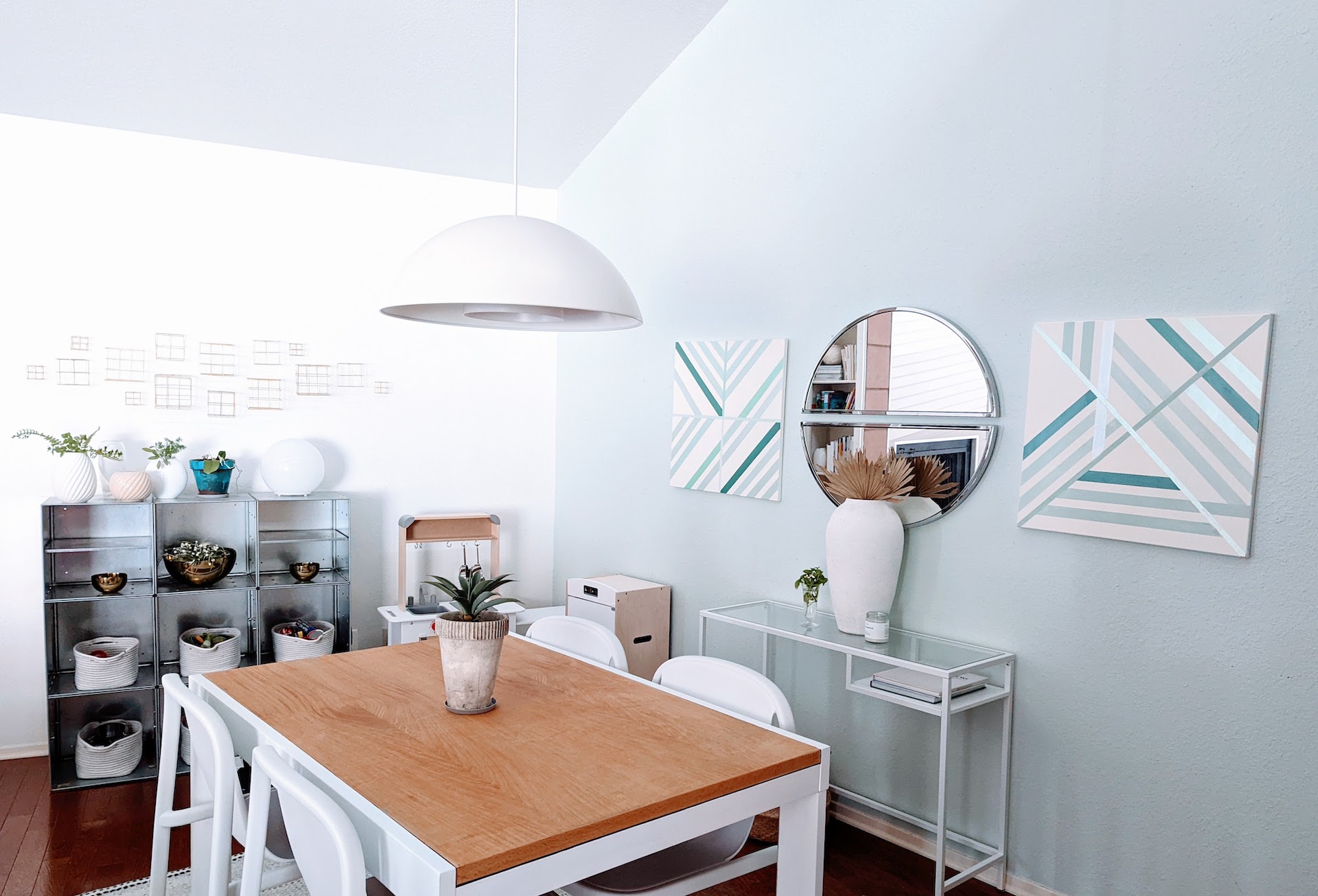
Long time no talk!! I wanted to share a dining room makeover update with you–you can see a dramatic “before” and “after” pics at the bottom of the post, but trust me when I say that this space needed some brightening up.
I also wanted to say that there’s no perfect time for a makeover. I’ve spent a LOT of time watching Architectural Digest home tours on YouTube, as well as reading design blogs where writers get a lot of free products in exchange for coverage. It can feel discouraging when your turn for a room makeover rolls around and you can’t gut everything, purchase all-new furniture and custom design a layout.
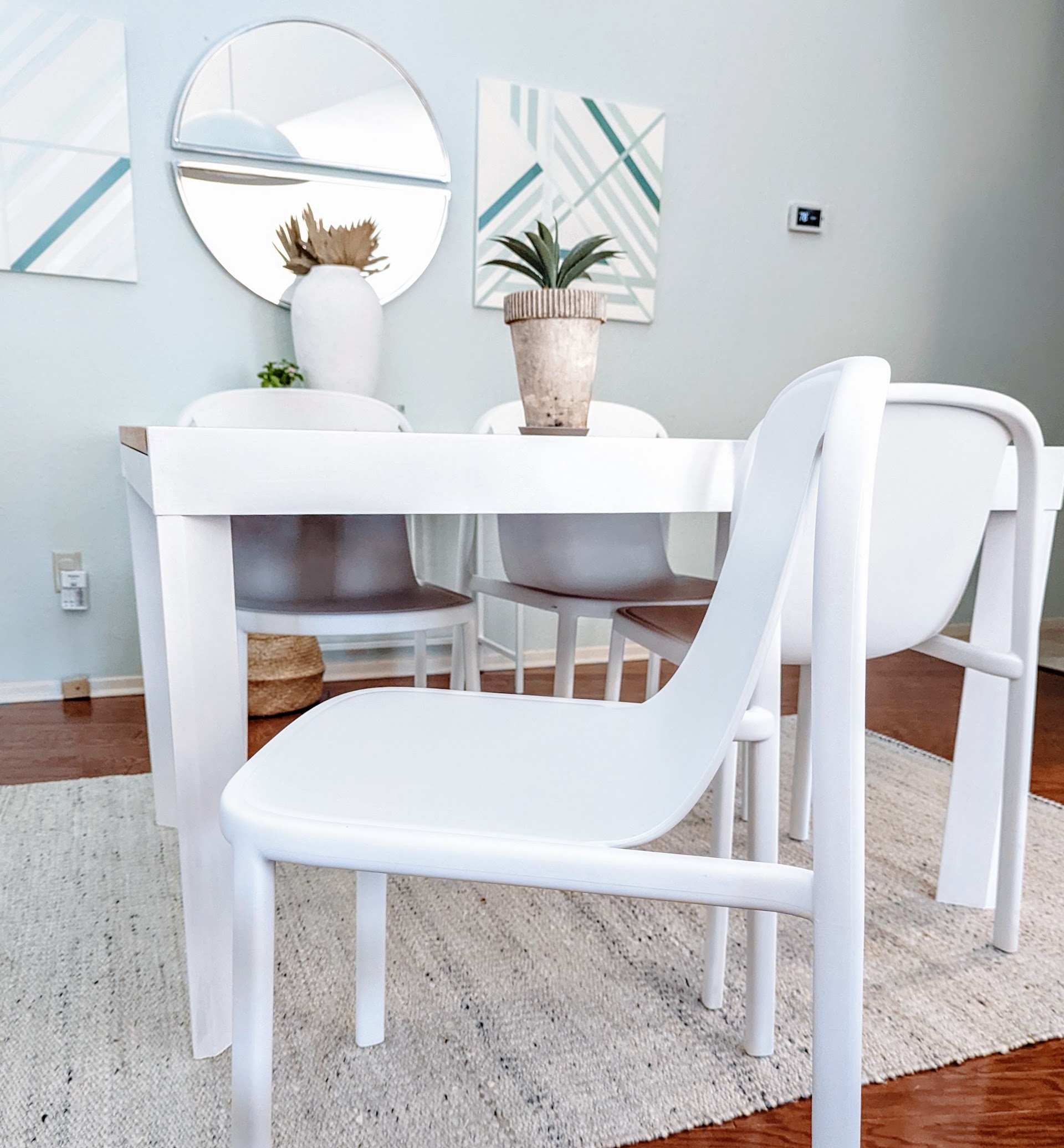
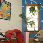
The white Decade Chairs above (from Blu Dot) were my one splurge for this room, and even these were reasonably priced. Other than that, I worked with what I had and used some mega budgeting skills to get a clean, bright look. The frugal problem solving was worth the trouble and no less valid than a makeover that knows no budgetary bounds.
My takeaway: If you need a change now, do it. There are ways to make it work!
For me this meant finally doing something about the table, which was the exact same color as the floor of this room. I’m not crazy about red oak, but it’s what we’ve got, and it’s not going anywhere anytime soon. I decided to sand the table down to its “natural wood” to lighten up the piece. After all, my search for the perfect ’80s table from sources like Facebook Marketplace hadn’t yielded anything interesting, and this table (purchased by my husband when he was a bachelor) has great lines that blend well with 1980s decor.
After a LOT of sanding to remove the varnish/lacquer, the result was still darker than what I expected. Plus, it would have taken much more backbreaking work to fully sand the legs and edges of this sturdy piece. I decided to paint the frame white and let the wood take center stage only on the tabletop. I liked the result so much better than I ever imagined, and painting the legs/edges white really helped to unify the “set” once the chairs were in place.
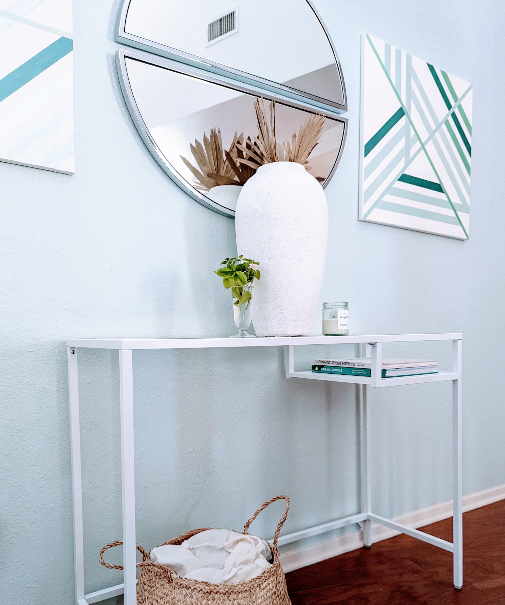
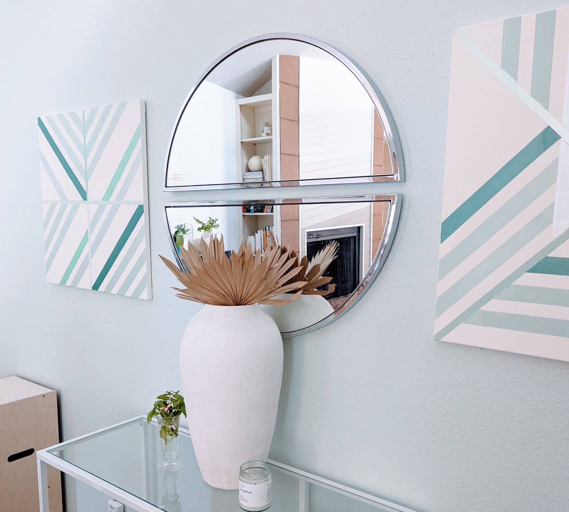
After using the space behind the table to store a dresser for a few months and finding it helpful to have an additional surface in the room, I had my heart set on a console table, to be placed under the two semicircle mirrors (I purchased these chrome beauties here).
Again, my hunt for an ’80s piece was fruitless. I’d eventually love a waterfall table for the space, but for now, a super affordable IKEA table will have to get the job done. It’s light, airy, and perfectly narrow so there’s still plenty of room for the nearby dining chairs.
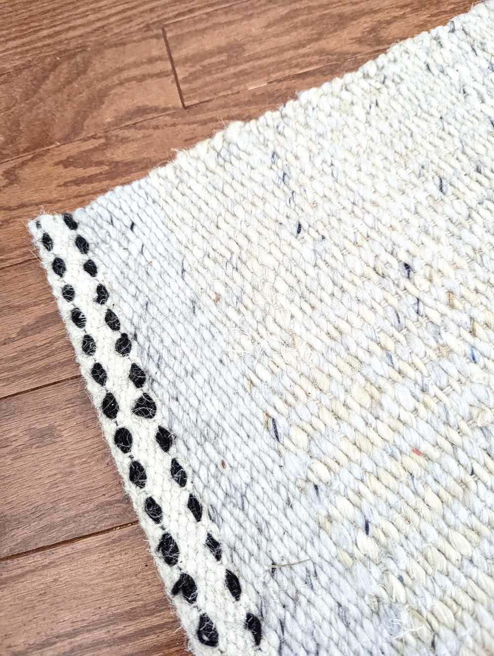
I was going to edit out the blade of dead grass near the bottom of this rug photo, but I realized the rug’s ability to camouflage debris is one of the reasons I purchased it–and I need to be honest about that! With a young child in the house, it’s also great at hiding spills. I can’t say enough wonderful things about this rug. Thank you, Joss & Main!
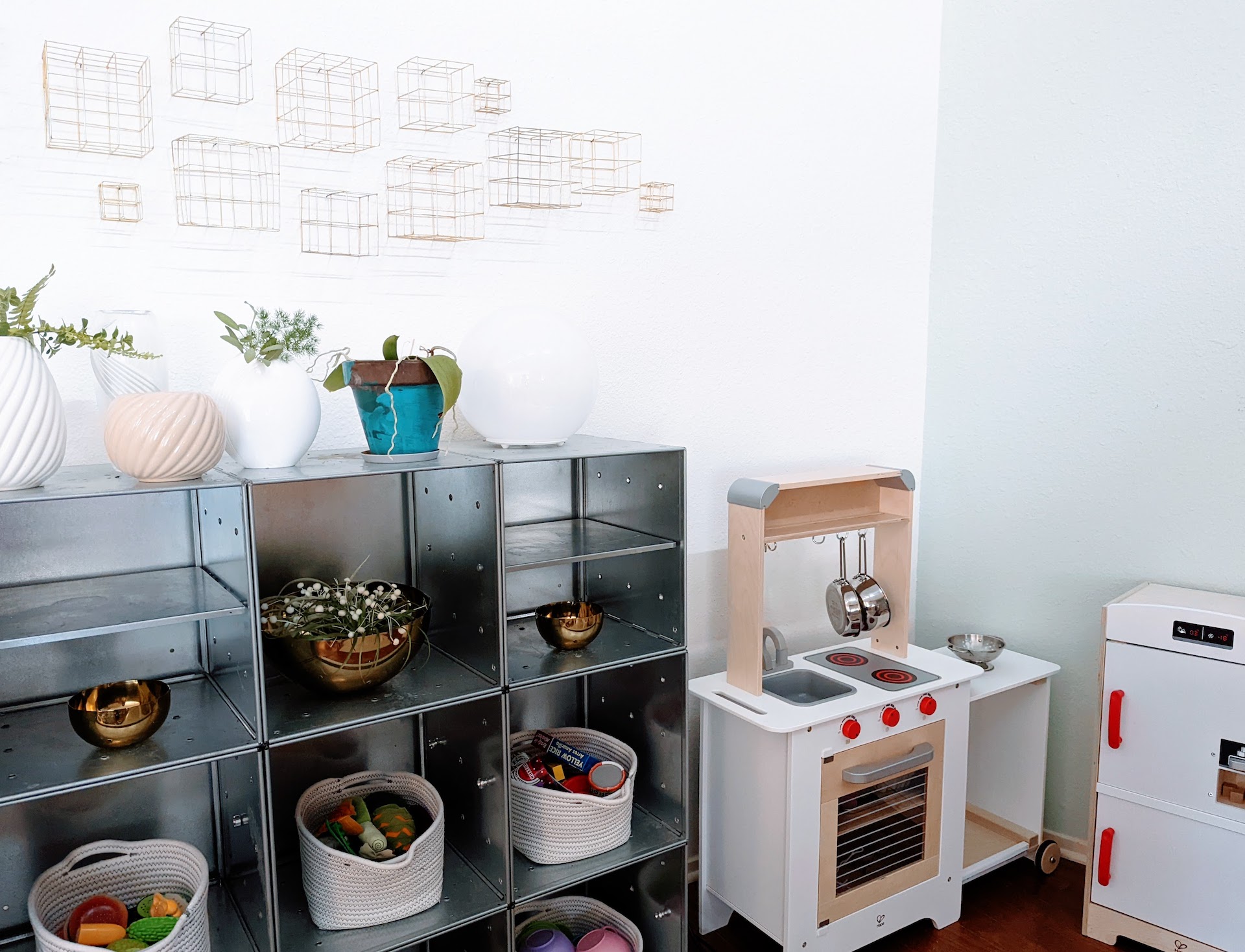
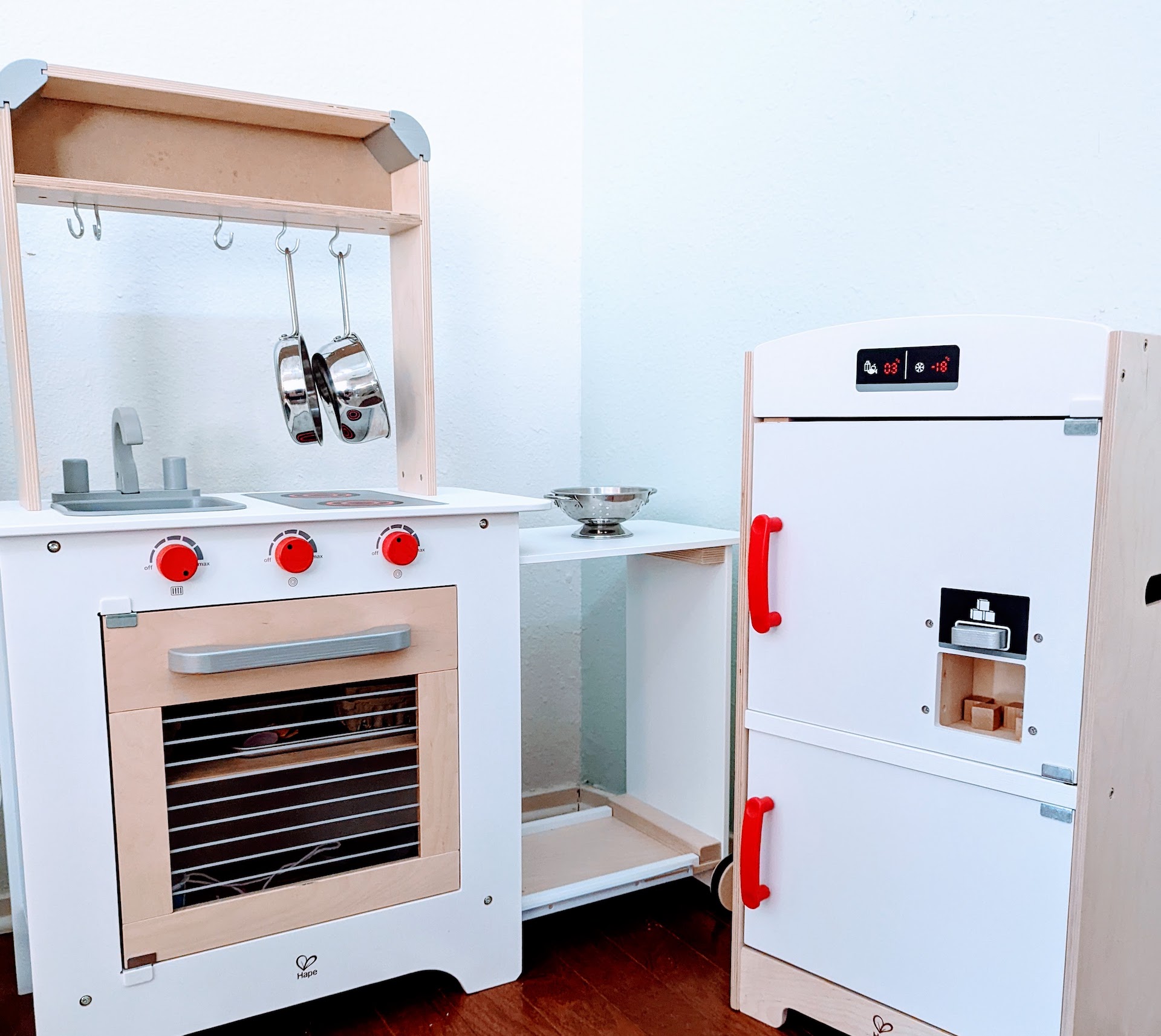
Since we’re really going for honesty here, I also made no attempt to hide the Hape play kitchen and baskets of play food that are in the photo above. My daughter frequently uses this space. Our house isn’t huge, folks, and we needed a place for her play kitchen. It’s not going anywhere anytime soon.
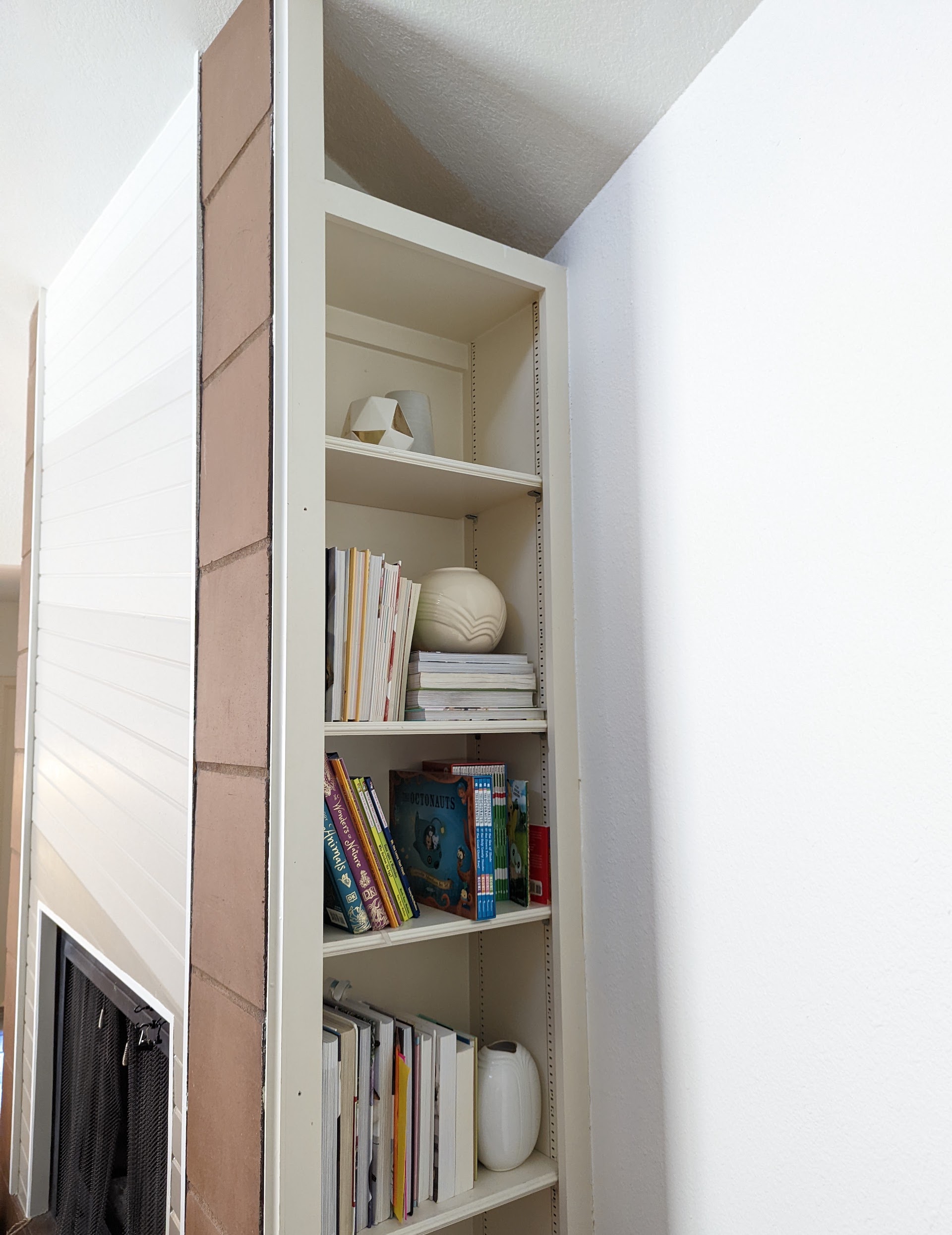
I should mention that our house was built in 1981. When I first saw the home, there were many features that I instantly fell in love with. The fireplace pictured below was the first thing to grab my attention (see how I painted it from natural wood to a gradient here). Before we moved in, we had a built-in cabinet removed in the dining room, and a “hidden bookshelf” was revealed. It’s one of my favorite features of the dining room:
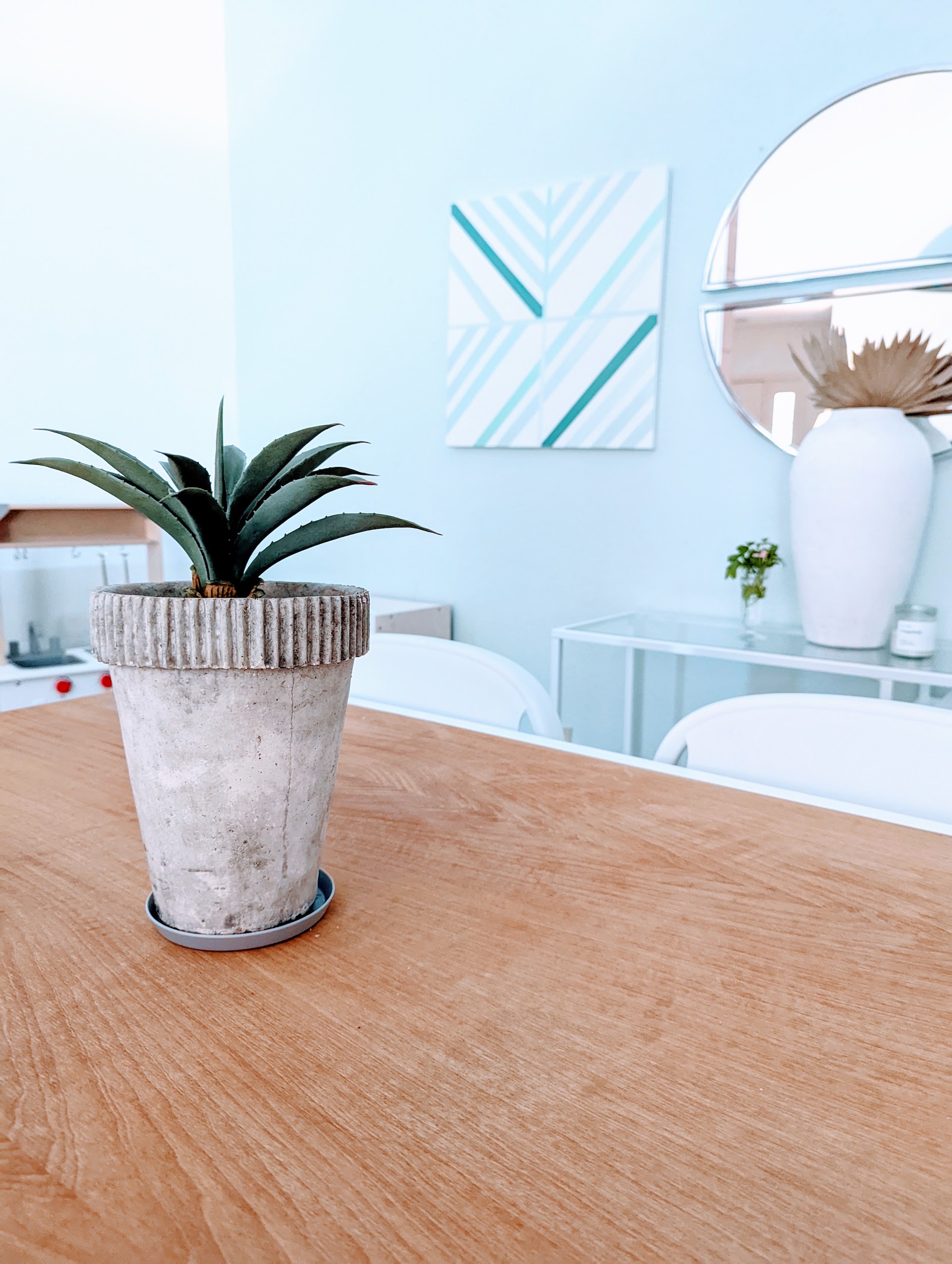
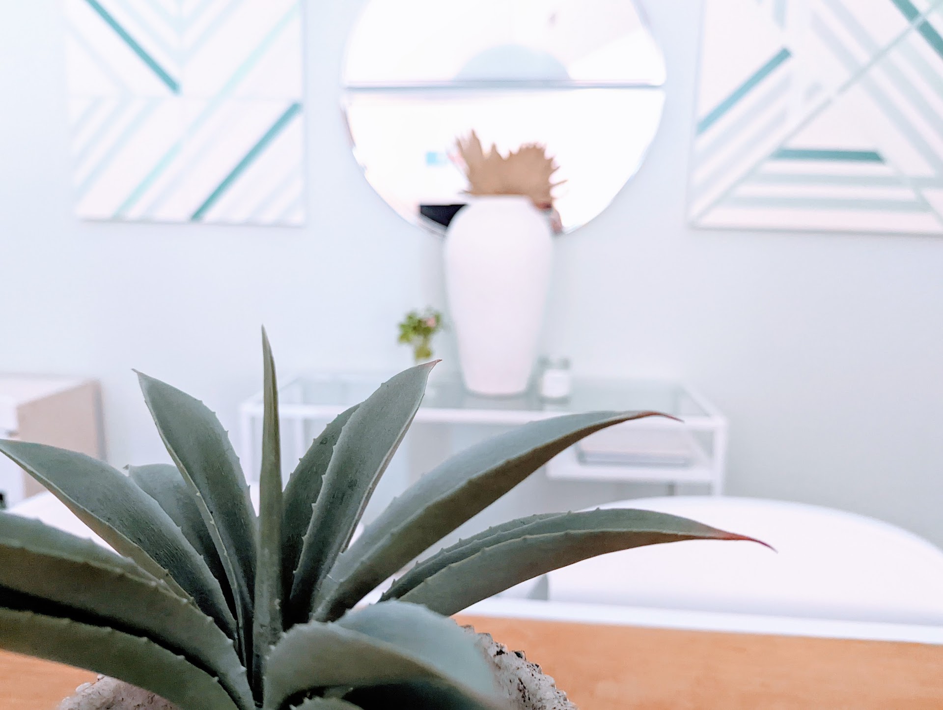
A few more pics of the finished room, which includes a faux plant on the table for now. After the real one perished, I decided to make it simple.
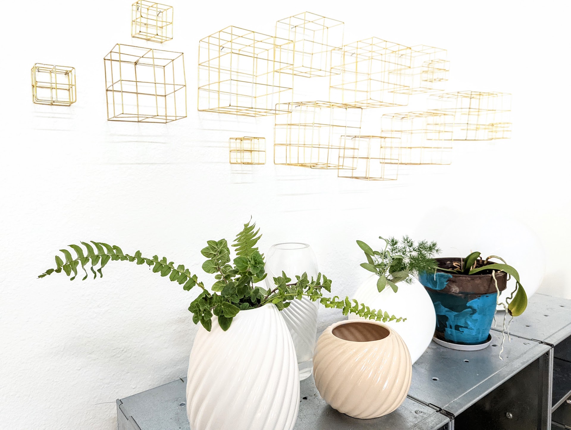
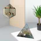
The brass cubes below are from CB2. A collection of retro vases lines the metal shelving. Keep scrolling for more pics, plus the big “before” and “after” moment.
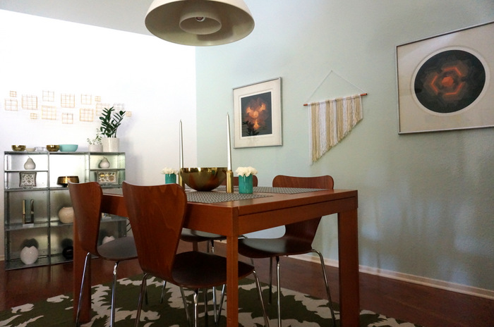
BEFORE:
AFTER:

To wrap up, the accent wall stayed light mint and we didn’t remove any flooring, but freshening up the table, getting new chairs, and adding a console table really made a big difference. I’ll add that the Brian Halsey artwork in the “before” pic will be going in another room of the house. It’s priceless. I painted a geometric design on canvases a few years ago, and that’s the room’s main wall art for now…
Happy decorating and thanks for reading!











“a super affordable IKEA table will have to get the job done” YES! from Sweden here ; ) A new great post! What an awesome job you have done it looks beautiful and homecomfy.
Awww, thank you, Teresa! I don’t know what I’d do without IKEA. 😉
With the dark old fashioned table and chairs and wall decoration, it felt more 80’s before the makeover. But that’s just my opinion!
I’m happy to hear from you after a long break, I love your blog and everything 80’s.
I can totally see that–and the original ’80s artwork in the space (by Brian Halsey) will be going in a different part of the house. I’m not letting go of those serigraphs! 😉 It was definitely time for a change–my husband bought the table in the early 2000s, and there was a certain heaviness to the chairs. Thank you for reading, Michaela!
Kate! I’ve missed your blog posts so much! Finally, there are and I’m picking my teeth off the floor again 🙂
What a gorgeous transformation, But even before that, the room looked very nice. Everything looks so perfect, matched together it creates an amazing and unique place. First of all, in the style of our beloved 80s.
I like the mirror the most, I would love to have one, it is perfect. I would like to buy it but I live in Europe and I’m afraid that in transport it might not hold up in two pieces 🙂 Next, my attention was drawn to the floor, I love wooden and shiny floors, as well as a table under the mirror.
I’ve written this before, but I’ll say it again.
Your blog has been and continues to be my main inspiration in decorating my apartment in 80’s style.
You do the best job, thanks a lot.
Well this comment makes my week! Thank you so much for your lovely words, Adrian!! Life has made it impossible to post more, and sometimes it feels like I’m fighting for each minute that I eventually get to “create” these days. To receive a response like this is just beyond wonderful. I’ll bet your apartment is fabulous–thank you again for the time you spend reading this blog, for taking the time to reach out, and for such a thoughtful comment.
Just reading this post, but this dining room is a perfect example of how you have such an eye for the elegant, sophisticated aspects of 80’s design that are so often forgotten and overlooked.
Thank you for reading, and thank you for these kind words, Danny!! I hope you’re having a wonderful holiday season. I really appreciate your comment and this shared affinity for ’80s design.