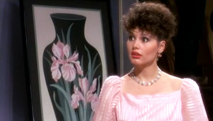
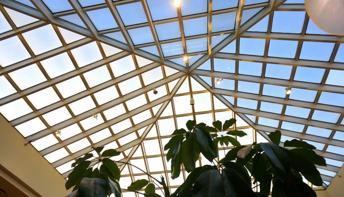
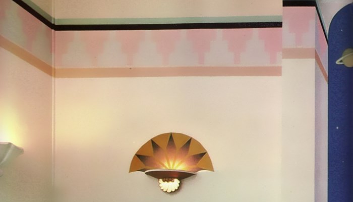
Today’s post is dedicated to the pink and purple fabulousness that’s painted all over the film Tootsie. OK, so the whole movie isn’t doused in shades of purple and pink. But these colors are used to turn female stereotypes on their ear, taking center stage at some of the most empowering moments for Tootsie/Dorothy (played by Dustin Hoffman) and Julie (Jessica Lange).
Decadent Pastels
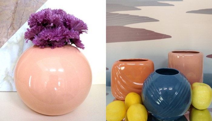
This week at Mirror80, it’s all about the pastels. Rather than using a modern minimalist approach, we’re taking things in a decadent direction. From a post dedicated to the pink and purple Deco-modern interiors of the 1982 film Tootsie to an original photo shoot featuring a variety of 1980s ceramics, this week’s posts will offer a richly layered approach to pastel design. Today we’ve put together a sneak peek of things to come, as well as pulled images from past Mirror80 posts that celebrate the style at hand. Read on for details…
New Decor/Retro Flair: Little Things
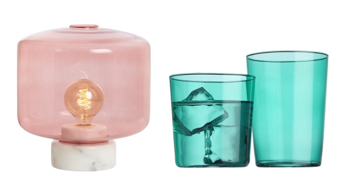
Little things mean a lot. Not that any of the featured finds in today’s post are small in any sense of the word. But sometimes the items that make a biggest impact aren’t large-scale purchases or statement furnishings. These accents are new and modern but filled with retro flair. And they couldn’t be more perfect for summer! Read on for links and details…
Design Profile: Hopper + Space
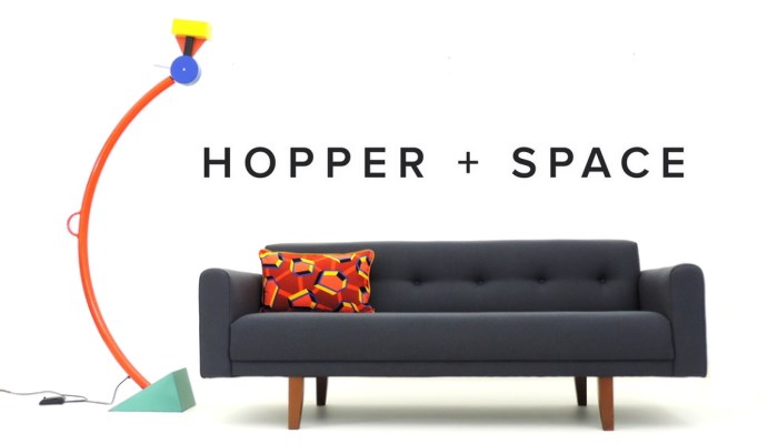
Today Mirror80 shines the spotlight on Hopper + Space, a London-based design studio and webshop offering everything from Art Deco and midcentury finds to postmodern and contemporary pieces. With selective eyes for clean-lined flair, Ben and Joe curate an impressive collection of items, including their own original creations, which pair beautifully with the shop’s 20th century offerings.
1980s Commercial Office Spaces
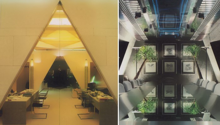
Working hard today? Maybe you can take a quick break to check out these commercial office spaces from the 1980s. If you caught our recent post on the ’80 home office, consider this a follow-up. Because things got a lot glossier when it came to corporate spaces. Mirrored ceilings and tables were not out of the question, nor was designer furniture and an abundance of angles, as shown in the images above from Commercial Interiors International.
Retro-Modern Roundup: Colors and Forms
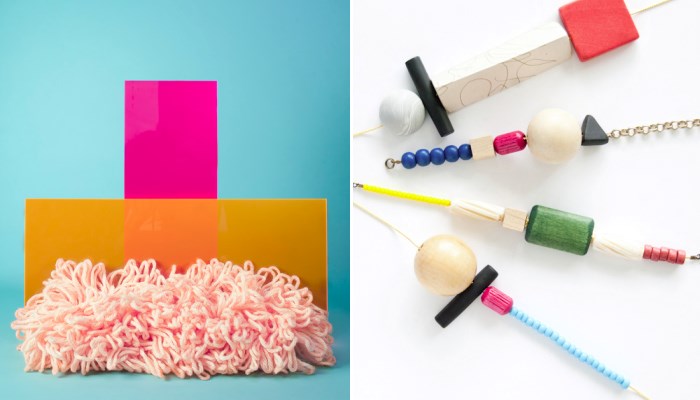
For today’s edition of Retro-Modern Roundup, we’re taking a look at new designs that channel Memphis style. Vivid colors and bold forms dominate the images above, and the styling is so fabulous, the featured items look good enough to eat! Read on for links and details…
’80s Flashback: Sharp Goes Pastel
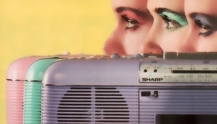
If you caught Mirror80’s recent 1980s design trend feature, you know I’m now the proud owner of the September 1986 issue of Metropolitan Home, which I ordered from Etsy shop The Archaic Ad Collection. And speaking of ads, I just had to share this 1986 Sharp ad (from Metropolitan Home) for obvious reasons. If you’re old enough to have lived through the ’80s the first time around, maybe you had one of the QT-50 Stereo Radio Cassette Players above. Mine was lavender. The very first song I recorded from the radio with the help of this device was “Escapade” by Janet Jackson. But enough about me. Let’s take a look at the rest of the ad…
’70s/’80s Interior Design: Kids’ Rooms
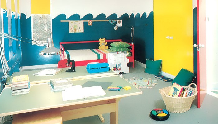
Today we shine the design spotlight on children’s bedrooms of the ’70s and ’80s. If you were a kid during this time and your room didn’t look like one of these, don’t fret. Interestingly enough, my childhood bedroom DID involve bright colors, until I was old enough to “redo” it in the ’80s country style, complete with pink walls and a floral comforter. Maybe I should have taken my cue from one of today’s featured spaces! Read on as we explore top trends in retro kids’ rooms…
Dead Malls, Childhood Memories and ’80s Style
My childhood mall, which was once the indoor retail hot spot of Austin, has slowly joined the land of the dead malls over the last decade. This week it closed its doors for good, and it will be converted to a branch of Austin Community College. Highland Mall was built in 1971, and it was Austin’s first indoor mall.
1980s Interior Design Trend: Borders
Today’s post is dedicated to the painted border. Yes, I’m talking about borders, which have been in “outdated” territory for years, thanks to a variety of country-themed designs involving ducks and floral motifs. But I’m here to say that the border is back! Especially since interior styling photos from the 1980s reveal that there WAS such a thing as a tasteful modern border, especially when paint was used to create a simple, striking design…

