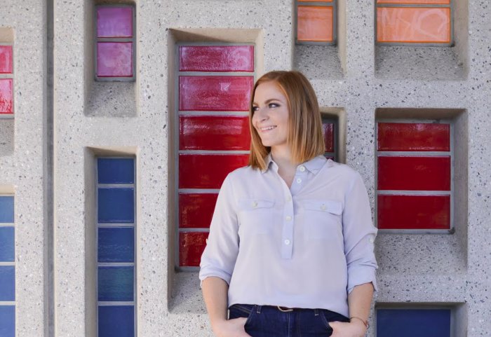
Today I’m welcoming Katie Rispoli Keaotamai to the blog! Katie is an architectural and cultural history professional who runs We Are the Next, a nonprofit organization that carries out construction projects in abandoned or neglected buildings. She then uses them to empower youth by raising awareness about the ways city buildings reflect our shared cultural identities and patterns in pop culture. Youth involved in We Are the Next programs also learn about historical movements and regional development, ultimately engaging with their city so their neighborhoods can thrive.
Since I began corresponding with Katie this past summer, she has shared her expertise on Postmodern design and the importance of preserving buildings from the ’70s through the ’90s. With her boundless energy and love of ’80s design, Katie has inspired me on many levels. Luckily she said “yes” when I asked for an interview! Below she shares her thoughts on a variety of topics, from key design features to note when viewing 1980s architecture, to what it was like to save the very first Taco Bell!
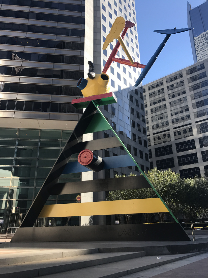
1980s Postmodern public art in Houston, TX
If you are moved by the mission of We Are the Next and you want to support the organization’s youth programs, visit their donate page here, where you can contribute a specific item or make a custom amount donation. Even $5 or $10 goes a long way in educating and empowering youth.
*Unless noted, all photos in today’s post are by Katie Rispoli Keaotamai
Can you tell us more about what inspired you to create We Are the Next?
I came up with the idea for We Are the Next after spending a couple of years working in the historic preservation community. Through my graduate work in Heritage Conservation in the University of Southern California (USC) School of Architecture, I was learning about design, but also about the diversity of our region. I came away with the impression that the historic preservation community was very focused on historic house museums and extravagant architecture, which tend to highlight wealthy populations (which are, most often, white).
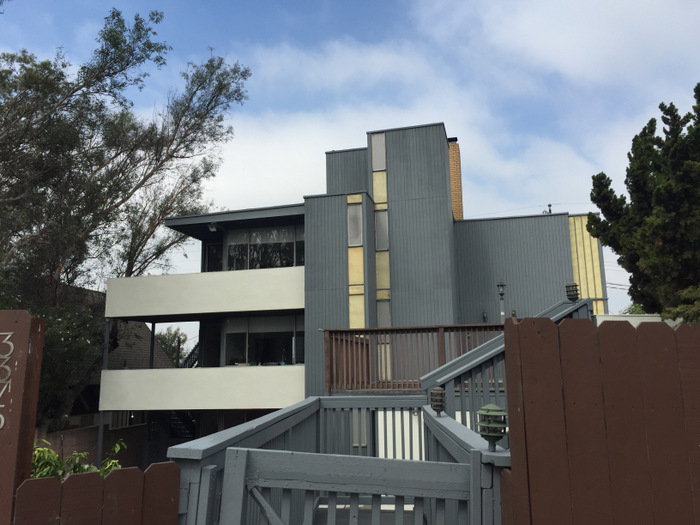
1970s apartments in Long Beach, CA
Long Beach, California, where I was living, is a very multicultural city. At the time, I was interacting with everyday people of different backgrounds daily, not the kinds of people who own or interact with this kind of architecture. All around me I was seeing the great things that everyday members of the community accomplish, and I thought it would be so much more powerful to tell their stories. I figured, there is already so much being done to tell the stories of the wealthy and powerful through history, so I wanted to tell the other stories – the ones that everyone can relate to on a personal level.
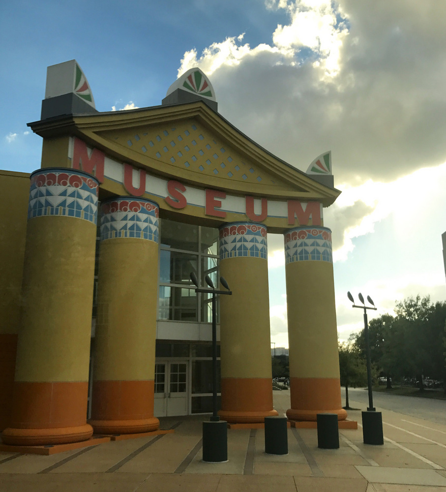
A Houston, TX museum featuring ’80s Postmodern architecture
Using this perspective, I created We Are the Next so we could provide community programs and create spaces for learning that would share all kinds of stories, not just those that center around extravagant, beautiful architecture. It’s easy to get caught up in the beauty of it all – I personally am an architecture lover – but I believe that in order to really love it you have to know the whole story. People need to know the hard stories, and the stories you can’t see just by looking at a building, just as much as (if not more than) they need to know about the design.
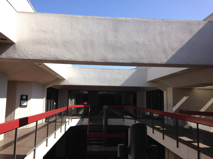
A 1980s-built office in Long Beach, CA
Ultimately, we’re learning at We Are the Next that it’s this more holistic way of sharing history and places that builds a lifelong passion for the subject. We do the majority of our programs with young adults, because they’re the ones who will inherit these places. I wanted them to get a grasp on the stories of real, everyday people so they understand that not everything has to be high design to be valuable, and they build a personal connection to these places that lasts.
How did you create We Are the Next’s geometric logo?

I designed our logo as a Venn diagram to demonstrate this concept of telling the whole story of architecture. I wanted to use a Venn diagram to show an overlap, but with triangles instead of circles because they have multiple sides, just like all of the stories we tell. By showing the overlap of the triangles, we’re showing the overlap between our traditional dialogue about “historic landmarks” and our focus at We Are the Next on “important stories.”
The overlapping green portion is the common ground, for instance, the idea that places have value, that they can be important for their association with individuals or movements. However, the orange and blue areas are distinctly different. While one traditionally tells the story of wealthier populations and celebrates high design, the other tells the stories of all races, communities, and genders, and helps us assign worth to their accomplishments regardless of beauty or extravagance.
Are there members of the architecture community who are interested in preserving buildings from the mid-’70s through the mid-’90s, or is architecture from this time considered “too new”?
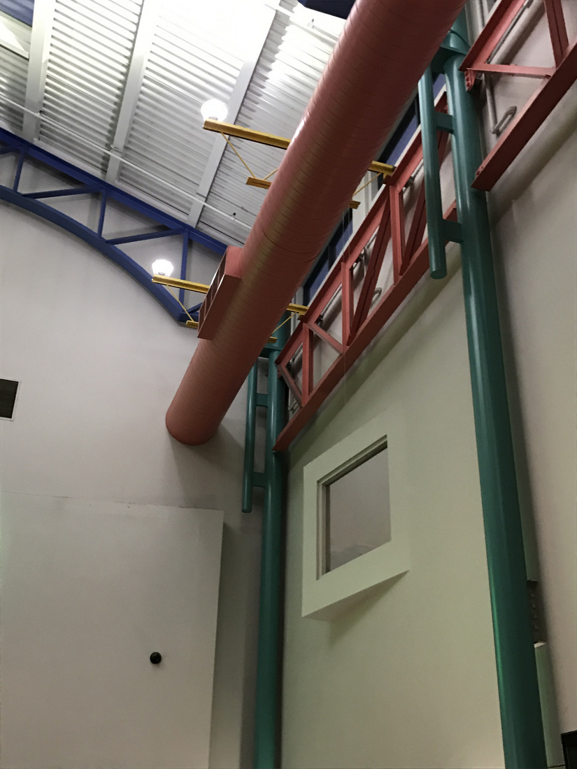
A United Artists movie theater, built in 1990s Sacramento, CA
As much as I work with more everyday spaces, I definitely maintain my passion for architecture. Aside from myself, there are absolutely members of the architecture and preservation communities who are advocating for the recognition of 1970s-1990s architecture. Architecture from this time is considered “Late Modern” and “Postmodern” in many cases, so these fall under the umbrella of Modernism. I’m sure many of your readers know that there is a huge level of public interest in Mid-Century Modern architecture, which has grown out of an effort to acknowledge and preserve early Modern architecture and design in the last 20 years. So it’s only natural as we’re progressing through decades of Modernism to start looking at the ’70s and later.
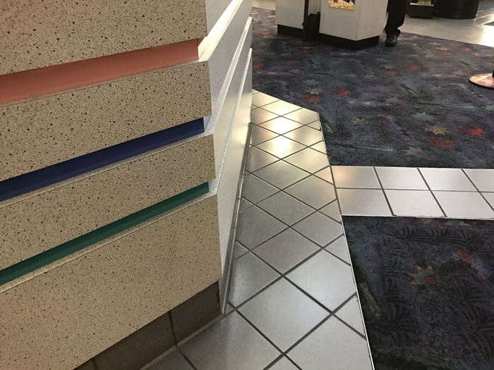
A United Artists movie theater in Sacramento
The number of people focusing on it is minuscule compared to the greater Modernism following, but they’re out there! There are some people who are way ahead of their time in this regard, like my friend Alan Hess. Alan was fighting to save the world’s oldest operating McDonald’s, a Googie-style (a type of 1950s/’60s Modern architecture) building in Downey, California back in the ’90s long before Googie was even acknowledged. He’s very passionate about Late Modern architecture, and he lives in a time capsule 1970s house in Irvine, California.
Why are you drawn to Postmodern architecture?
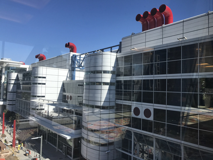
’80s architecture at the Houston Convention Center
For me, I love architecture from this time because it’s the first time we see architecture designed with people of all genders and cultures in mind. This is the first wave of design trends to come about following the Civil Rights Movement, so we’re seeing economical designs, trends that can be adapted at varying levels depending on financial ability, and workplaces built out to accommodate women just as much as men. This becomes especially key in the 1980s and ’90s.
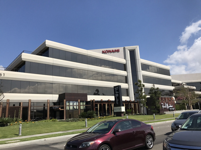
An ’80s office building in Manhattan Beach, CA
As you can probably guess, I’m all about equality, and this time period is when we start seeing architecture broach that conversation. It really began with the entire concept of Modernism in the early 20th Century, which was very Utopian.
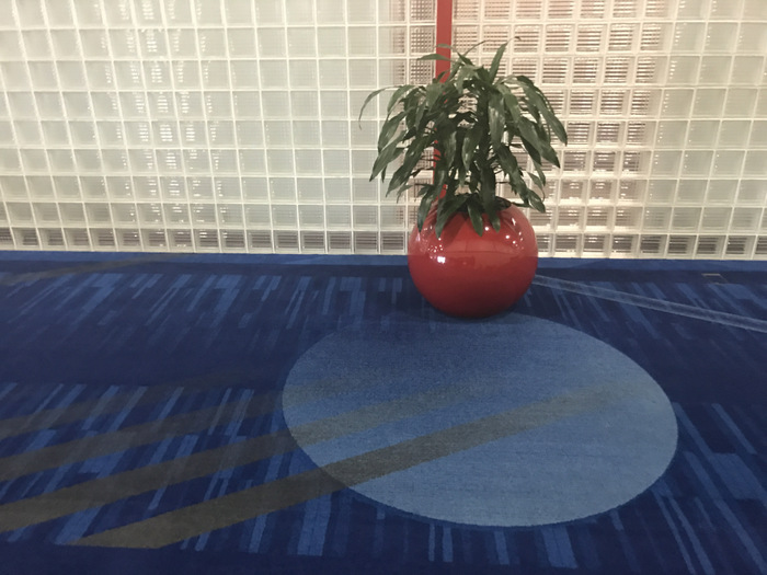
1980s design at the Houston Convention Center
However, despite architects who tried to create prototypes of affordable high design for the masses, it was never really was able to cross cultural lines and become realistic. Today we live in a world where low-income housing developments are built by some of our time’s greatest architects and designers, and it is a reality… but it’s not the norm.
Tell us about how We Are the Next saved the very first Taco Bell in Downey, California!
Before I started We Are the Next, I was working in the construction industry restoring and rehabilitating historic buildings. Though I created We Are the Next to be a youth organization, there have been a couple of times where it worked out well to use my construction background. One example of this is when we partnered with Taco Bell to save the world’s first Taco Bell!
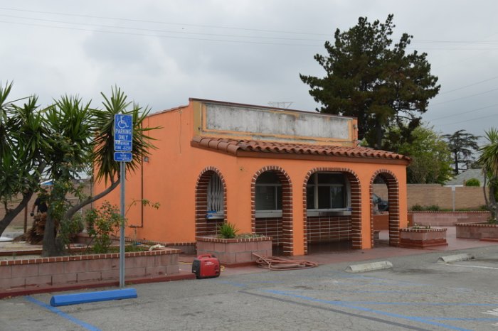
Taco Bell Numero Uno
We did the project because we saw an opportunity for this important building to serve as a ‘learning lab’ of sorts for our students. It’s a perfectly ordinary taco stand, and I honestly couldn’t think of a better place to send the message that important history can be embedded in even the most ordinary places! I jumped at the opportunity.
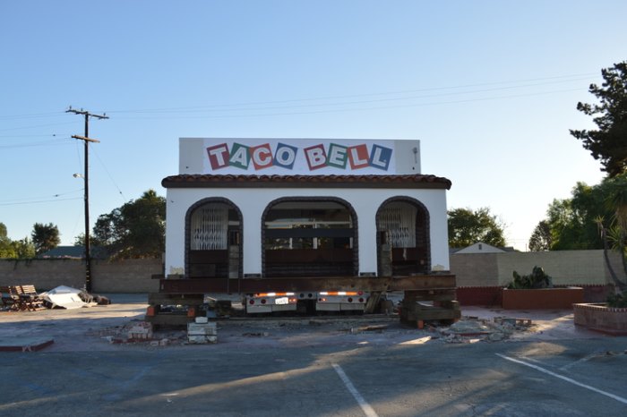
Refurbishing Taco Bell Numero Uno
It was really a matter of being in the right place at the right time. We had been working with the City of Long Beach to relocate a historic train depot so it could serve as an educational center, and Taco Bell got wind of our work right after they learned that the first Taco Bell was going to be demolished. The owners of the Taco Bell were very generous. They really just wanted it off their property so they could reuse the land for something else, and they really didn’t want to tear it down. They told Taco Bell that they would give them a grace period to move the building, and so Taco Bell got connected with us to see if we could help them do it.
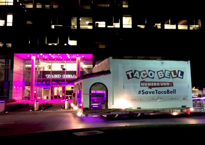
Taco Bell Numero Uno arrives at Taco Bell headquarters
They hired us to evaluate the building to see if it had a story they could realistically promote. We determined that its story was historically significant, and they went forward with the move! We had the building’s structure assessed, had all asbestos removed, fumigated it, repaired and repainted the exterior, and then finally moved it in November of 2015 to Taco Bell’s world headquarters in Irvine. It was a 47-mile drive!
Can you share any current or future projects that you’re excited about?
We’re a unique kind of operation in that we don’t always have construction projects happening. They’re one of my favorite parts of our work, but we only do them when we see an opportunity to create a space for our students to learn. For now, we are continuing to work with Taco Bell to transform Numero Uno, and we’ve got a lot of community programming in the works for 2017.
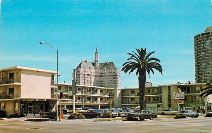
Historic Long Beach images will be an important part of the Step Back project
We’re doing an exciting project called “Step Back“, which is an installation happening in Downtown Long Beach. We’re going to install viewing devices (you know those things you put a quarter in at the pier to look far off into the distance!) in multiple locations, except we’re altering the devices so when you look through it won’t zoom, but instead there will be a historic photograph taken from the exact spot you’re standing in. The idea is to allow pedestrians and tourists to get a glimpse into how our built landscape evolves over even just a few generations – we want people to see what we’ve lost, what we’ve kept, and what we’ve built just in the last eighty or so years.
Are there upcoming programs to continue your mission of working with young adults?
We’re doing a series of very meaningful programs with high school students over the next year. All of the programs have been created using feedback from students who are on our Youth Advisory Committee. These students live in the areas we serve, and they share ideas with us so we can ensure our programs remain relevant to the kids who participate in them. This year our students are feeling very anxious about our government, especially considering that many of them are the children of immigrants and are worried about their families.
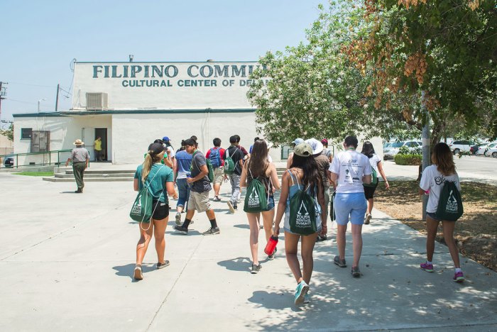
We Are the Next’s Youth Heritage Summit
Here in Los Angeles County (home to about 10 million people), roughly half the workforce wasn’t born in this country, and over half of the students in the school districts we service speak more than one language in the home. As a response to the feedback our students have shared with us, we’re creating a series of programs that involve talking about historical experiences relating to oppression, discrimination, and success by people of color, minorities, and immigrants who lived in our region.
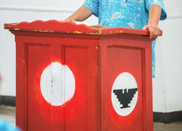
Youth Heritage Summit California
Our goal is to create conversations where students can see parallels between the lives of people yesterday, and their lives today. Then they can find opportunities for action and progress that they can take themselves, even if they’re not old enough to vote.
There are so many amazing features to take note of when viewing buildings from the 1980s (glass block, metal railings, neon lighting, etc.). What are some of your favorites?
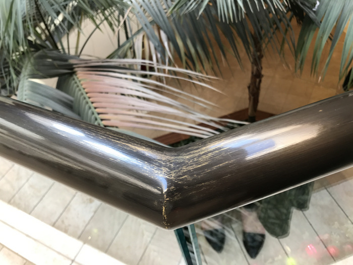
1980s design at South Coast Plaza
It’s so true!! My favorite absolutely has to be gold railings, they really are my weak spot. I was a little put off, actually, when I went to South Coast Plaza (a notorious example of awesome ’80s design!) to do some Christmas shopping recently and saw that they painted all of the fantastic gold railings that line the mall’s iconic walkways.
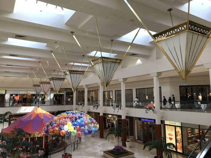
South Coast Plaza in Costa Mesa, CA
I would say that my second favorite would be a bold, asymmetrical ’80s roofline. Where I grew up in Cameron Park, California, a lot of the houses were built in the ’80s, including mine. Lots of them have geometric facades and asymmetrical rooflines with high ceilings and plant ledges… oh, the plant ledges!! If I ever get to go house hunting, I will definitely be hunting for a dramatic roofline!
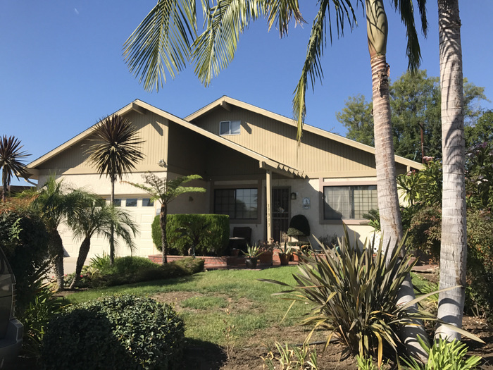
A 1980s-built residence in Artesia, CA
Are there key architectural features that ’80s enthusiasts can be on the lookout for when trying to determine if a building is from that time period?
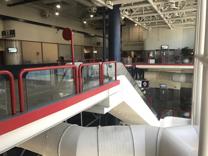
’80s design features at the Houston Convention Center
Oh yeah, trademark signs of an ’80s building are thick railings (usually made of brass, gold, or wood) and/or an asymmetrical roofline. The way to tell if a building is completely ritz is if you see thick railings made of Lucite. Any and all Lucite is the holy grail of the ’80s and ’90s!
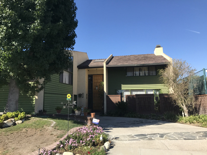
An ’80s residence in Artesia, CA
In the ’70s it was really popular to have patterned brick or wood shingle facades (you mostly see the brick in Southwestern areas and commercial buildings), but in the ’80s wood took over, and then stucco became the obsession in the ’90s. That one has stuck!
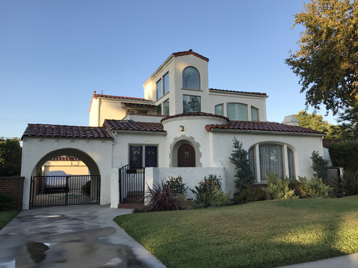
A ’70s addition in Downey, CA
The dead giveaway for the late ’80s/early ’90s is a simple, octagonal window (preferably with a lamp hanging nearby). See one of those, and it’s a dead giveaway!
How about key architects from the mid-’70s through the mid-’90s? We’d love to learn more!
Every area has its regionally-famous. In Long Beach, one of the most iconic is Don Gibbs, who is still alive and practicing, though he’s in his eighties now. He’s been doing some art pieces and murals lately, and they’re so amazing! Gibbs has done incredible works throughout his career, his earliest being in partnership with his father Hugh Gibbs, who helped design much of California State University, Long Beach (CSULB) in the 1950s and ’60s. Don Gibbs worked with his father at their firm, Gibbs & Gibbs in the 1970s and 1980s when they designed the City of Downey’s City Hall and worked with others to design the Long Beach Civic Center in 1976.
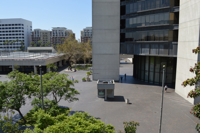
The Long Beach Civic Center
The Long Beach Civic Center is currently facing imminent demolition and will be replaced by a new Civic Center by 2020. However, Gibbs’ most notable works are the School of Dance and the Walter Pyramid (one of only three true pyramids in the country), which he designed in 1994 for CSULB. The pyramid has become his claim to fame, and both are excellent examples of the geometry and historical influence that come into play in Post Modern Architecture.
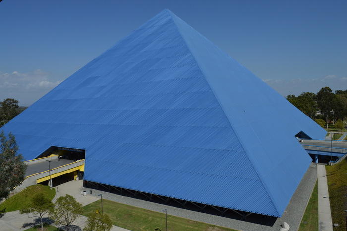
Mike and Arlene Walter Pyramid by Don Gibbs, 1994
Another regional architect I have a fondness for is Edward (Ned) B. Sawyer of Arizona’s Phoenix region. I met Ned a few years ago when visiting Scottsdale with the USC School of Architecture, and we really hit it off. We’ve kept in touch, and I visited him in early 2016 for a more in-depth tour of his work. Ned started his career training with Cal Straub, a Mid-Century Modern great who taught at USC, and he has taken Mid-Century Modern design into the twenty-first century.
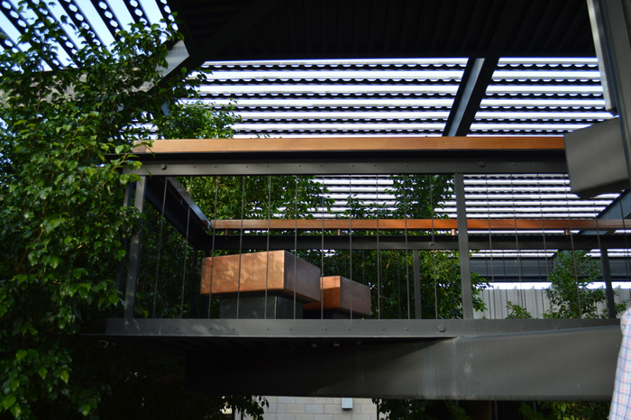
The Pavillion Complex by Edward B. Sawyer in Scottsdale, AZ
His work is inspirational for me – he designed the majority of his buildings in the 1970s and 1980s, though he is still working now. His style intertwines Post and Beam with thick, geometric shapes, natural color palettes, and rough materials present in Late Modern and Postmodern architecture. On my last visit, we walked a residence he is just finishing, and it’s as though you’re walking through a Mid-Century Modern architect’s design, if it was designed in 2016. He truly is a talent.
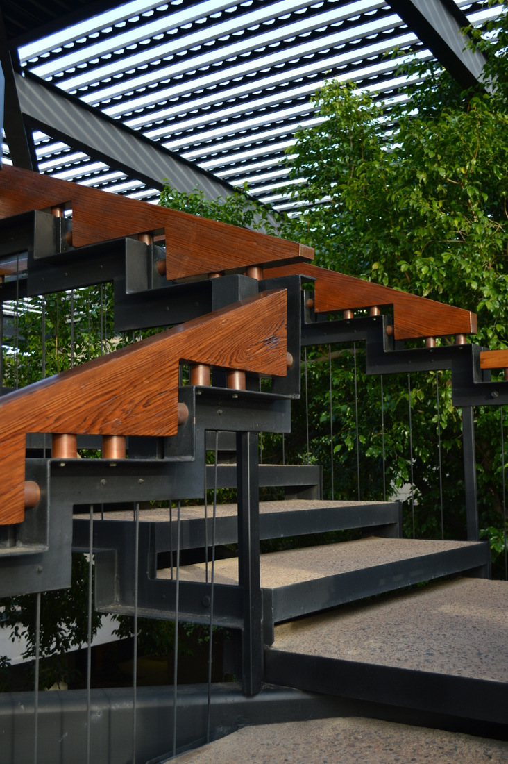
A staircase at The Pavillion Complex
Are there other architects whose work would be interesting to fans of Postmodern design?
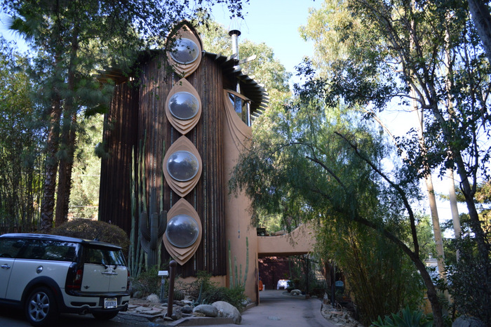
The Al Struckus House by Bruce Goff
Nationally, two of the best known are Michael Graves and Frank Ghery. Ghery, of course, is still around and considers himself a “Deconstructivist” rather than a Postmodern architect, but the bulk of his work certainly fits the time period. I think I would say my favorite architect so far is Bruce Goff. I’ve only had the opportunity to visit two buildings he designed, and both of them are so geometric and spatial that you almost feel like you’re visiting another planet! Both are in the Los Angeles Area: the Los Angeles County Museum of Art (LACMA) Japanese Pavilion, and the Al Struckus House.
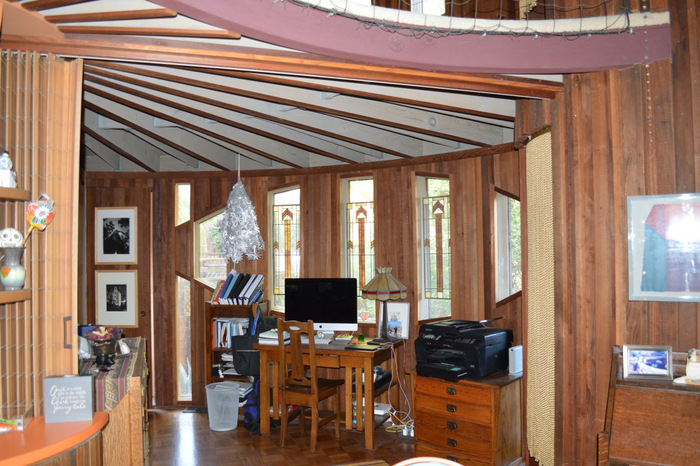
The interior of the Al Struckus House
The Struckus House in particular is a work of art! I had the privilege of seeing the inside at an event hosted by docomomo_socal awhile back. The house is a cylinder shape with giant “eye-like” windows along the sides.
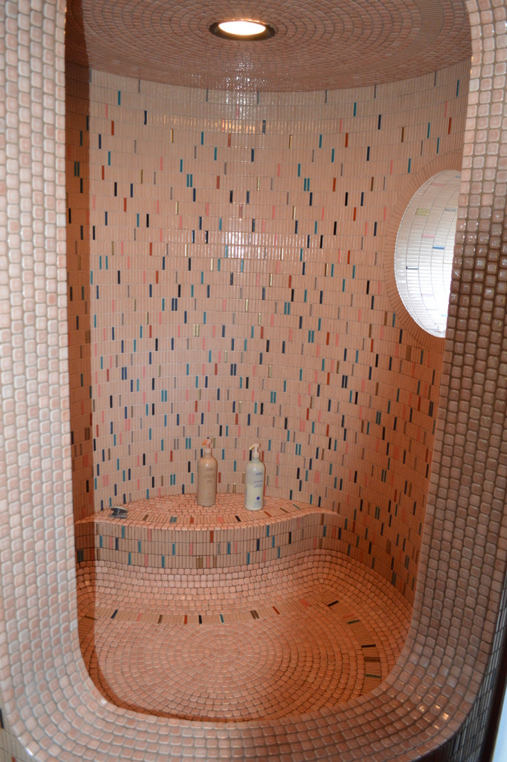
Pink mosaic at the Al Struckus House
Its three stories face into a rounded void on one side, which acts as a balcony lined with a fishing net instead of a railing, so if you fall you fall into the net! It has pink mosaics which repeat throughout the residence and custom stained glass designed by Goff inside.
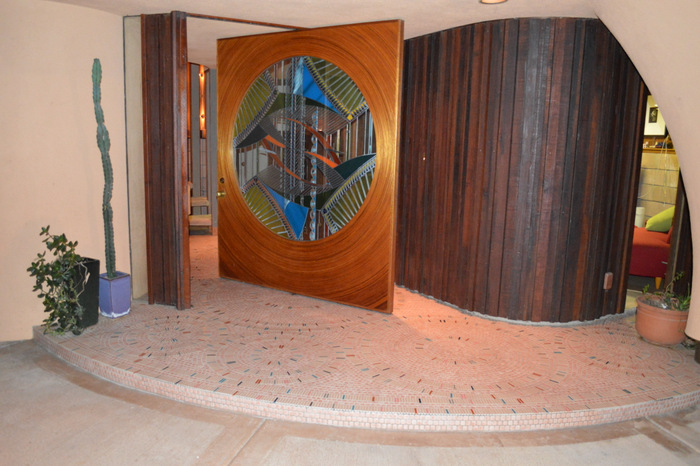
Stained glass designed by Bruce Goff
We all know that design doesn’t occur in a vacuum. Are there other decades that involve similar architectural features to those of the 1980s? Perhaps certain styles or time periods that clearly influenced ’80s architecture?
I’d argue that we can trace back much of our beloved Postmodern design characteristics to Victor Gruen Associates. Gruen was an immigrant from Austria who came to New York to escape Hitler’s reign. He was inspired by the storefronts of old “main streets” in Europe and felt that notion could become commercialized. His firm went on to specialize in commercial design, shaping the way Americans and the world over shopped. He essentially created “the mall” and did a fair amount of design here in Southern California. The book Mall Maker by M. Jeffrey Hardwick puts it best saying, “[Gruen] included a lounge for tired shoppers… to transform a retail facility into ‘the center of cultural activities and recreation’… By 1943 the idea that a shopping center might serve as both a retail facility and a social center was very popular.”
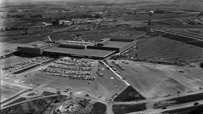
Victor Gruen’s Southdale Center in 1956, Photo Credit: Minnesota Historical Society via WTTW
The entire concept of the mall being the center of commercial and social life that the ’80s and ’90s were essentially built upon is likely a construct that was conceived of by Gruen’s firm in the 1940s and ’50s.
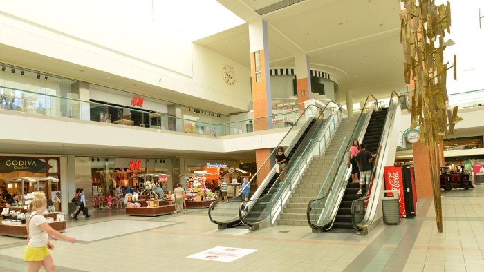
A modern photo of Southdale Center, Photo Credit: Rory Thomas O’Neill via WTTW
A very special thank-you to Katie Rispoli Keaotamai for sharing her knowledge of Postmodern architecture with us!
If you are as moved as I am by the mission of We Are the Next and you want to support their continued mission of educating and empowering youth, donate here to support their campaign.








Leave a Reply