I couldn’t be more excited about today’s interview! David Zakrzewski experienced the best in ’80s retail design during the Decade of Decadence. Before becoming a public relations practitioner, David was an interior decorator and retail sales associate for four years at Los Angeles’ renowned Beverly Center. After learning more about his knowledge of ’80s design history, it was clear that I should have interviewed him years ago. Better late than never! Get ready for a lesson in ’80s retail design, as well as a firsthand account of what it was like to be at the center of cutting-edge mall culture when it mattered most.
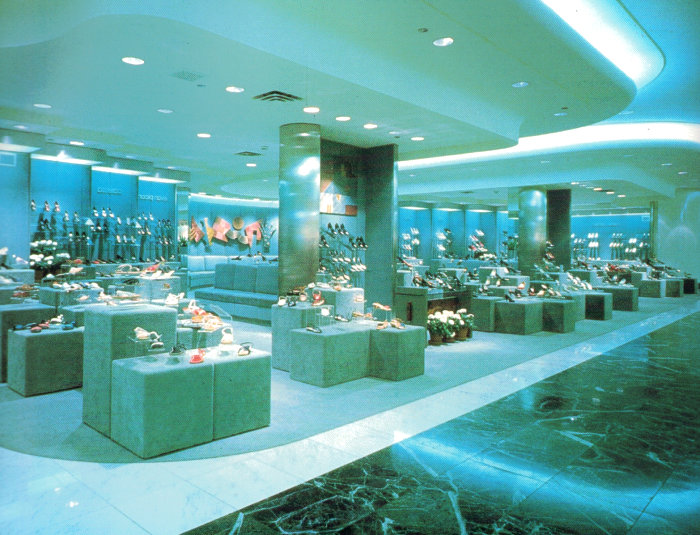
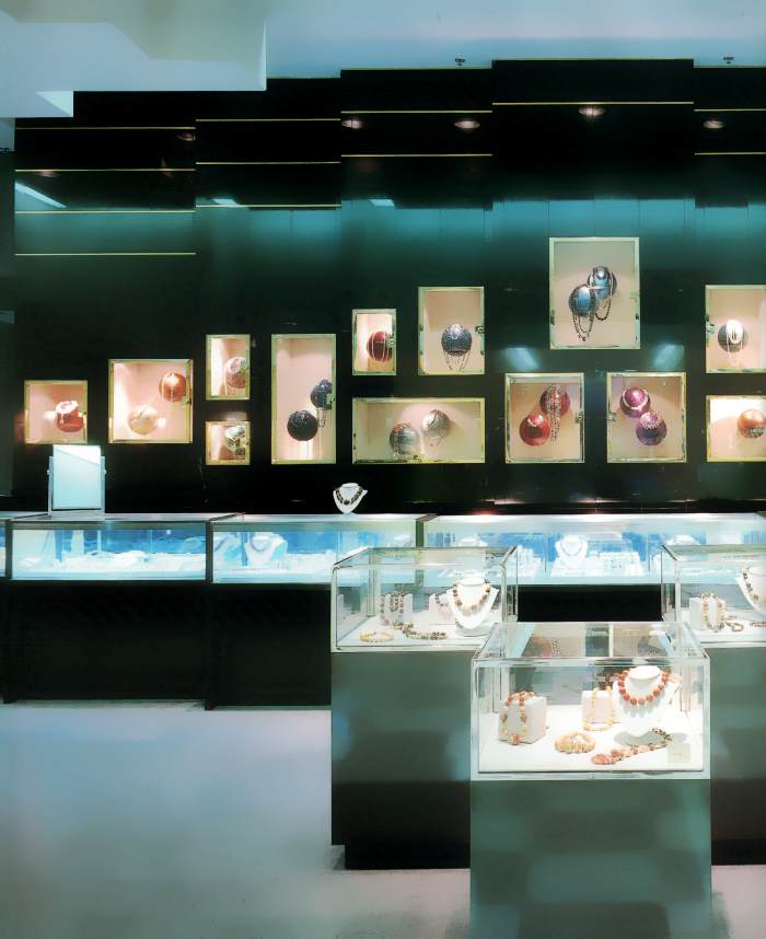
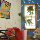
*Note: David focuses on Beverly Center throughout much of the interview, yet several of the featured photos are from The Best in Store Designs, 1986. While they do not depict Beverly Center, they are used to illustrate the design features discussed in the post. Enjoy!

Welcome, David! Thank you for taking the time to chat with Mirror80.
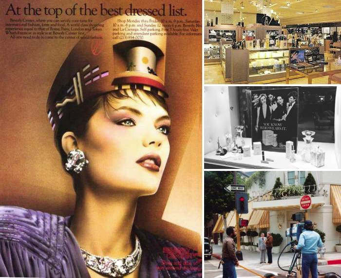
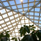
Thanks for extending the opportunity to interview. I am very flattered that you would consider asking me about the things we all love and miss. Obviously, most of us were present to see and experience these things, so this was not unique to me. I simply devoured what I saw and experienced. I paid more attention to it, and maybe it was due to being in LA, which had a bounty of everything. [photos above feature Beverly Center, as do the two architectural photos below, taken by Ned Paynter, courtesy of Friends of San Diego Architecture]
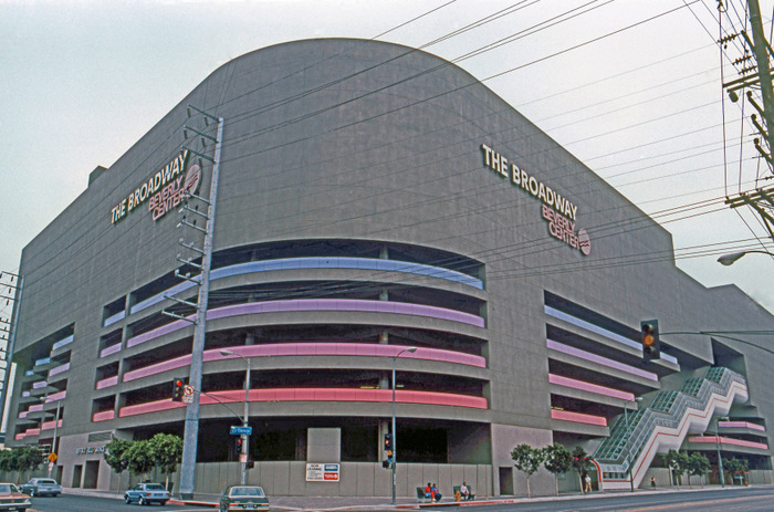
Can you start by telling us about Beverly Center in the ’80s? What inspired you to work at this mall?
I had just moved moved cross-country from Albany, NY to West Hollywood, and wanted to find work quickly. The Beverly Center was close to home, and offered more than I ever expected: glamour, celebrities, and the opportunity to sell some of the most creative merchandise of its time, much of which is highly sought after today. Designer clothing led to sales of home furnishings and accessories, propelling me to my next career incarnation as an interior decorator.
Upon arriving, I began working in an art gallery as a commissioned art sales rep. at The Gallery Connection, which sold works by notable 80’s favorites: Yuroz and Mark Kostabi. It’s hard making a living on just commission, so I took a sales associate position, selling men’s designer sportswear at Bullock’s. [Less Than Zero screen shot below from Radiator Heaven]
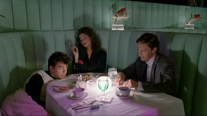
This was a time when everyone was still spending with reckless abandon and dressed like they stepped off the set of “Less than Zero”. Dressing the part was crucial, for dinner and night clubs like The Stock Exchange, Vertigo, and Park Plaza.
The Beverly Center was the perfect place for a young guy who wanted to be in the center of things. It’s perfectly central to West Hollywood, Beverly Hills, and Melrose Avenue. So many other awesome places all in the area. It really did spoil me, and moving there was the best thing I ever did. It changed my life. I think one word to describe design then, is IMPRACTICAL. [Beverly Center photo courtesy of Friends of San Diego Architecture]
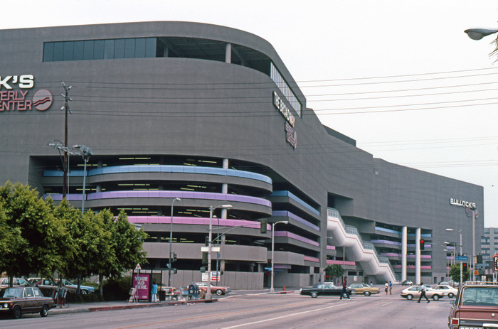
During my time at the legendary Bullock’s, it was common to assist celebrity clientele, like almost daily. The studios would send in many personal shoppers to buy tons of clothing for movies and TV shows. It was that time in the late ’80s where people were still throwing money around, it was fast-paced, exuberant, fun, and all about glamour and status. I can remember serving clients like Robert Downey, Jr., Sigourney Weaver, Barry Manilow, Rutger Hauer, Jody Foster, Belinda Carlisle, Keanu Reeves, Lynda Carter… [photo: Beverly Hills glamour via a Beverly Center ad, Robinson’s May department store, and Giorgio]
I was young and just wanted to have fun. I worked at Bullock’s for about 1 1/2 years, until the Macy’s takeover was in effect. From there, I took a job at British home furnishing retailer “Conran’s Habitat”. They sold a mix of high and low design. Trendy home furnishings. This store closed in the early-mid ’90s and became a Macy’s Men’s Store.
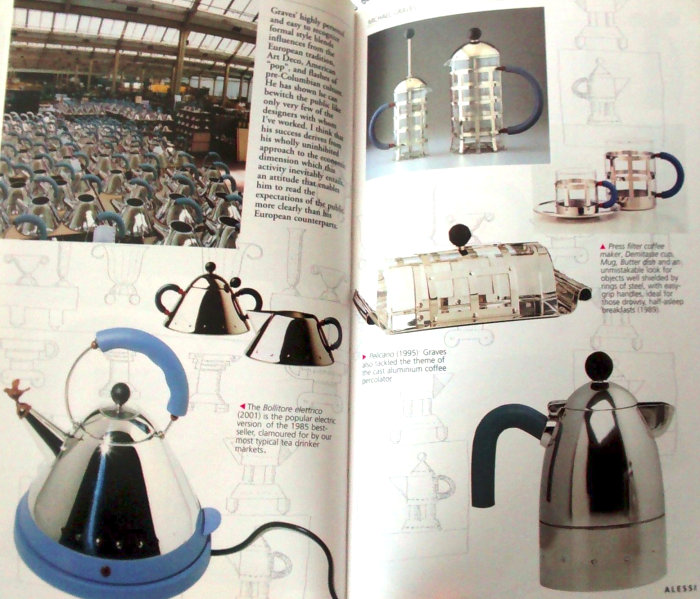
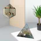
From there, I took another sales associate position in the Center, at “By Design”. This was a smaller store much like a MOMA / MOCA museum store. In this all-white store, they sold many amazing design items: Memphis (and inspired) vases, desks, tables, Alessi Collection, Alvar Alto vases, Artemide lighting (Tizio), Filofax leather accessories, Warhol, Hockney, and Sprouse prints, calendars, jewelry, pens. I remember it always being hot in the store, because of all the halogen lighting on display. Many music video and set designers would buy accessories here. [Alessi Collection highlights below, designed by Michael Graves, from The Dream Factory: Alessi since 1921 by Alberto Alessi]
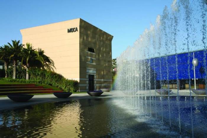
I went to work for Kneedler-Faucher showroom, in the Pacific Design Center, after By Design. At the PDC, there was a separate detached Richard Meier-inspired MOCA gallery, which featured an iconic exhibit and lecture by Richard Meier, Richard Sapper, Ettore Sotsass….at the time I didn’t know they would have the impact they did. Frank Gehry was also a major architect that did a lot of fun projects like the Santa Monica Place mall. [photos below via Pacific Design Center and MOCA]

Is there anything specific about the architecture and design of Beverly Center that stands out in your mind?
The mall at this point had many of those sunken seating areas shaped like diamonds, using black leather, silver trim, and brown and black granite. The central elevator was a dramatic jewelry box that looked out onto a larger sunken conversation pit lobby area.
[youtube id=”_ZBNQLVEO98″ align=”center” maxwidth=”700″]From what I recall, there were a lot of columns and squares, geometric shapes. Memphis-style archways with built in “can lights” featured in many boutiques. [next two photos of Aventura Mall’s Macy’s in North Miami, Florida, from The Best of Store Designs]
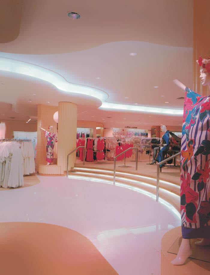
Large TVs were placed in wall cutouts and played videos of runway shows or music videos. Lots of white art studio display-style cubes were common everywhere, usually in a series of 3. There was a sense of zones or dimensions within the space. Many times a set of steps leading to a higher lofted area, with railings. LOTS of granite, marble, columns, chrome, brass accents.
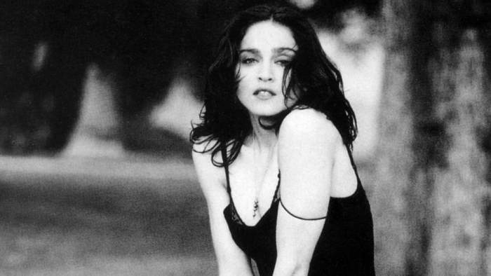
I remember the distinct lack of video cameras, and even when they installed the first one. I remember seeing that and how uncomfortable it made me. The presence of then-resident, Madonna, was also felt. There was a time that a lot of religious imagery was being used to complement, name or style, stores and other establishments (Trinity, Prey, The Abbey…) Think of that whole “Frida Khalo”, “Like a Prayer” era. It was not unusual to see her around town, jogging, on her bike, shopping, etc…I worked on a few projects that she was involved in: Truth or Dare movie premier fundraiser, Jean Paul Gaultier charity fashion show, AIDS Dance-a-Thon / Walk-a-Thons…. [Madonna photo from A.V. Club]
Also of note, from the top-floor windows of Beverly Center, you could see straight down La Ciengega Blvd up to the Esprit Store and the Hollywood Hills. Great Vantage point, indeed!
Did Bullock’s, By Design or Conran’s Habitat remodel/re-do the layout while you were working there? Regardless, were there special interior features in any of these stores that would interest ’80s design lovers?
There were no remodels of these stores when I worked there, they were perfected before my arrival. I remember a lot of white walls, like being in an art gallery. As you may recall, design morphed throughout the ’80s, and by that time, it had transitioned through the “pastel watercolor” phase and into the “High Tech” look–black & white, with chrome and maybe some red accents, and a LOT of that “concrete” look towards the end of the ’80s. [photo of Burdines in Gainesville, Florida via The Best of Store Designs]
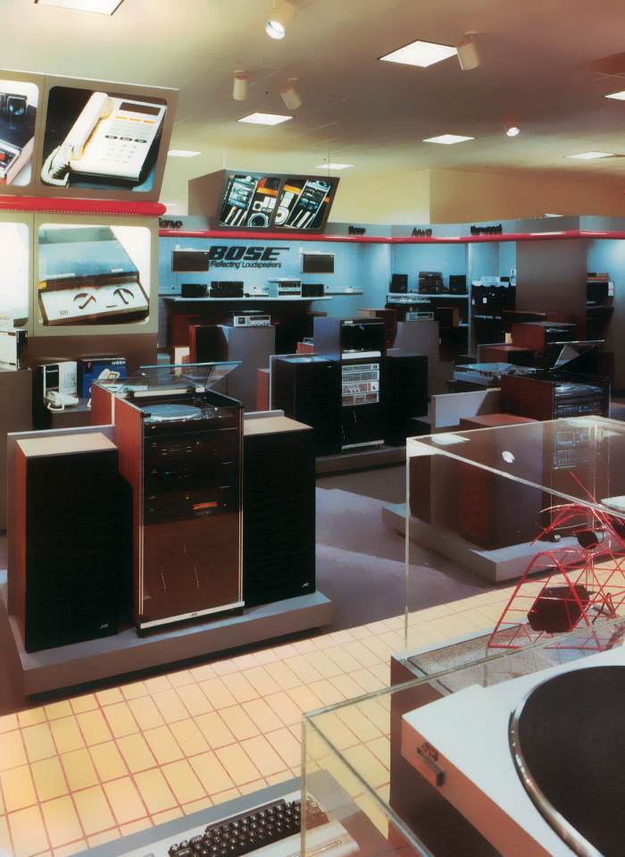
By then, that “Wall Street” loft/art gallery look took over. In the earlier years, retail and office building design favored using more friendly earth tones: beige/coral marble tiles and gold or brass trim with polished maple wood. Later we saw what I call the “Polo Ralph Lauren” years, when Reagan took office and everyone wanted to be rich or look like it. Lots of hunter greens, gold/brass, classic preppy accents, plaids, dark green marble tiles, brass, and darker wood.
Based on your experiences at these stores, what were some of the biggest retail design trends of the ’80s?
Some of the biggest retail design trends of the ’80s? The changes came in stages and kind of blended together. [photo of Bloomingdale’s in Miami from The Best of Store Designs]
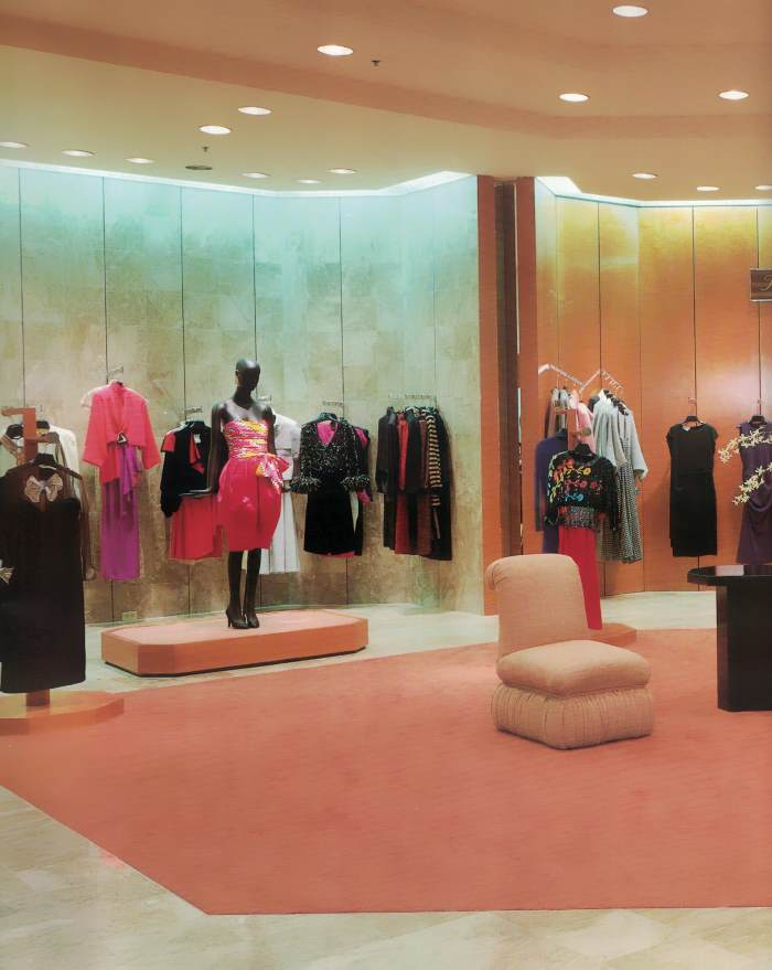
Early ’80s was geometric, but with humble materials: honey-colored polished wood, brick, stepped/lofted zones. The late-’70s “Studio 54” glam look crept into the ’80s with the mirrors, sleek geometric furniture, large grid windows, fountains, marble tiles, brass, and lots of glass “atrium” styling. Reagan’s ’80s recalled the Hollywood ’40s that both Ronny and Nancy hailed from. The earlier ’80s had more of a Ralph Lauren, Martha Stewart, Izod, LaCoste, Laura Ashely “old-money” look to it. This led to younger newly monied Yuppies demanding more innovative luxury products to consume. [photo of Dynasty’s Alexis Carrington (Joan Collins) from Fashion Gone Rogue]
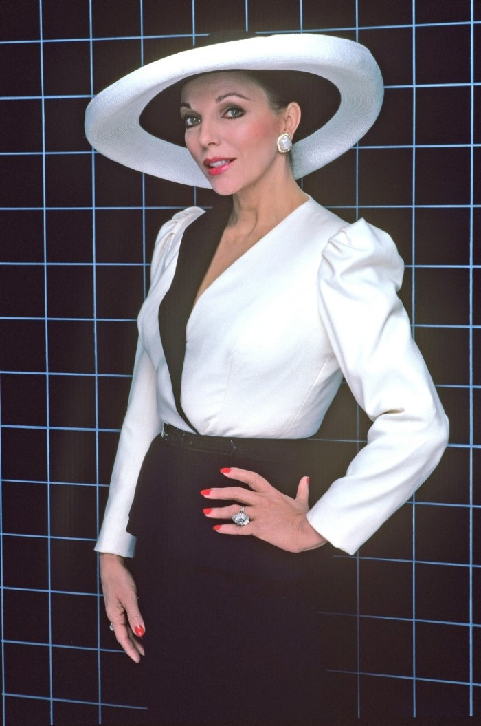
Dynasty emerged and ushered in that older Hollywood glamour that I think helped inform the biggest design trend of the 80’s, what I call ’80s Deco: a sleeker, newer, shinier version of the earlier Art Deco shapes. Think series of 3; simple, stepped features; gleaming metallic trims; bolder, crisper geometric shapes and shiny luxurious finishes. Accent lighting: wall sconces were seemingly everywhere, usually in chrome.
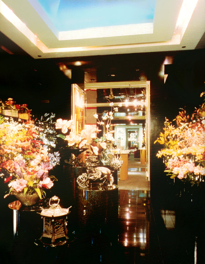
From here, the “Corporate Chic – ColbyCo/Trump Tower” look took center stage. It was all about power finishes and design that communicated wealth and power. Bold, confident, shiny geometric mirrored business buildings with jewel box elevators, columns, sconces, and glass grid atriums. LOTS of enormous floral arrangements were present everywhere! [photo of Robert Lloyd in Palm Desert, CA, from The Best of Store Designs]
Did you get to help with displaying merchandise/arranging vignettes? How do today’s retail displays compare with those of the 1980s?
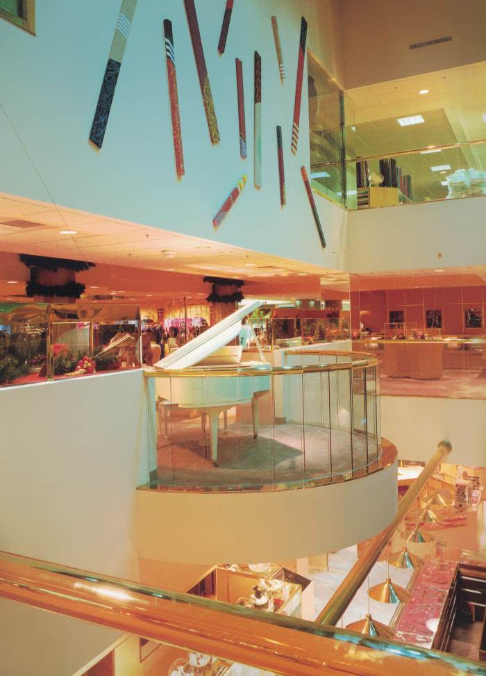
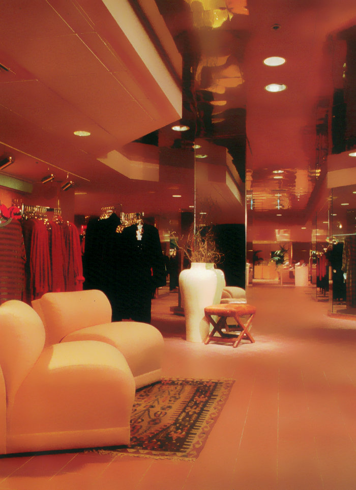
I did get to assist with dressing some of the mannequins, but more of the product vignettes. At Filene’s the Women’s area was done in coral and gold accents and glossy black Art Deco-shaped corner aisle vignettes, and the Men’s was beige and black with glossy black details. One difference now is that the lighting has changed dramatically. Back then, the lighting was darker, softer and more comfortable. Fluorescent overhead lighting, sconces and rows of can lights were used to highlight areas. NOW, stores are hyper-lit like supermarkets, with the used of LED. To me, it is uncomfortable. Older retailers used classical or uptempo jazz music to shop to or had actual piano players. It made for a classy experience. [next 2 photos of Coconut Grove, Florida’s Burdines, from The Best of Store Designs]
Shopping bags were premium glossy paper, with nice handles, boxes and tissue paper, and gift cards were the norm. Not plastic bags. The other big element that I have noticed is that the colors and design finishes that are used feel cold, sterile, and hard. Unlike the warmer earthier tones like coral, gold, green… These newer establishments look like over-lit, glass, steel, open boxes. I’ve noticed a lack of conversation areas to sit, relax, and linger. Perhaps they don’t want to encourage homeless people, but it communicates that you can’t linger.
Merchandise is no longer “zoned”, so you don’t get to change the mood when entering another area. It’s all just shoved out into a big open space. It all feels like they want you to “Get in, spend your money, and get out.” There is no sense that you want to linger or have a relaxed shopping experience. There are much fewer stores competing, so everything looks the same everywhere you go. Much less luxury and creativity. Corporations no longer take risks on the fanciful and different. They want to keep their margins and losses tight. Add to that the online options, less enthusiastic shoppers, less discretionary spending, and a public that no longer places value on dressing up.
Glamour is gone. It’s about convenience and being frugal. Lastly, many of these malls are being remodeled as open spaces without the enclosed mall format. This will not encourage people to spend money. The newer mall designs are not any better than what we grew up with. They degrade the experience in my opinion, and are a dying breed.
Are there specific 1980s design styles and features that interest you?
I love all of those ’80s styles. The Dynasty/late ’80s look is my favorite. [photo of Miami’s Bloomingdale’s from The Best of Store Designs]
Tell us about your favorite…
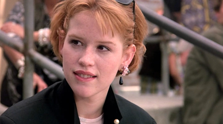
’80s movies: Anything John Hughes: Breakfast Club, Pretty in Pink…Wall Street, Terminator, Aliens, Big Business, I could go on…
’80s television shows: Knots Landing and Dynasty, and all those shiny TV movies/mini-series: Bare Essence, Paper Dolls, Hollywood Wives…
’80s musicians: Madonna, Duran Duran, Thompson Twins, Flock of Seagulls, Human League, INXS, Depeche Mode, U2, Prince, a million more…
Can you share a favorite ’80s mall memory or two?
Running right into Lynda Carter, who was coming around the corner…before I sold her some clothing. Chatting with Keanu Reeves for a half hour about random stuff. Late one night Robert Downey Jr. came in for some last-minute shopping and shocked me when I realized who he was. Talking to Jodie Foster about her latest movie…
Thank you for sharing your knowledge of ’80s interiors and retail culture with us, David!





It’s fantastic to hear these kinds of oral histories about this kind of thing.
When I was a kid, we lived in Mesquite and we had the Town East Mall, which was 80’s deco. I’m sure they’ve remodelled it since, but it still has the neon-lit skylight atrium. I remember thinking it looked like my grandmother’s bottle of Passion, with the vintage purple jewel cap. Or like a very fancy handbroom.
I read somewhere that they haven’t built any indoor malls since ’06 and it’s all outdoor promenades now. Sounds cool in theory, but as a fellow Texan, I’ve not wholly enjoyed the experience of it. When I lived in Denton, we had the Firewheel Town Center, which has very cute one-way roads with angled parking along them that criss-cross through the mall so you have to poke along through all the pedestrian traffic, but little other parking to speak of so you’d be poking along for half-an hour before a spot freed up.
Here in San Antonio where I live now, we have the Shops at La Cantera, which has ample outdoor parking and no traffic within the mall itself, but is way unfun to get to when it’s raining and you’re late for a hair appointment. In either case, it’s Texas so it’s always a million degrees outside so ambling around outside after a trip to Sephora where I bought something expensive and likely heat-sensitive? Nah, man.
My time in Dallas, TX, was brief, but I’m wondering if there are any cool 80’s remnants still around. Obviously, Dallas was a very 80’s city and there have to be more than a few things to explore.
I spent 20 years living in the Los Angeles area, and it’s hard for me to return, these days, as I see the ghosts of buildings and businesses past at every turn. I am constantly comparing “what is” to “what was”, and it leaves me sad and frustrated that so much of my/our history is being erased. I see this happening in other metropolitan areas as well. What we had may be dated, but it was, and is, still perfect.
Man, half of Dallas’ skyline is remnants of the 80’s. It’s one of my favorite things about Dallas, all the neon lighting and 80’s deco. And when they build new things, I feel, they tend to be more adventurous with the architecture in order to match the existing buildings. For instance, both the W Hotel and the Cirque apartment building are new-ish skyscrapers, but they both feature the neon lighting and geometric architecture of the older 80’s buildings, with some modern elements of course.
The lighting in particular is important for a new Dallas building. I sometimes lurk in a forum about Dallas’s urban development and lighting is something people always get excited about. As one poster put it, it’s something we can all enjoy, regardless of what the building’s function turns out to be.
Anyway, because those elements of the skyline are so intrinsic to Dallas’ iconography, tacky though some might think, we build with and around it instead of tearing it down and acting like it didn’t happen. Everyone saw us in “Dallas”; they know what we looked like.
I can’t speak much on interiors, whether there’s anything that hasn’t been renovated, but I do know that Fountain Place’s fountains are still more or less exactly as they were 30 year’s ago.
That’s it–I’m taking a road trip to Dallas in the near future! I’m delighted to hear that there is genuine interest in matching the existing buildings and being adventurous. I wish more cities would take an interest in honoring existing architecture and celebrating key features!
I wish I could see an 80s mall interior. I wish an old 80s mall designer would design condos or apartments or something. A gym, even. And make it look actually from the era.
I agree with David Zakrzewski about contemporary things being only utilitarian. However, I think part of it is that theft has increased so much, and another part is that — I get the idea from having worked in other fields with clients is that they want everything slapped together as quickly as possible and they want everything to look like what someone else has. I’ve been ridiculed by clients for presenting different or unique designs (that were not offensive and still designed competently). (So why didn’t they just use a template? Why did they even bother hiring me?) It’s like you’re insulting them. I quit my design field that I spent a lot of work being educated in because of the clients. I could have filled out templates without bothering to be educated.
There is so much conformity in general in contemporary society, so much insult against something different. Yet they praise themselves on being tolerant. They’re not. Its like people work to try to make themselves fit into stereotypes. All this goes way beyong “trends.” A lot of people say contemporary times are “angrier” than previous times – I think that has a lot to do with. Arrogance, wanting to insult others to prove superiority (even though it doesn’t), being angry about everything seems to make people want to conform – maybe to be inoffensive so they don’t take the brunt of anger? I don’t know. I would go with it any way because by being different, especially visually, you catch people’s (consumer’s) eye. Standing out is important in design. Clients want everything to be the same. “Make it look like this.” And they mean it literally – absolutely no variation.
I’ve had clients that wanted me to rip off things. Break copyright and plagurize them – just steal them. I have to explain is not legal – then they get really frustrated at me.
It is thoughtless. Like I said, part of the problem is just people wanting to slap something together as quickly as possible, with no thought behind it.
My great-grandmother left Ukraine after the Soviety revolution. A lot of ancestors that never left because they were killed. I’ve seen 80s entertainment where there is a former Soviet coming to enjoy the freedom and creativity – the “decadence” – of America. My great-grandmother said that during the Revolution, everyone was ultra-conformist. There was no more individuality. And of course everything had to be “functional.” It’s like contemporary America suffers more from the Soviet mentallity and needs to be introduced to a unique and creative society, where people want to be individuals. … A society that thinks more and that doesn’t steal, that isn’t so angry.
Actually, you may be pleased to know that three years ago, the argon lighting on Bank of America Plaza was replaced with LED tubes that now permit it to glow in different colors. I think they still usually have them set to green though.
A similar upgrade was performed on Reunion Tower, so that the previously white bulbs on the sphere can be set to different colors too. I think they still usually have those set to white as is tradition, but they had it set to cycle rainbow colors when same-sex marriage was legalized. They also do special colors for holidays now. Green for St. Patrick’s Day. Red, white, and blue for the 4th of July. That sort of thing.
Back in February, all the buildings that had the option to do so, including BoA Plaza and Reunion Tower, were lit in purple. The official reasoning is that it was to showcase Dallas as a city of innovation, but I think that’s just a nice way of saying that we’ve invested in the ability to change the colors of the lights, so we’re going to do it because we can.
Hello from another Texan! I haven’t been to Dallas in a few years, but I’d love to go back soon…and hunt for fabulous ’80s features. I agree that the outdoor mall phenomenon is tricky in climates like Texas, where we only get temperate weather for about half the year. There are aspects of outdoor shopping areas that I do love–the landscaping, the way they get people “out”, the way they’re trying to re-establish a “city center” feel. But I think there’s a great need for more indoor spaces where people can just be–spend time together, walk around, regardless of what the weather is doing! I wish someone would build a spectacular new indoor mall…
Yeah, no, I like walking around outside in theory too. It’s just the reality of it is you start getting all sweaty and gross, which makes trying on clothes inconsiderate. IF I buy a fancy new lipstick, it’s sweating too when I take it out of the box. Last time we went, we were burning up so we got ice cream, but then we couldn’t find anywhere to sit. All the shaded seating was packed and the seats out in the sun would burn your thighs. And these were wooden benches too, not metal.
For the most part, though, La Cantera is the rich people’s mall and I only go up there if I’m getting my hair cut or if I want to go to Z Gallerie. Otherwise, I go to the North Star Mall, which is indoors, has nice shady garage parking, and most of the stores I’d want to visit.
I enjoy North Star Mall and La Cantera for different reasons, and I think they both have their merits. I haven’t been to either in a few years, but I’d love to revisit North Star Mall soon!
It’s refreshing to read an interview with someone who really knows what he’s talking about and who is thinking. Don’t see much that online – it’s like it’s all a sales pitch by a self-titled “guru” who read confidence self-help books about how they are winners, frought with buzz words like “game changer” and “empowerment”… This guy actually experienced something, was observant, and was able to process it, think about it and write about it. — Did the whole world used to function like that back in the olden days?
It’s also refreshing to read anything online that isn’t just AI resorted information copied from other websites…
Although, there is a typographical error: “I was young and just wanted to have fun.”
“Fun” should be written “fu-un.”
That’s all he really wa-a-a-anted, some fu-u-u-un. When the working day was on, he just wanted some fu-un.