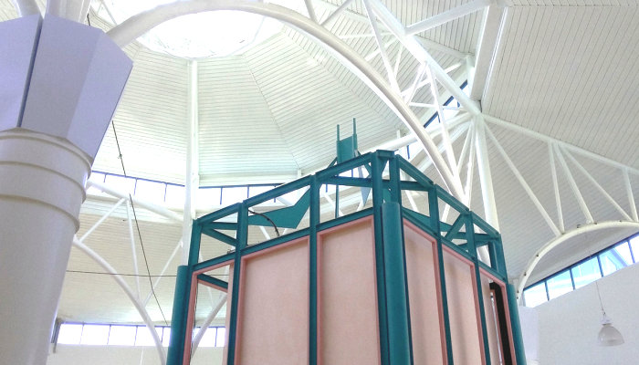
In the ’80s, architectural features such as columns, arches and structural beams were true focal points. Not only were they geometrically interesting, they were often painted candy colors to make a big impact. In today’s post, I’ve rounded up some of my very favorite spaces, some of them residential and others commercial. There just might be a mall department store (or three) involved…. [photo above from Tumblr Manila Automat]
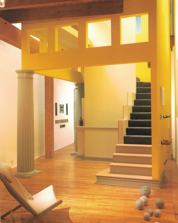
An ’80s Chicago loft renovation, complete with Doric columns and a yellow house-like structure with square openings [featured in The International Book of Lofts]:
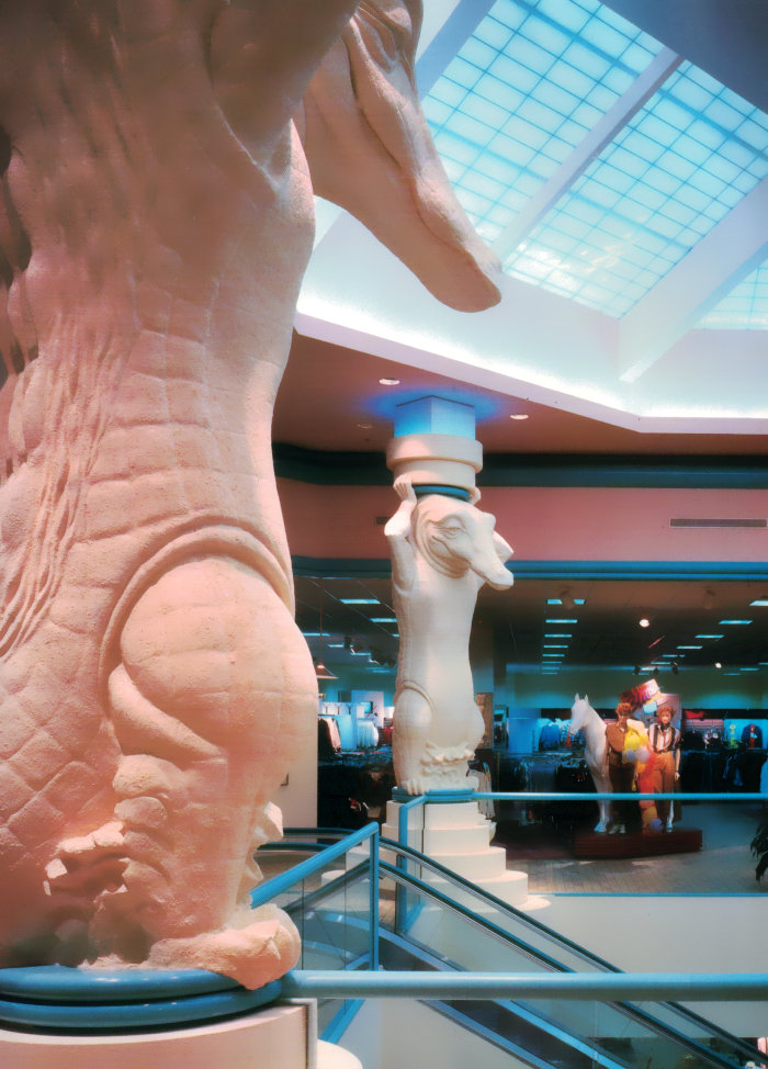
Alligator columns at Burdines department store in Gainesville, Florida, designed by Walker/Group Inc. [featured in The Best of Store Designs]:
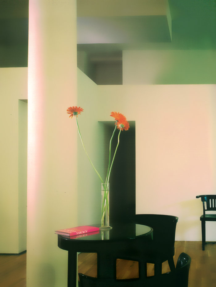
A column and geometric ceiling in a 1980s New York loft [featured in The International Book of Lofts]:
The “mini mall”-within-a-store concept of department store Carson, Pirie and Scott [featured in The Best of Store Designs]:
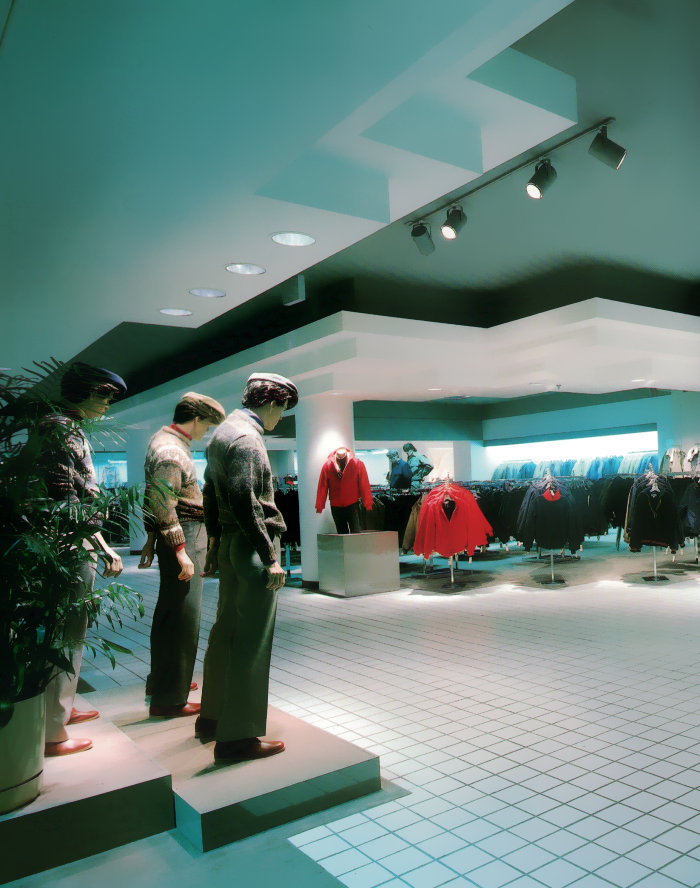
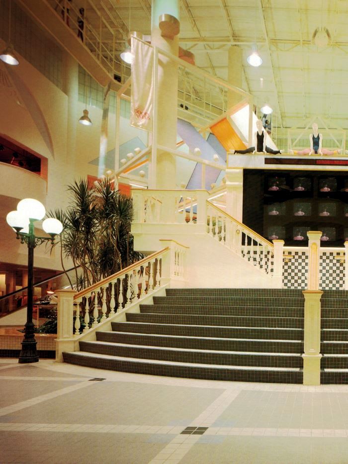
The ’80s central plaza of department store Parisian in Huntsville, Alabama, complete with hanging fabric and classic touches [featured in The Best of Store Designs]:
Does today’s post inspire you to paint a wall or door frame a pastel color? Or suspend strips of hanging fabric from the ceiling? I know I’m getting plenty of design inspiration! Cheers to new creative projects… XOXO, Kate










Your site is amazing, I am sad I didn’t find it before! It’s a shame that so many of these retro malls are disappearing but I’m really glad you are also a fan.
Hi Robbie! Thanks for your comment! I agree with you about the malls. I’m just glad people are photographing them, even as they’re deteriorating. It’s a way we can “archive” them! Thanks again for getting in touch.