
Today we revel in the Memphis-meets-Deco world of the 1991 film Soapdish, the story of a soap opera leading lady (played by Sally Field) whose real life drama rivals the absurd plot of her daytime drama! Not only is this film smart, hilarious and well-written, it features over-the-top set design that is a glorious mishmash of retro motifs. It’s elegant vintage meets postmodern. It’s tropical meets swanky. Ready for a closer look?…
The Palette
First we’ve gotta name drop, OK?! The Soapdish design dream team included many talented individuals, such as production designer Eugenio Zanetti, art director Jim Dultz and set decorator Lee Poll.
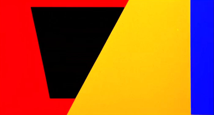
A striking palette of red, yellow and blue (with dashes of black and bits of magenta) is established by the film’s opening credits. Geometric forms and glam illustrations help set the movie’s bold, playful tone.
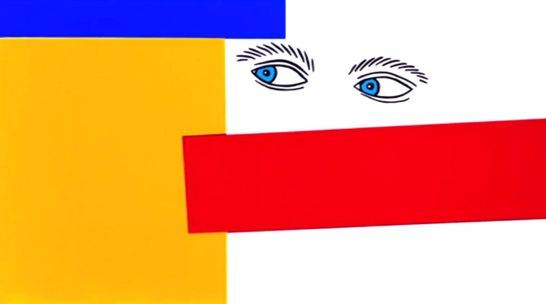
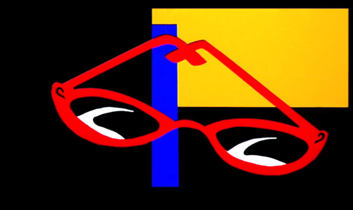
Stay tuned for Mirror80’s next post, which will present a party concept based on this film. The opening credits were instrumental in our party palette, a sneak peek of which is shown below…

The Glamour
Soapdish is filled with chic glamour. Here’s a shot of the film’s fictional soap opera title, on display in the opening scenes of the film, which take place at the Daytime Television Awards.
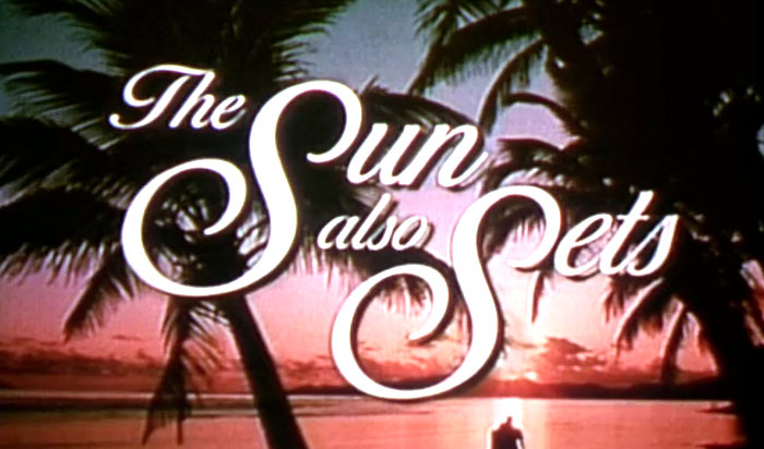
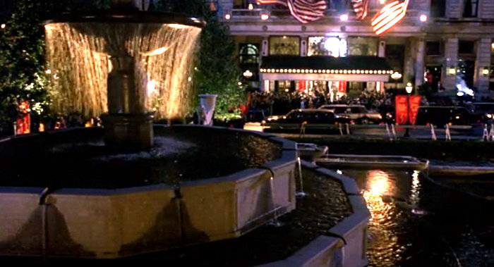
The awards show is at New York’s Plaza Hotel. Did we mention that our Mirror80 Soapdish-inspired party concept is an awards show viewing party? Screen shots like this one inspired us:
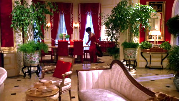
Here’s Sally Field’s apartment, which features red paint and upholstery, gold trim and molding, a black and white tiled floor, and LOTS of potted plants. This shot doesn’t do the space justice. Watch this film and daydream about living in a decadent penthouse one day…
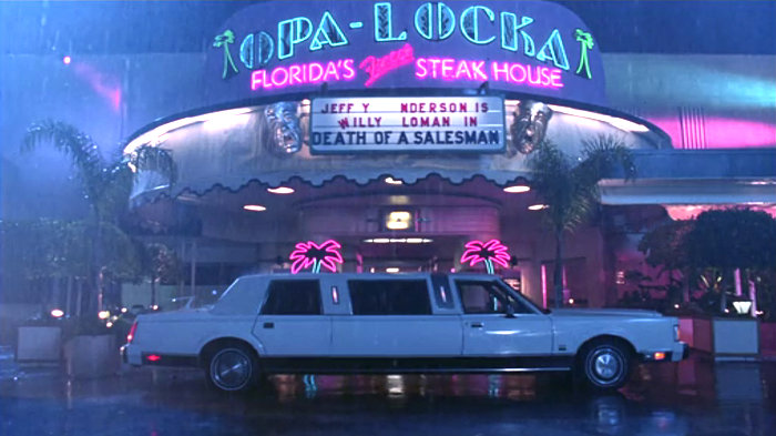
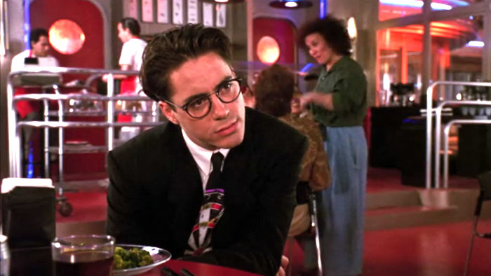
Kevin Kline’s character is performing at a Deco-style dinner theater until he’s invited to re-join the cast of the soap. Check out that neon lighting…and those palms!
The Deco-Memphis Flair
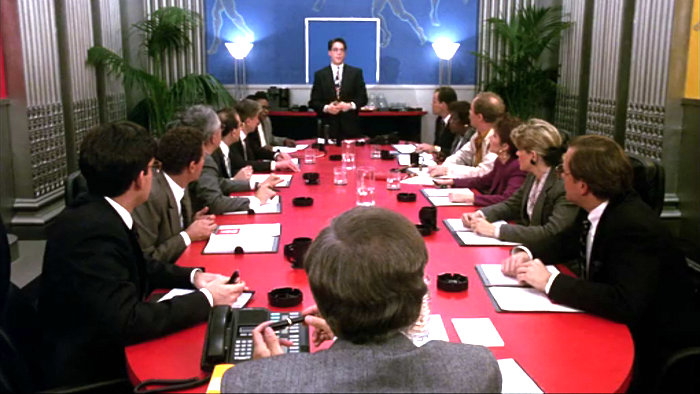
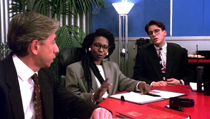
We now spotlight the offices of the show’s fictional soap, The Sun Also Sets. And oh my goodness, you won’t believe the tropical-Deco-Memphis details that went into the design. Let’s start with the conference room, where pivotal scenes take place! Recognize the red, yellow, blue and black palette?
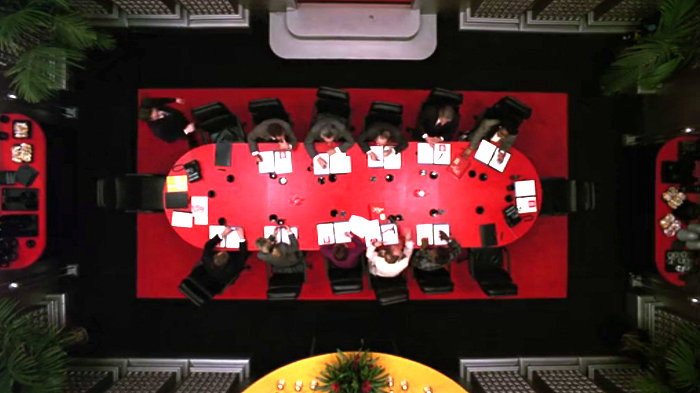
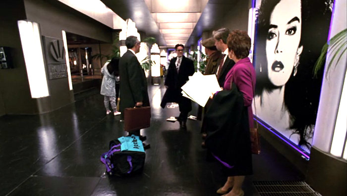
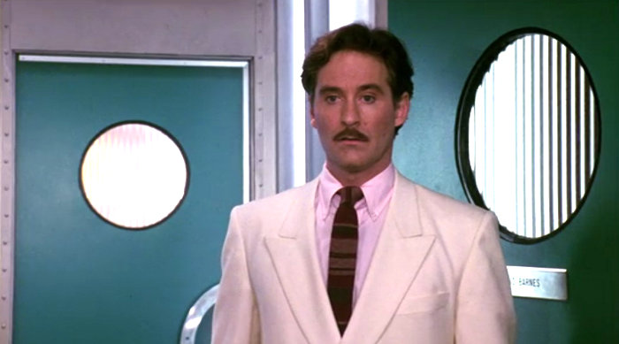
Deco flair can also be seen throughout the hallways, which feature lots of metal, curves, palms, porthole-style windows and neon lighting:
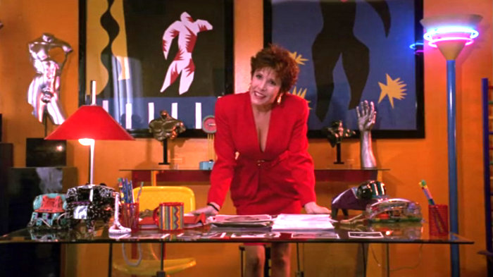
And then there’s the office of the soap opera’s casting director Betsy Faye Sharon, played by Carrie Fisher. There’s actual Memphis furniture in this space, plus plenty of Memphis knock-offs (like the lamp with the neon bands, featured in our interview with ’80s design aficionado Skylar Strickland). Pretty crazy space, right?!
This film demands to be seen, not only because of the amazing design, but for the witty dialogue and laugh-out-loud humor. And while it was filmed in the early ’90s, it’s filled with ’80s details.
As mentioned, we’ll be sharing our Soapdish-inspired awards show party concept this Wednesday, just in time for the Emmys. Until then, hope your week’s a colorful one!






Ah, love love love this post. It’s so original and creative, breaking down and reviewing what is an absolute must see film. Keep up the great work. I’ve just jumped onto your email list to keep abreast.
Adam
Thank you so much, Adam! I appreciate your kind words, and the fact that you’re following the blog through the email list. So glad you’re as much a fan of this movie as I am. Cheers!