I’m completely addicted to 1980s interior design Tumblrs. Are you with me here? Actually, it’s not just the Tumblrs. It’s the Pinterest boards as well. And the design books from the Decade of Decadence, such as The Decorating Book by Mary Gilliatt. Since Mirror80 is dedicated to bringing you the best in ’80s-meets-modern design, you can bet that I’ll be featuring a slew of 1980s interiors, grouping them by theme so you can see how certain motifs and trends played out back in the day. Today’s featured trend: stripes!
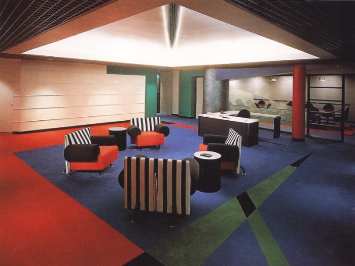
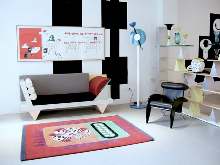
At the top of this post, we see an image from Tumblr deargenekelly, and it’s bathed in Memphis-Milano design. In fact, black and white stripes were a hugely popular Memphis motif–don’t they pair well with primary colors and other brights?! Above is an image from Zonkout (curated by my friends Chad and Clare). This retro-fabulous interior is actually the Apple Computer office, designed by Phyllis Martin-Vegue:
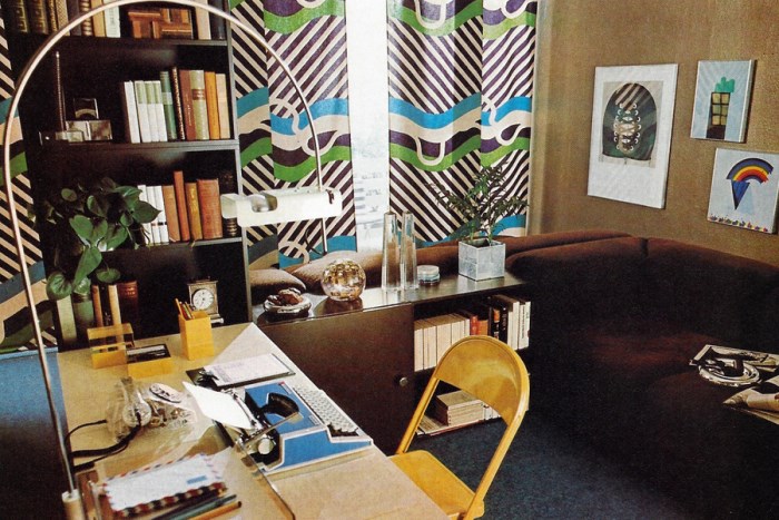
Next we have an image from DRY DOCK SHOP. Remember our recent post on this treasure trove of ’70s and ’80s interiors?!!! You won’t believe how comprehensive this Tumblr is. In fact, most of their images are very well sourced, including the interior above, which comes from The Complete Book of Decorating by Corinne Benicka. Love the striped pattern on those curtains! And I’m ready to paint some furniture after seeing the stripes below in this Brian Murphy interior from 1983, highlighted by the always compelling Aqqindex:
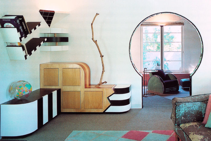
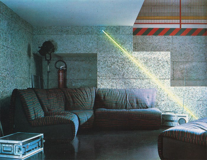
We end with another interior featured at Aqqindex. This time the stripes aren’t black and white, and they’re diagonally oriented. We’re seeing a LOT of diagonal stripes this season, and they definitely have a retro flavor. I’m fairly certain that this is an interior from the past (rather than the present), but there’s something so fresh about it! The sofa is designed by Annie Hieronimus for Roset:
Today’s design lesson: stripes + primary colors + black and white = design perfection! Need more proof? Check out the Tumblr links scattered throughout today’s post for even more ’80s design inspiration…




Wow I really love that second picture with the blue and red carpet!