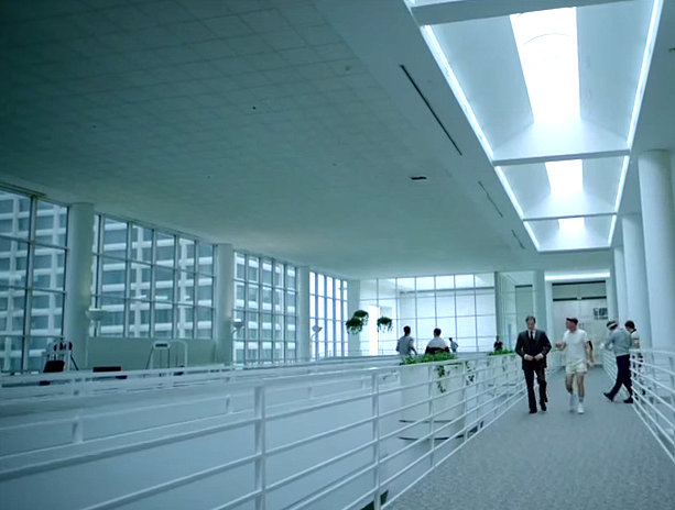
’80s interior design is a true highlight of AMC’s new series Halt and Catch Fire
If you’ve been reading Mirror80 over the past couple of weeks, you’ve probably figured out that I’m a bit smitten with AMC’s new ’80s tech series Halt and Catch Fire. Kate here, and today I’m sharing more design inspiration from the show. Last week we revealed our top reasons to watch, and this week I’m zoning in on the way series creators have meticulously re-made the 1980s, from the interiors to the fashion!
When Chris and I came up with this idea for the show, we really honed in on this idea of a contemporary period show, where there was some stuff in the ’80s that could drop right into today and you wouldn’t even notice, and yet there’s some stuff that you look at and go, “there’s no way we’re ever going back.”
–Christopher Cantwell, Co-Executive Producer and Co-Creator, Halt and Catch Fire
Let’s start with the video that gives us a behind-the-scenes look at the show, set in the early days of the PC revolution. It’s (appropriately) titled “Re-Making the ’80s: Halt and Catch Fire”…
This video blew my mind. As I watched, it hit me…after years and years of waiting, it’s finally here: a television show about the ’80s that doesn’t fall into the trap of endless clichés. A show that celebrates ’70s-meets-’80s interior design. Will people get together for viewing parties, Mad Men-style? I’m already planning a Halt and Catch Fire viewing party for our next Retro Foodie post!
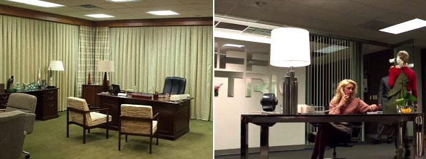
Old meets new in the offices of Halt and Catch Fire
The visual kind of style of the show is to…bring the analog and the digital together visually, and we thought the best way to do it was to use warm tones and browns for the analog world and use crisp grays and blues for the office world.
–Nelson Cragg, Cinematographer, Halt and Catch Fire
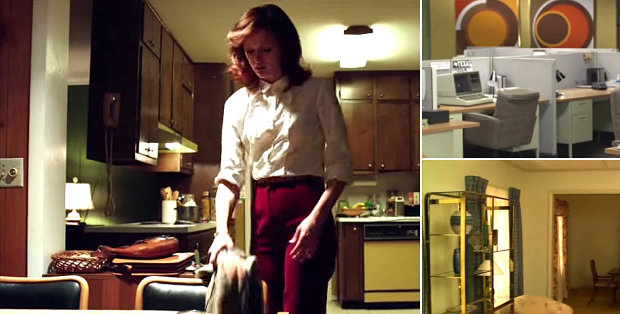
’70s interior design meets ’80s interior design
The above quote tells us a lot about the design philosophy of the series. The next time you watch, look for warm tones in the home of engineer Gordon Clark (shown in kitchen and living rooms above). Then look for steely gray hues in the office of Cardiff Electric (shown both above and below). And pay attention to the general level of radness revealed through detailed set design, from the geometric art to the touches of 1970s decor! Because most of us who grew up in the ’80s didn’t live in houses filled with of-the-moment furniture. It took awhile for the ’70s to leave the building, folks!
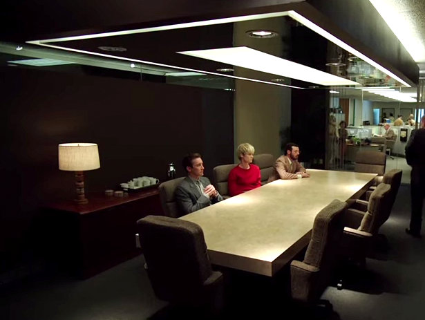
It’s a sleek ’80s corporate world…
Remember that wood paneling? Somehow it looks more stylish than out of date in the home of Gordon Clark, thanks to unforgettable wall art and retro-fabulous brass lighting:
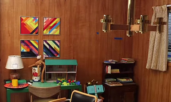
The ’70s meet the ’80s in an interior from Halt and Catch Fire
And for all of you who are currently obsessed with shopping mall design from the 1980s, there’s some retail-inspired goodness here, from the globular lighting to the vaulted glass ceilings:
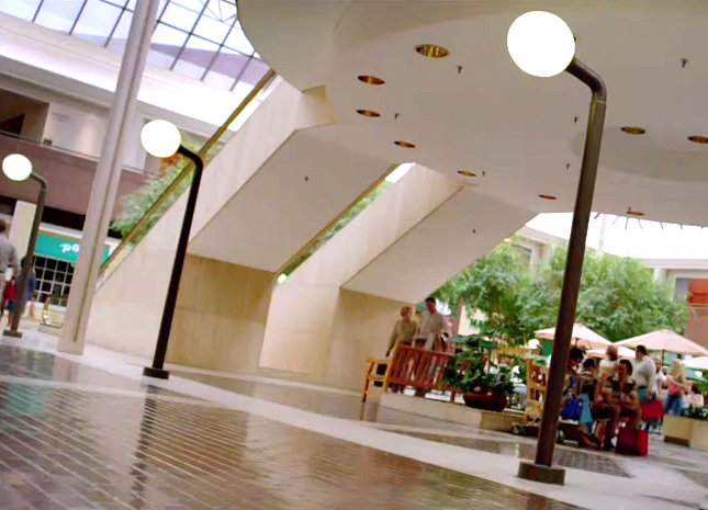
’80s mall design at its finest in an episode of Halt and Catch Fire
This mall is the scene of programmer Cameron Howe’s shopping trip, in which she attempts to purchase more appropriate office attire. While actress Mackenzie Davis can pull off any look (including puffed sleeves), her character Cameron is less than thrilled with the mall’s selection of corporate wear. Looks like it’s back to tank tops and camo pants!
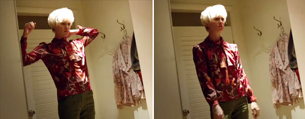
Mackenzie Davis as Cameron Howe in Halt and Catch Fire
I hope today’s post gave you many more reasons to watch this intelligent series that shines the spotlight on 1980s design…
Halt and Catch Fire airs Sunday nights at 10/9c on AMC.










THEE most authentic representation of 1983 that I have ever seen. My favorite scenes are at Gordon & Donna’s house. Can’t get enough. I love this show. Have you seen Virgin Suicides by Sofia Coppola? Another great example of a moment in time captured on film, so authentic.
Thanks so much for your comment, Nico! Like you, I love the scenes at Gordon and Donna’s. I’m so glad Halt and Catch Fire was renewed, and I’m counting down the days until the first episode of the new season. Would you believe I saw The Virgin Suicides for the first time last month? And LOVED it! It inspired this Pinterest board, which reflects the modern-day re-interpretation of ’70s style:
https://www.pinterest.com/mirror80/1970s-style/
Thanks again for getting in touch!
Hi Kate. Thank you for the article and links. Do you have any idea if the 4 multi coloured square panel pieces of art in Gordons living room are custom made for the show or are by a specific artist? Since this show appeared on amazon prime I’ve been catching up very quickly. Music and style are amazing.
Hi John! Thanks for your comment and question. The four panels you mention are definitely favorites of mine when it comes to Halt and Catch Fire artwork. I’m actually not sure if they are retro or custom-made for the show. I interviewed Lance Totten, the set decorator, and he at one point did say that they use a combination of older pieces and new pieces painted in the style of ’80s art. I’m sorry I can’t be more help!