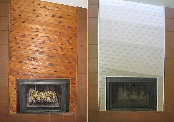
An ’80s fireplace makeover!
Hi Everyone! This past weekend I moved to a new place, and boy am I exhausted! But I’m excited to share the results of a DIY project my hubby and I embarked on–a project involving a slanted wooden fireplace. For those of you who weighed in on our living room design dilemma, I thank you for your comments. I definitely used your feedback, which included an idea for incorporating more than one color, as well as the suggestion of purchasing glossy paint. As you can see above (“Before” pic on the left; “After” on the right), the result is a subtle gradient effect that plays up the other warm tones of the room…
I’ll start by saying that I know the ombre trend is anything but new. However, I’ve always been drawn to color gradients in ’70s and ’80s tones. And the color palette I went with reminds me of a retro eye shadow palette. Also, the inclusion of five subtle colors was a great way to update the space and work with the other brown tones of the room, all the while calling attention to the diagonal lines of the fireplace. I would have LOVED to have left the wood alone. But with brown tile surrounding the fireplace and brown wood on the floor, it just wasn’t possible. We needed this feature to stand out!
Fun fact: This was not supposed to be a DIY project. We were very pressed for time during this move, and we initially had painters cover the fireplace with three colors. But through no fault of their own (hey–we picked the paint), the colors were way too subtle. So that’s when I took things into my own hands and decided to add two darker shades and have the segments of color get smaller from bottom to top. I used painter’s tape to ensure that the lines were smooth, and I painted two segments at a time (not adjacent to one another) to make sure that everything stayed neat and tidy.
It would have been fun to go crazy with other 1980s colors on the fireplace, but keep in mind that I share this space with another person. One who loves ’80s design but isn’t quite the retro fanatic that I am! The results represent something we can both enjoy–and something that goes with the stuff we already have. Thanks again for your feedback, and I can’t wait to share a few pics of the rest of the place with you (including the ’80s-style kitchen that we left as-is)!












What a great idea with the ombre coloring! It looks great, love it!
Thanks so much! I was happy that it ended up coming together at the last minute ; – )
What an awesome makeover! I like the monochromatic choice of neutrals and the weight that the darkest shade gives to the centerpiece. I would not have made the connection between the pallet and eyeshadow, but you’re right. Apparently, the ad people at Maybelline agreed. Check out the wall behind Lynda Carter in this retro-ad.
http://www.youtube.com/watch?v=iBXcp2feeFk
Wow–what a great ad! Thanks so much for sharing this! It’s the perfect choice, especially since I was a huge Lynda Carter fan as a kid. : – ) Thanks also for your kind words about the fireplace!
It looks great!! Can’t wait to see the rest of the place – good luck!
Thank you! We’re getting settled slowly but surely. I’ll do another feature in a few weeks with some better pics!
I know it sounds cliche but…… It’s amazing what a little paint will do. That’s a very effective treatment. Sometime it’s best to just embrace those old design elements and work with them. You toned down the 80’s just enough to make it work as a “neo-80’s” element. Smart!
Thank you for your kind words, Jonathan! I went back and forth with this fireplace feature, and it took one botched attempt to clarify what needed to be done. Happy accidents, right? ; – ) Thanks again for your comment!