
Today we’re celebrating ’80s color palettes…using ’80s visuals! In fact, the images featured in this post come from retro design books. Like the Deco-style palette of black and pastels above, expect color combinations that may have once been considered outdated, yet are now drawing a new wave of fans. From graphic design flourishes to ’80s ads, these photos and illustrations showcase a range of color palette possibilities. Which one speaks to you? If you’re working on a design project, this just might be your lucky day! [image above from The Best of Store Designs, 1986]
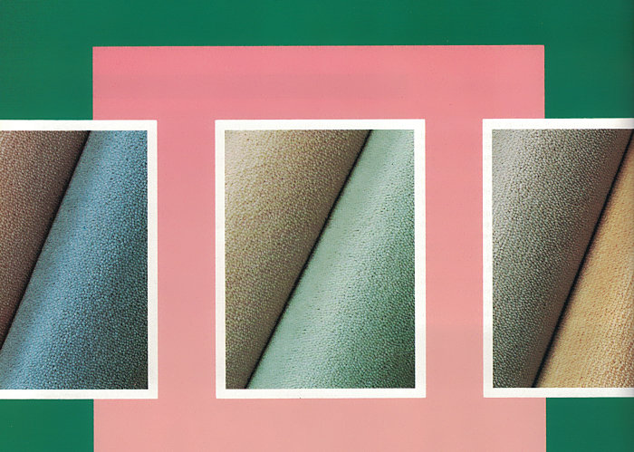
Combine brights with neutrals. Teal and peachy-pink are a welcome duo, especially when tempered with shades of beige or gray, plus a dose of more subdued colors like mint. [excerpt from a 1986 Invicta wool carpet ad via the International Collection of Interior Design]
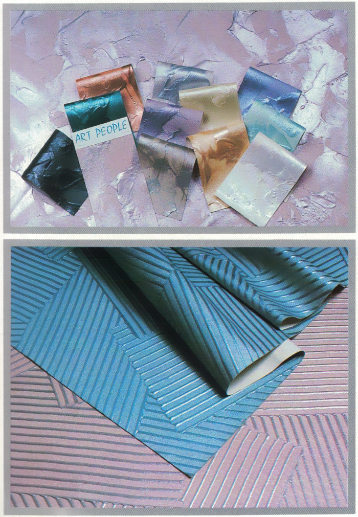
Mix pastels with richer hues. Lavender and rose come to life when contrasted with shades such as rust, smoky blue and peacock blue. A little bit of iridescence never hurts, either. [textured wall covering photos from the International Collection of Interior Design]
Keep it in the same color family. You can also celebrate pastels by grouping hues in the same color family, including a rich shade or two. For example, below we see light berry tones set against a backdrop of saturated blue. [illustration from The Best of Store Designs, 1986]

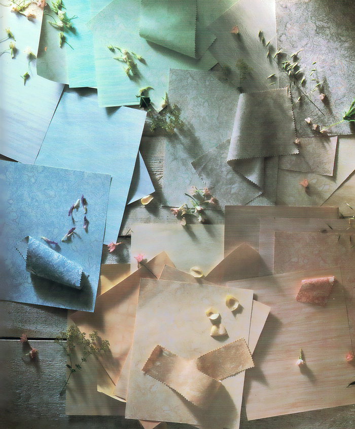
Go light and breezy. Then again, it never hurts to keep things light. Soft hues combine for a dreamy effect in the petal-clad image below. [fabric and wall covering photo from the International Collection of Interior Design]
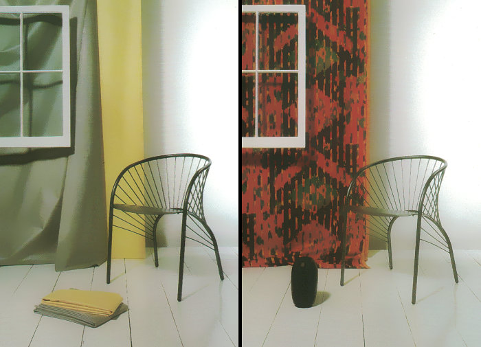
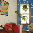
Combine black with primary colors. Red and yellow are a great place to start, especially when providing a backdrop for sleek black furniture! [photo from The Mary Gilliatt Book of Color]
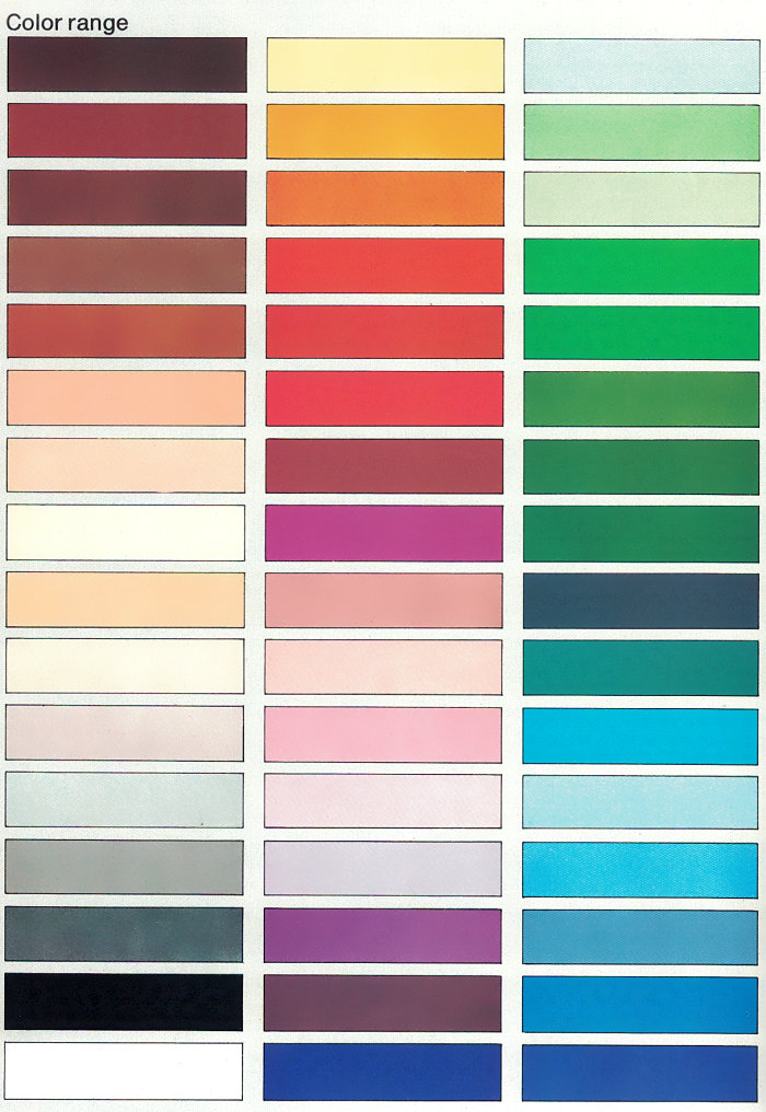
Consider all the possibilities. In fact, you might even be tempted to frame a retro illustration that features a gradient-like display of colors. [image from The Decorating Book by Mary Gilliatt]
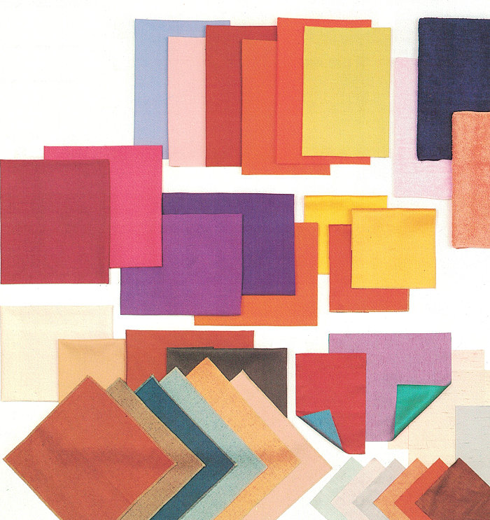
Mix brights with lights. When going for a big colorful statement, don’t hesitate to mix really bright colors (such as hot pink and fiery orange) with softer hues (such as lavender and blush). You might be surprised by the way it all comes together! [photo from The Decorating Book by Mary Gilliatt]
I hope today’s post gave you some retro-fabulous color palette ideas! XOXO, Kate






Leave a Reply