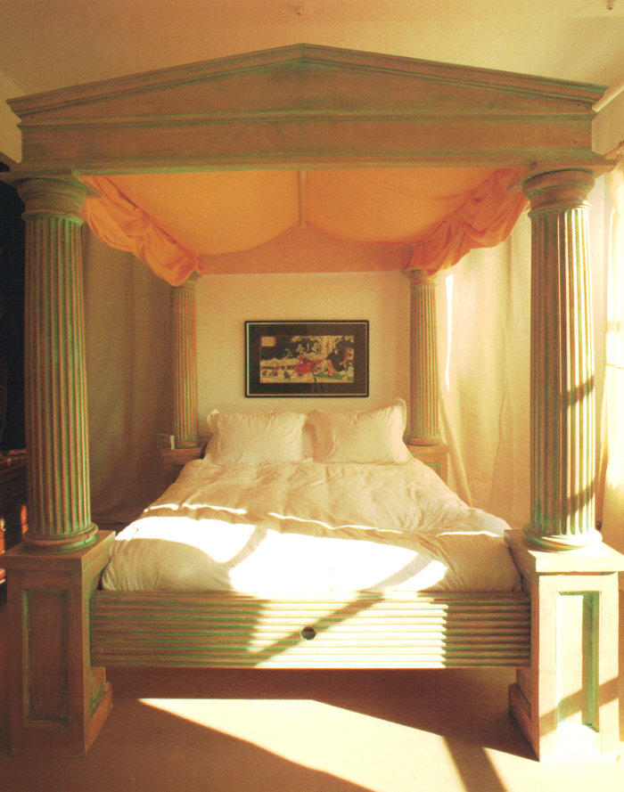
Columns are always in style–after all, they provide a key architectural function. But in the ’80s, they were extra fabulous! So fabulous they took on some decorative properites. From plaster column side tables to the four-columned bed below, the proof is in the pillar! Read on as we take a look at the design magic of ’80s columns, from the minimalist to the totally decked out… [photo above from The International Book of Lofts, 1986]
Pure and Simple
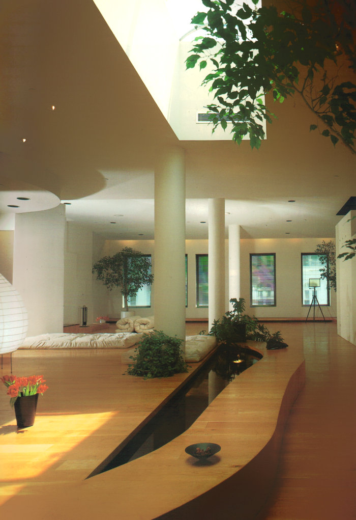
Sometimes keeping it simple lets the architectural features of a space truly stand out. In the ’80s, loft living was a way of life, especially in cities like New York. Support structures such as columns were abundant. The space below is filled with interesting elements (hello, indoor reflecting pool!), so white columns add stately style without detracting from the room’s other highlights. [photo from The International Book of Lofts, 1986]
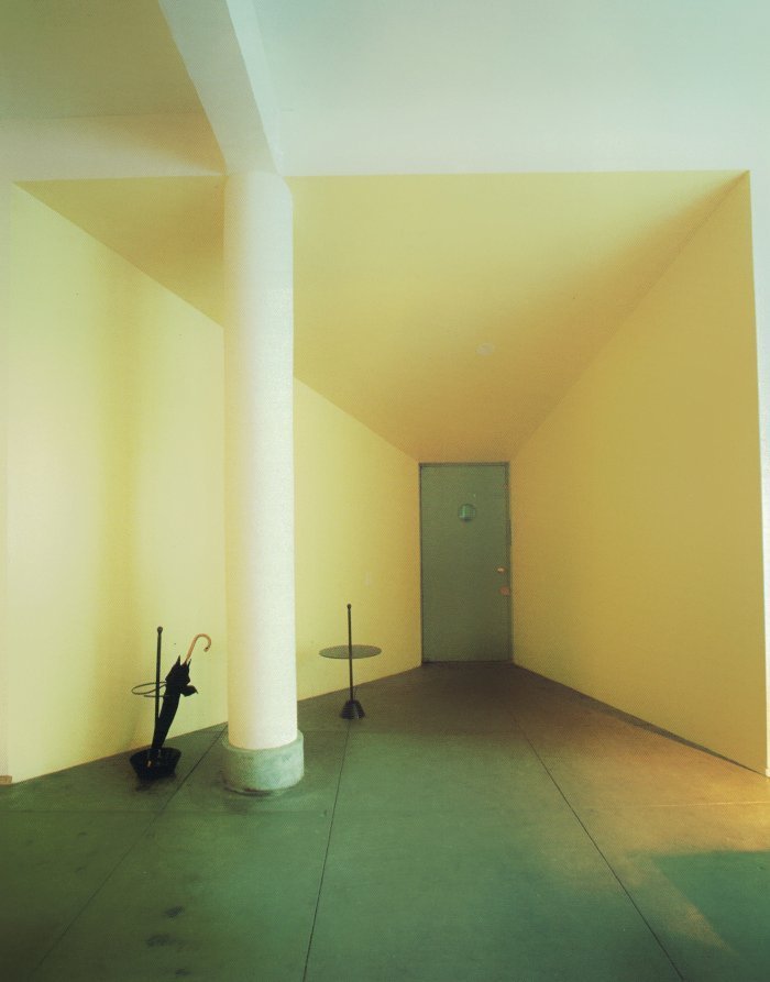
This loft entry area features angular walls. A white column draws the eye upward an emphasizes the unique lines of the space. [photo below from The International Book of Lofts, 1986]
Big and Bold
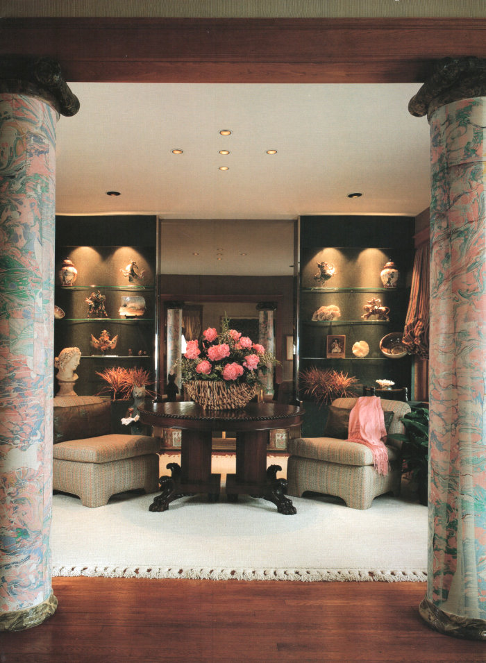
White columns are bold in their own right, but sometimes you just have to go bold! It’s hard to know for sure what covers the marbleized columns below (wallpaper maybe?)… Regardless, the columns take this formal interior to the next level. [photo from Showcase of Interior Design: Pacific Edition (1992), via Palm & Laser]
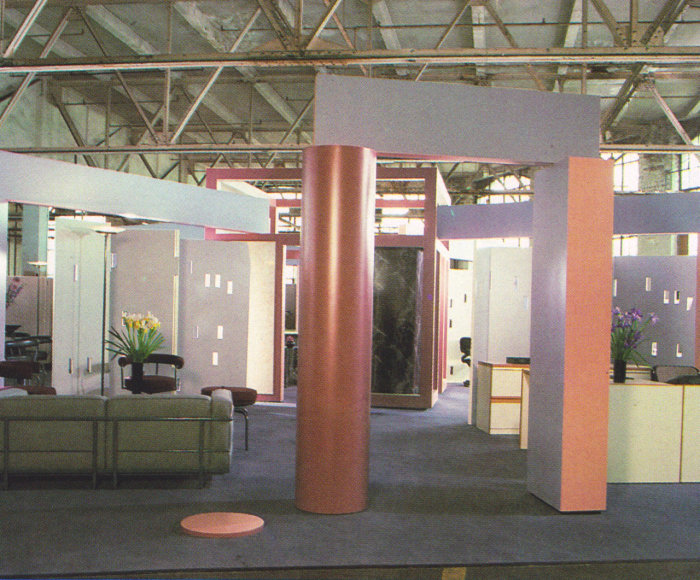
In office spaces, there’s always room to be adventurous. A range of soft shades can be found in this next photo. The support columns range from glossy and round to dual-toned. [photo from Commercial Interiors International (1986), via Palm & Laser]
Department Store Columns
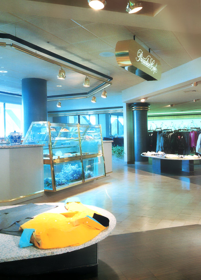
Column design was extra adventurous in the palace-like atmosphere of the ’80s department store! Lacquered, marbled, reflective, glossy…you name it! Each and every photo in this section is featured in The Best of Store Designs (1986). Buy this book for the graphic design/layout, as well as the photos! First up: the Deco-style columns surrounding “Paradise Cafe” inside of Burdines department store in Coconut Grove, Florida. Bring on the brass…
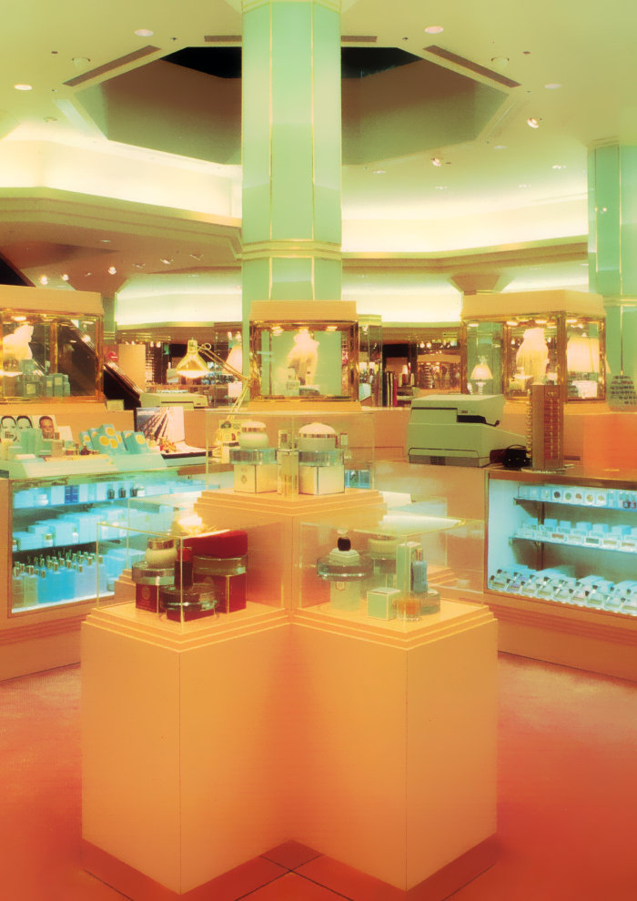
Speaking of brass, the gold-toned fun continues in the form of trim on these faceted mint green columns from Younkers department store in Des Moines, Iowa. The street level of the store was remodeled to mirror Younkers’ lower level (called The Metropolis)!
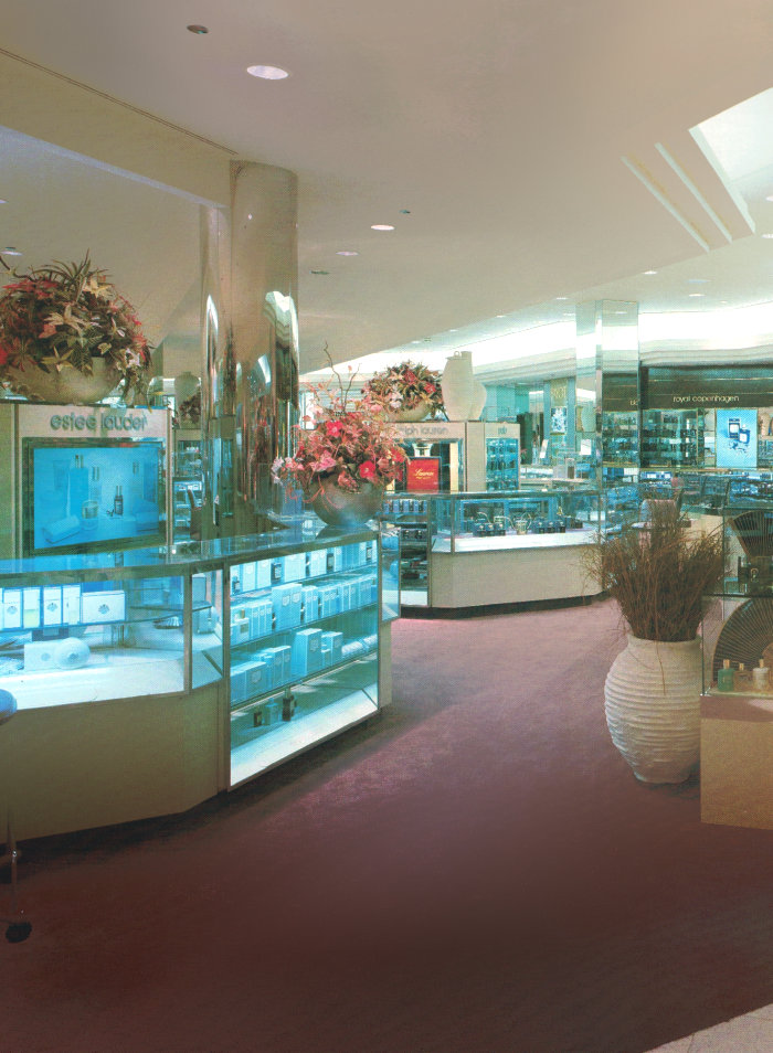
Reflective and sleek. From round and metal to angled and mirrored, the columns in the cosmetics department of this North Miami, Florida Macy’s (in Aventura Mall) couldn’t be more modern-glam:
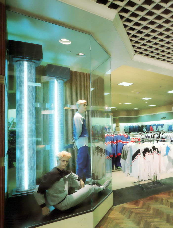
It’s hard to beat columns that are lit from within. The lacquer-cube grid ceiling is another standout feature of this retail space featuring wood and glass accents. Say hello to the men’s section of Rich’s department store in Atlanta, Georgia (located in Cumberland Mall):
A Column Revival
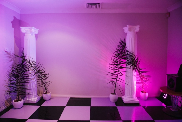
Let’s end today’s post with a new photo of a Vaporwave party hosted by Reddit user BlueRoll18. Yes, Greek columns are back. And they look a lot more stylized than when we scattered them throughout our ’80s traditional interiors. Just add palm plants, neon and checkered floors. Nice work, BlueRoll18! [featured at Vaporwave 420]








Leave a Reply