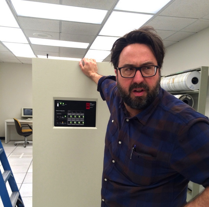
Lance Totten on the set of Halt and Catch Fire
Today I’m thrilled to share Mirror80’s latest interview: a chat with Halt and Catch Fire Set Decorator Lance Totten. With more than 20 years of experience in the industry, Lance has brought his design vision and flair for detail to HCF for the past two seasons. It’s no secret that I’m a big fan of this ’80s-set drama that chronicles the early days of the personal computer revolution. So when Lance agreed to this interview and then offered to contribute set photos that he’s personally snapped over the course of Seasons One and Two, I was beyond excited. And I just might have holed up at home for a large chunk of time while combing through set photos, and much like Mutiny’s enthusiastic coders, sent out for pizza.
Mirror80 readers are often driven by a shared passion and goal of bringing ’80s design to their own interiors. Thanks to Lance, we’ve all struck gold! Read on as he shares his favorite ’70s and ’80s design resources, as well as the importance of authenticity. Yes, he’s been known to special order brass spray paint from Krylon, meticulously ensure that lamps on set have tapered shades, and insist on replacing plastic with metal when it comes to ’80s office staples such as dry erase boards and chair casters. Enjoy Part 1 of the interview (and stay tuned for Part 2)…
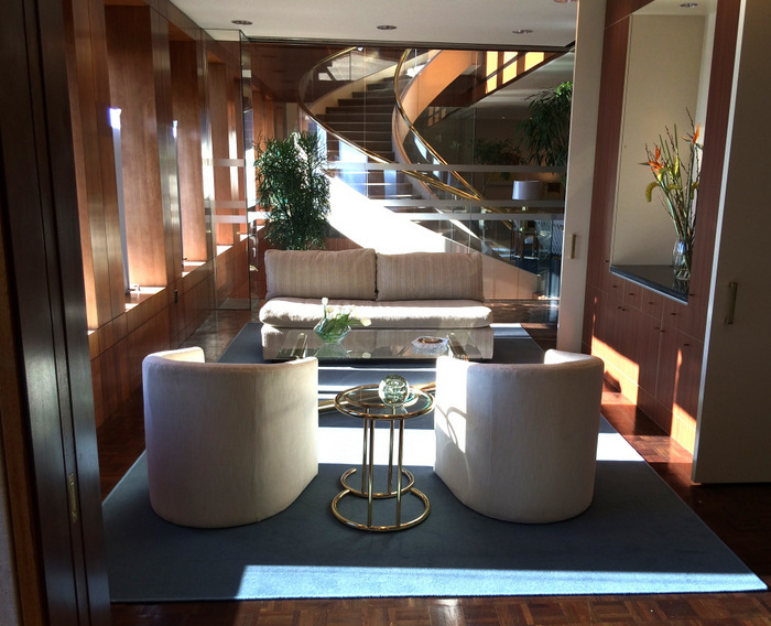
Chrome, brass, glass and upholstered furniture on the Halt and Catch Fire set (photo credit: Lance Totten)
You have experience working in a variety of different genres. What led you to Halt and Catch Fire?
Connections and timing, basically. I had worked with our Production Manager previously on another show, and when she brought the pilot to Atlanta in Spring 2013 I got a call from HCF’s Production Designer Christopher Brown about my availability. But I was already booked at the time and I couldn’t interview with him. So I didn’t do the HCF pilot, which turned out to be Episode 101. When the show got picked up about 6 months later, they wanted to go with a local Decorator for the season run, and I was able to do it that time. We actually re-shot several scenes for the first episode at the top of the first season, so I ended up getting co-credit on the first episode anyway.
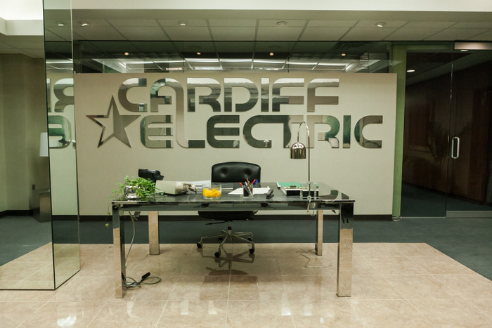
Metal and glass in the offices of Cardiff Electric (photo credit: Tina Rowden)
The principal recurring sets for Season One were all established in the pilot, and mostly done on location with modifications to existing spaces. When I came on for the first season they were all recreated on a soundstage to facilitate long-term production (Cardiff Electric, the Clark House, Joe’s Condo, etc.), so I had the task of being faithful to them as established in the pilot (for continuity’s sake), but was also able to sneak in my own tweaks and changes from the get-go. The Art/Decor team on the pilot did an incredible job with no doubt limited time and budget, so I had something great to build on and develop further as the first season progressed.
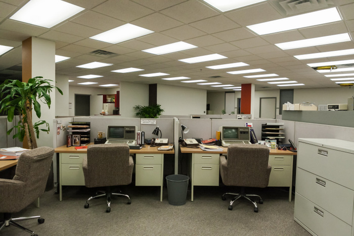
The offices of Cardiff Electric (photo credit: Tina Rowden)
Your job sounds like a dream! Can you tell us more about the responsibilities of a Set Decorator, and what a typical day at work is like?
Sometimes it’s more like a nightmare, actually! But I love what I do, as frustrating as it is much of the time. I think you have to, in order to maintain the stress and physical pace of the entertainment business. A “typical” day is tough to imagine, as what we do in Set Decorating changes dramatically and is quite unique depending on the project and location and budget and personalities involved. But the basic set-up is I read the written material, have a series of meetings with producers, writers, directors, etc., and spend as much “creative” time as possible getting info from the Production Designer on the “big picture” of what all the sets should look like (based on his or her earlier meetings and scouts with the Director).
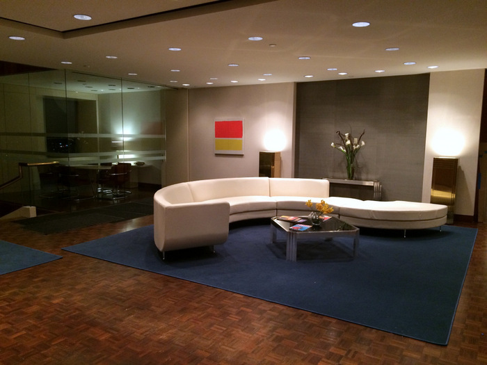
A curved ’80s sectional at Stokes Venture Capital from Season Two (photo credit: Lance Totten)
Then, once I’m dialed into that vision, I go to my team of buyers, set dressers, and office staff, and start the process of figuring out what all of the physical elements of the decor should be, where they are coming from, who’s finding or making them, how we are paying for them, etc. This part involves a lot of research into what the decorative elements should be, based on the characters and the settings and the story and the period and the locations chosen, and the design of the built sets and the budget, too! Then after we figure out what we should be going for, I circle back through with the Designer for approval/input on my choices, and sometimes a director or writer/producer/show-runner type too, and then hopefully we still have time to get the right stuff purchased and/or made.
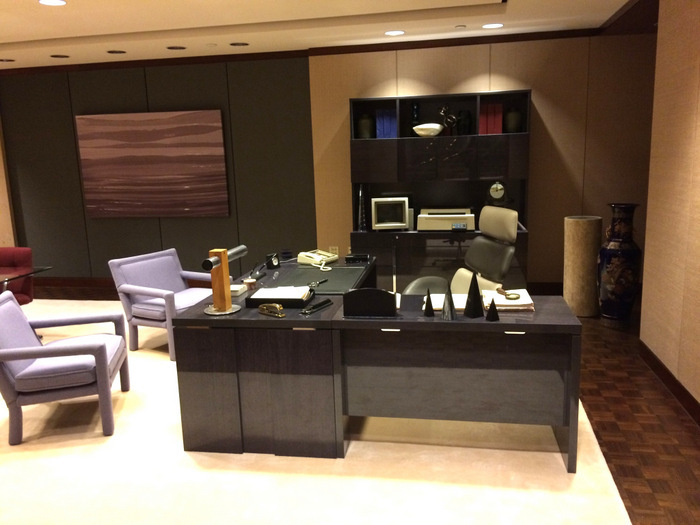
The ’80s modern office of Stokes Venture Capital (photo credit: Lance Totten)
How long does this prep period last?
On a feature film this prep period can last weeks or months; on a dramatic TV series there is some prep time up front in the beginning of the season, but this process repeats itself every 8 days or so once actual shooting starts. Since we don’t get all the scripts up front, we don’t know what we need until a couple of weeks before the next episode shoots. This process is difficult on any series (prepping a new episode with one director while shooting the current episode simultaneously), but add in the period and all the technology and shooting it in a location other than where it’s set, and it becomes a “perfect storm” of challenges every single day. HCF is hands-down the toughest project I’ve ever done, and I think a lot of people in other departments would back me up on that. I think that’s why after 2 seasons I’m so worn out, but also feel rewarded that it’s been well-received!
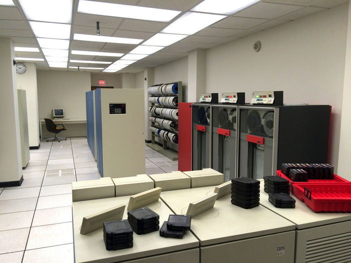
The West Group mainframe room from Season Two (photo credit: Lance Totten)
Are there any other duties and tasks you’d like to highlight when it comes to a day on the job?
Back to the original question, a “typical” day would usually consist of meetings with my Buyers to look at options they have located/sourced so I can make choices as to what items to buy/rent, as well as giving them info on what we need to find for specific episodes/sets/scenes; meetings with my office staff to go over budgets with my coordinator, updating where we are with shipping of certain items, clearance of artwork, looking at research they have generated, creating lists of requests for the graphic designer; scouting upcoming locations and taking measurements with my Leadman to plan layouts, window treatments, etc., going over particulars with other department heads (there’s a lot of collaboration between set dressing and Props, but also Greens and Construction and Paint and even a bit of Wardrobe at times).
At some point I go to the warehouse or lock-up or gold room (3 different storage areas for stock/inventory) to look at recent acquisitions to see how they look in person, check for scale, color, condition, etc., as well as pull items for use in specific sets that we are in the process of dressing that day or week.
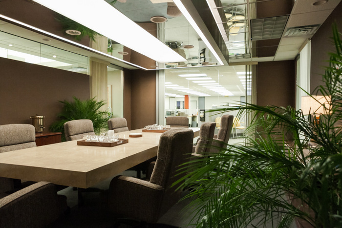
The conference table of Cardiff Electric (photo credit: Tina Rowden)
Even with 2 full-time Buyers, I still occasionally interact with some of our vendors (usually by phone or email these days), especially anyone doing drapery or upholstery or custom window blinds and shades, as I generally order all of that personally (and I use the same vendors for those things on most every project so they almost feel like crew to me), and in the case of HCF, certain tech-related vendors and suppliers. I also create budgets for every episode and write extensive notes for my team for each episode. And THEN I finally go to the set at some point every day with a team of set dressers and decorate a set! Sometimes when we are dealing with location shooting I will work on 3 or 4 different sets in the same day.
Whenever people tell me they want to decorate, I always say that it’s a good day if I can spend 2 or 3 hours out of 12 or 14 actually decorating the set. Even with all the delegating I get to do, there’s an enormous amount of time spent running a department and dealing with logistical and financial housekeeping, and then suddenly it’s like you hit a switch and say “now BE CREATIVE!” But it’s awesome, and I can’t imagine doing anything else.
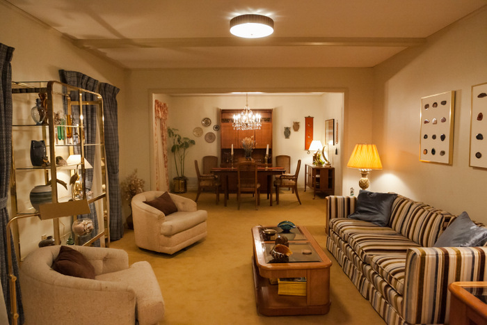
The Clarks’ living room on the set of Halt and Catch Fire (photo credit: Tina Rowden)
Can you share a little bit about your process for recreating the 1980s on Halt and Catch Fire?
Well, as with everything in set decoration, it involves a lot of research. What we intend to do is honestly and accurately depict the physical environments of characters in their time and place. It’s not supposed to be about me or what I like or want to represent personally. “The ’80s” as a design concept really didn’t coalesce for me until nearly halfway through the first season of HCF. Having lived through the decade (HS Class of ’87), I initially had a knee-jerk expectation that we would be doing a “Big ’80s” type thing, but then you realize the whole neon-pastels and shoulder pad vibe didn’t really hit until around ’86, and most of Season One takes place in the second half of 1983. And in Dallas. And in the computer tech industry. So with the exception of Joe MacMillan, there really weren’t any characters “of the moment” who would seem to be on-trend for the era.
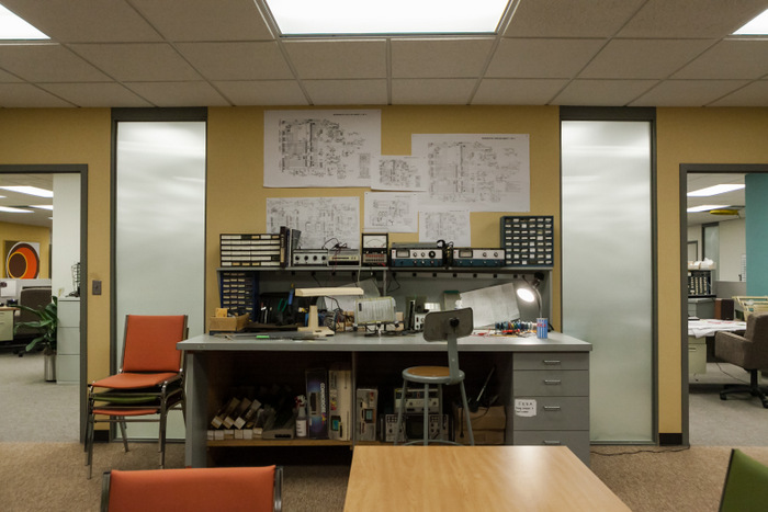
An interior at Cardiff Electric (photo credit: Tina Rowden)
So we thought a good deal about how the show would really reflect the 5-year period from ’78 to ’83, as in most aspects of real life. You’ve pointed out yourself that very few of us live in a catalog or design magazine spread where everything is from right now. And for some reason that I don’t entirely understand, the early ’80s is a much tougher time to pin down than the mid-late 1980s. A lot of the things we wanted to find, especially in mass quantities like office furniture, or barstools, or banquet seating, just didn’t turn up. So luckily we had the ’60s and ’70s to draw on in the case of the Clark home and Bosworth’s office, which is much easier stuff to come by.
Part of the problem is that the ’80s furniture hasn’t been as collected as other decades, with the exception of high-end designer pieces that are too iconic and over-the-top for these characters’ environments. And it was also the beginning of mass disposability, so I don’t think regular people held onto things like they might have done with mid-century furniture that has been wildly popular since at least the mid-’90s now (even before Mad Men).
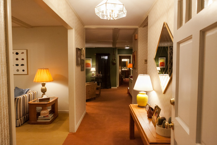
The hallway of the Clark house (photo credit: Tina Rowden)
Were there any sources of inspiration that proved to be particularly helpful?
I looked at a lot of back issues of Texas Homes magazine, and D Magazine loaned us an entire run of issues from ’82-’85 from their archive, but mostly my go-to sources were old Sears and JC Penney catalogs. Architectural Digest and other decor magazines from the period are great fun to look at, but for true American middle-class folks there’s nothing better than Sears. They sold everything back then too, so I could get an idea of light fixtures, TVs, telephones, dinette sets, and curtains all in one place. I’m also a fan of Terence Conran and his iconic Interiors books, and the ’70s and ’80s editions were also helpful. Chris Brown the Production Designer had a great book on ’80s office interiors that he got when he was designing Cardiff Electric, and we continued to draw on that for inspiration well into the second season for Wheeler’s Office and others.
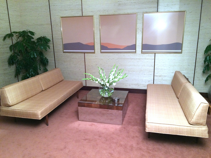
The ’80s modern waiting area outside of Jacob Wheeler’s office (photo credit: Lance Totten)
We also looked at Malls Across America quite a bit for Episode 102, when Cameron goes shopping for new work clothes at Sanger-Harris in a mall. Anytime the writers put retail into a script it creates a tremendous amount of work for us, and that episode has 5 different retail environments that were all shot in one day and take up about 3 minutes of screen time, but it was literally weeks of work for us! Even with all the period architecture still existent here in Atlanta, everything got remodeled in the ’90s and again in the ’00s, so very little on a decor or color-palette level is the same as in the ’80s.
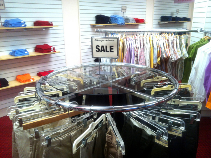
A Sanger-Harris mall retail set from Season One of Halt and Catch Fire (photo credit: Lance Totten)
We take the approach that we are basically making sci-fi in that there are no locations ready to roll in and shoot “as is”. We have to alter everything to make it period-accurate. No ADA curbs or water fountains, lose the plastic and digital thermostats and alarm pads, no blue ethernet cable, etc. Other crew people on tech scouts will point to an older looking TV and suggest we keep it, but I’ll look the model up and it will be from 1997. So it’s from the future in our story! Most folks have no idea how much everyday consumer goods have changed in the past 30 years. That’s one of the things that makes Halt so challenging.
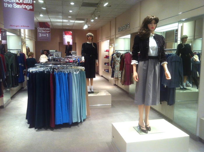
1980s mall retail from the set of Halt and Catch Fire (photo credit: Lance Totten)
Can you share any interesting/fun/unexpected details you came across in your design research (and how they affected the design process)?
What I found interesting in my earliest ’80s research was that upholstered furniture wasn’t nearly as lumpy and curvy as I had thought it was initially. That was really a later ’80s, early ’90s trend, and in ’83 there might be a slight curve on a chair-back and a certain massiveness of scale, but for the most part the lines were still fairly clean, almost in a mid-century way but not quite as linear. And upholstery would run all the way over the arms, legs, and feet of chairs and sofas, too!
And lampshades absolutely were ALWAYS tapered or subtly bell-shaped and usually pleated. I personally love drum shades but it drove me crazy that my predecessor on the pilot established so many drum shades everywhere! I chose to leave them in certain areas that were well-seen in the first episode, but we did a lot of costly shade replacement in the early days of the first season and managed to pay close attention to details like that throughout.
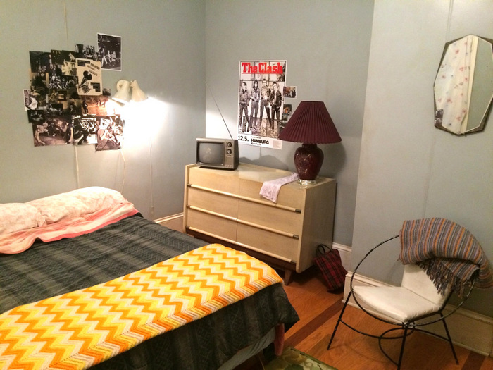
A lamp with a tapered shade in the bedroom of Cameron Howe (photo credit: Lance Totten)
Plastic was another big one. It was certainly around and in use back then, but I think we tend to forget that it has gradually gotten much more prevalent as a building material. So when we would have to buy something new that seems to have been around forever (like a rolling dry erase board or a media cart), we would very often have to change the all-plastic black casters to metal ones, something I started having my crew do a lot of with task chairs in the second season. I also found it very difficult to find shiny brass finishes for fixtures last season. I recall always avoiding those in the past at thrift stores when shopping for contemporary projects since they seemed so dated and really just tacky.
Suddenly I wanted shiny brass vanity lights and sconces, and I could never get them in-stock anywhere. Even if a store said they had that as an available finish, they never had them in stock. It was always brushed nickel or antiqued bronze or something. So I started buying things in the “wrong” finish to paint them, but then I couldn’t even buy shiny brass spray paint at Home Depot so I had to settle for gold half the time! My assistant last season finally contacted Krylon directly and we ordered a case of shiny brass spray paint to give to the Scenic Department who was doing all this painting for me. Other than Jonathan Adler which is super-distinctive, it just seemed like no one had brass around anymore.
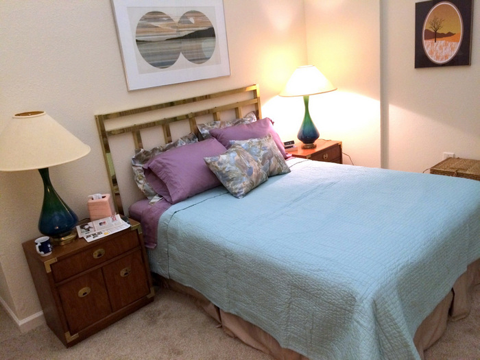
A brass bed in the bedroom of Joe and Sara’s apartment (photo credit: Lance Totten)
It got better this season somehow. We reached a point toward the end of season 1 where I just screamed at my shopping staff every day that I only wanted to see brass and mauve or someone was getting fired; I actually went through 5 different Buyers last season! A lot of what helped us last year was that the scripts tended towards more traditional settings (like LuLu’s mansion in 103, or Joe MacMillan Sr.’s Hyde Park estate), so those tended to be rather timeless in decor, as well as the multiple hotel rooms we built on-stage. Aside from drapery, phones, and woodgrain TVs, those are fairly timeless too.
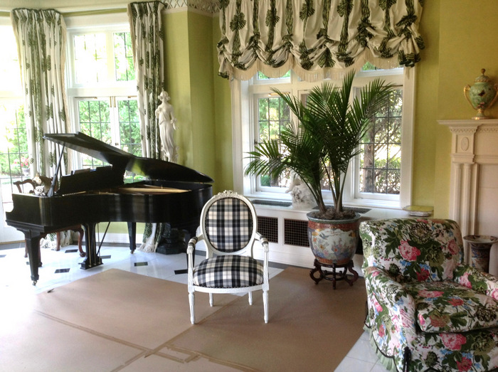
An ’80s traditional set from Season One of Halt and Catch Fire (photo credit: Lance Totten)
I didn’t feel like I was really doing iconic ’80s until quite late in the season, when we had this great sequence where Donna and her boss from TI are staying at a hotel in Lubbock, or all the Vegas hotel interiors in 109 when the gang goes to Comdex. Both of those episodes were a nice combo of period locations that we were able to take back in time with decoration.
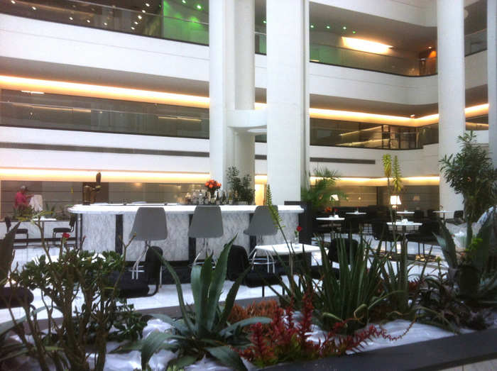
A Halt and Catch Fire ’80s Vegas hotel lobby (photo credit: Lance Totten)
When it comes to ’80s interiors, do you have any favorite design styles (or favorite pieces from the Halt and Catch Fire set)?
Well, I’m not nearly as knowledgeable on the design movements of the decade as you are, but am more of an “I know it when I see it” type! I do think I’ve always had a fondness for the Deco revival movement of the ’80s, even as a youngster when I didn’t necessarily know what it was. The great painted octagonal mirror in Joe and Sara’s second season Dallas Apartment is very much in that style. In fact, I’ve always felt that their apartment was for me the greatest achievement in true ’80s decor that we’ve done yet. Of course, we had to have a few Bohemian touches thrown in like the tattered Persian rug and piles of books and Southwestern pottery to tie in their recently established cottage in Austin and to underscore her earthiness. We also didn’t want this white-walled apartment to be in any way reminiscent of Joe’s previous life in the stark and trendy condo he had in Season One.
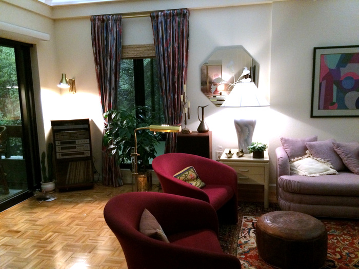
An octagonal ’80s Deco mirror in the apartment of Joe and Sara (photo credit: Lance Totten)
As for favorite pieces, I’m a big fan of the cocoa suede light-up sectional sofa that we used in the Las Vegas Hotel Suite in Episode 109. It has a built-in corner table with lights, and lights all around the base too! We re-wired it and replaced the lamps with film-friendly fluorescent tubes, replaced the milk plexi-glass, etc. I actually purchased that piece early in the season with the intention of using it in Joe MacMillan’s Condo.
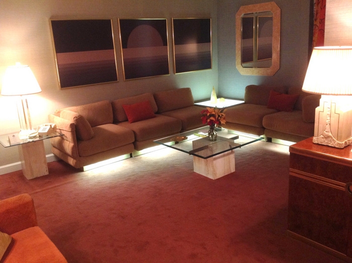
A light-up sectional sofa from the set of Halt and Catch Fire (photo credit: Lance Totten)
Joe’s condo has such an ’80s modern look. Can you tell us more about how you designed the space?
We always planned on moving Joe into the condo gradually during Season One, so that by mid-way through he would be fully decorated. The prevailing opinion among the show’s producers was that the space should stay minimal, with Joe’s focus being entirely on the Cardiff Giant project. I argued that as a proto-yuppie, he would have at least had his secretary call a local Dallas interior design firm and someone would have come in and handled it. My plan was to use that light-up sectional in the main living area, where his TV and Corbusier chairs had been, along with an Italian designer lounge-chair and a petrified-wood, glass-top coffee table, then move the 2 Corbusier chairs into the curved window area facing out at the skyline with the Arco lamp between them, and his stereo cabinet nearby. Like the old Maxell tape ads. Then we would create a formal dining area in the rest of the space, which we did do.
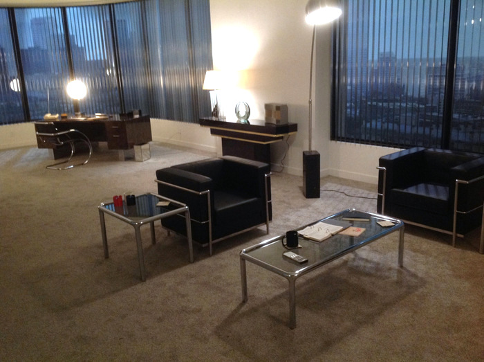
The first season apartment of Joe MacMillan (photo credit: Lance Totten)
The opinion of the producers was that his desk should stay in the living area, to underscore his drive for the work, and that his place should not feel decorated with objects or artwork. I had planned to do a giant blow-up photo in the style of Richard Prince to cover an entire living room wall. It would have been AMAZING!!! We framed these abstract blurry B&W photos of a nude woman struggling in plastic wrap too. Very disturbingly beautiful images, but unfortunately I lost that battle.
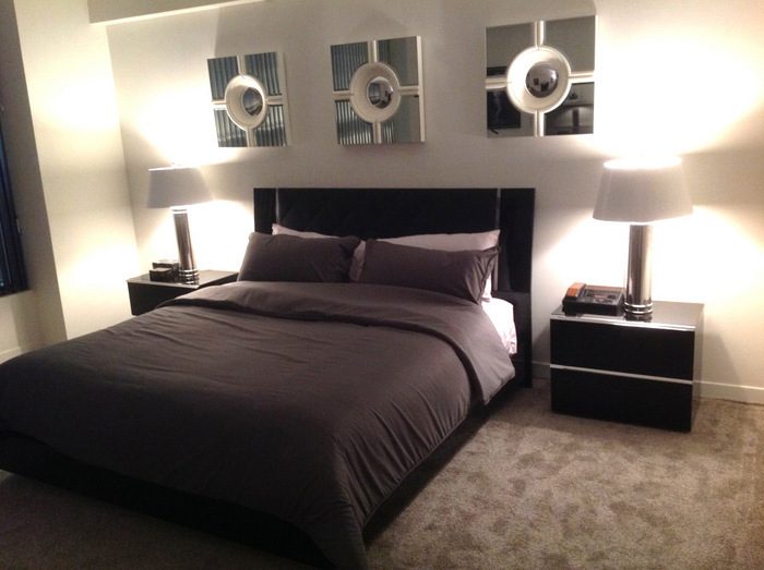
The first season bedroom of Joe MacMillan (photo credit: Lance Totten)
Any other favorite set furnishings you want to mention?
Aside from the sectional, there was also a Pierre Cardin buffet that we used in the Vegas Hotel Suite that is another favorite of mine. I actually purchased it for a different show on another network about 3 years earlier. When that show ended I bought the case piece out of their warehouse with Halt in mind, not realizing that there wouldn’t be very many opportunities to use something like that (I see someone on 1st Dibs is selling one for $15K!). Although it’s set in ’83, that first season is all about Dallas corporate office interiors and middle-class homes.
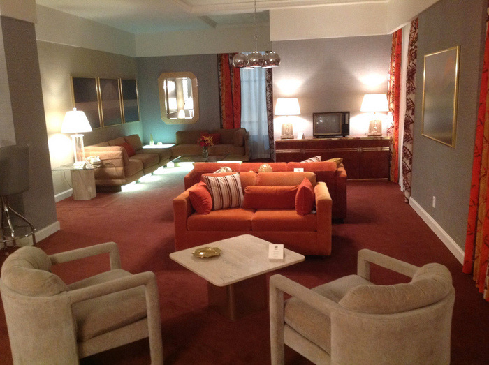
A television rests on a Pierre Cardin buffet from the set of Halt and Catch Fire (photo credit: Lance Totten)
Thank goodness in the second season we get a few more on-trend environments like venture capital firms, the Dallas apartment, and even the Starck Club too!!! There are many of my favorite pieces in the Vegas suite (from Season One) though, including all the custom artwork we had made, the set of brass-inlaid marble tables with glass tops, some incredible mirrors, a fabulous dinette set we got for next to nothing at a flea market, and those 2 amazing upholstered armchairs! For the second season, one of my favorite pieces hands-down is the big bar in Jacob Wheeler’s Office. Several aspects of the set were actually designed around that piece.
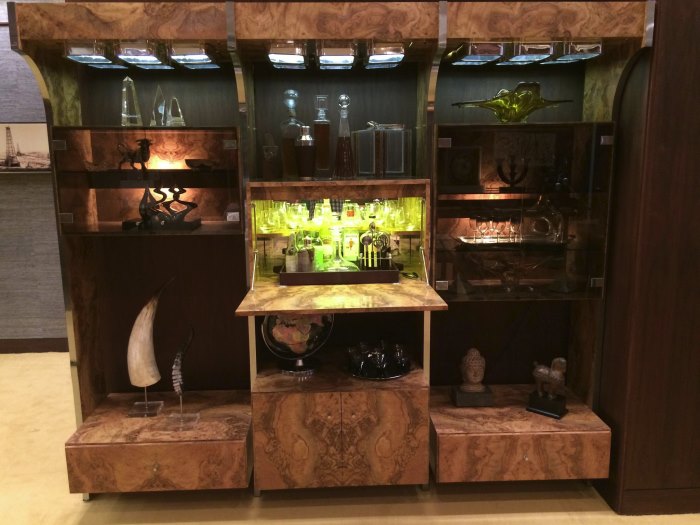
The grand bar in the office of Jacob Wheeler (photo credit: Lance Totten)
Since the show is recreating a decade from the not-too-distant past, do cast or crew members ever have nostalgic moments when they walk onto the sets you’ve carefully crafted?
ALL THE TIME!!! And it’s one of the greatest compliments I can hear, too. Nothing makes me happier as a set decorator than doing something truthful in a set that resonates with folks on a personal level. I get that with contemporary sets too sometimes, like “my grandmother’s house is EXACTLY like this; she collects porcelain pigs too!!!” or whatever. For people my age there’s a lot of passionate responses to the Clark House especially.
The fact that Donna and Gordon are both engineers who met at Berkeley then moved to her hometown of Dallas to “settle” into safe jobs after failing to make it as inventors is just more rich backstory to weave into the decor. And I have 2 daughters close in age to their daughters, so refrigerator art is always in good supply. I just have to remember which colors of crayon were around then. There are also tons of photos of me and other crew members taken in the ’70s in similar homes that are framed throughout the set, too! Like extended family to weave into the cast photos…
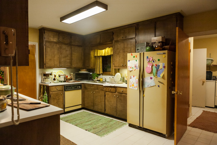
Refrigerator art in the Clarks’ kitchen (photo credit: Tina Rowden)
At one point I was dressing the Clark house for the first time and making my own alterations to it from the pilot, and I realized that in the storyline it was November 1983, and I was looking at a photo of myself and my dad from Thanksgiving 1983, but in “the real world” it was the week after Thanksgiving 2013, and how could this have been 30 years ago RIGHT NOW but seemed like yesterday, and yet stuff looked so different but seemed normal then, etc., etc., etc. Some very weird moments making a show about a time that you lived through, for sure. A lot of disbelief on my part that the mid-’80s was thirty years ago! I have a crew member on my team who was born in 1985, and when she walked into the Dallas Apartment this season she said “I basically grew up here; this was my mother’s apartment.”
Lance, we can’t thank you enough for taking the time to chat with us about re-making the ’80s for Halt and Catch Fire!
MIRROR80 READERS: stay tuned for Part 2 of this interview, which will take a deeper look at Season Two and the process of tracking down 1980s furniture and decor for the retro-fabulous sets. In the meantime, enjoy watching Halt and Catch Fire Sunday nights on AMC. You can even plan a viewing party to make the experience more memorable!










Hi Kate!
Just a small comment to let you know I really love your blog and it’s been a great source of inspiration and a lot of help!
My boyfriend and I bought a house that was build in 1980 and has some obvious 80s architecture features, and I really want to incorporate 80s design in my interior. I was completely lost a couple of months ago but since I found your blog I’m much more relaxed about all of it :D.
Greets,
Jennifer
Thank you for your kind words, Jennifer! My home was built in ’81, so I totally get where you’re coming from! I’m glad that the blog has been helpful. Researching the posts I write helps me with the interior design in my home, and I love that people are once again embracing ’80s design. Thanks again for your comment!
What a great interview! I hadn’t heard of this show before, but I am gonna start watching it TONIGHT. Lee Pace and meticulously crafted 80s sets?! IS IT A DREAM!?
Thanks so much, Becky! And yes, the show is an absolute dream! Season 1 is on Netflix if you want to check it out, and new episodes from season 2 air Sunday nights on AMC (you can purchase previously aired season 2 episodes on Amazon, or perhaps AMC reruns them). Thanks for your comment!
It’s interesting to compare this to what the set designer on Mad Men said about trying to find things. Her problem is that once the show took off, it became a million times harder to buy things because mid-century modern became so popular as a result. She was basically having to compete with fans of her own show to dress the set.
Whereas with Halt and Catch Fire, it’s hard to find stuff because few people kept it in the first place. Just in my own experience in looking for 80’s deco furniture, IF anyone posts any for sale at all, they’re lamenting publicly about how “tacky” it is. But, you know, they still want an extortionate amount of money for it.
Great idea to do this interview Kate, it’s so interesting. I especially love the point about tapered and pleated lamps in the 80s. There are some amazing glass top coffee tables in this article too. Sounds like a really challenging (but exciting) job to find all the pieces for the HCF set.
Thank you for your kind words, Alana! I couldn’t agree more about the lamps and glass-top coffee tables. Stay tuned for Part 2 of the interview, to be published later this week.
No pix or mention of the fabulous den next to the kitchen in the Clark house – the green cabinets, the modern art. I’d love a tour of just that room. and I agree; what a dream job!
Love your site! Thank you!