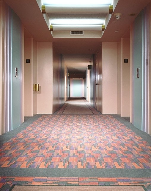
A hallway by B-Pila Design Studio
Happy Monday, Everyone! This past weekend, I was scanning the internet for ’80s design images, and I came across a few great finds. Like this Miami commercial interior from B-Pila Design Studio. OK, so it’s not “hit you over the head” ’80s, and any resemblance to our favorite decade is likely unintentional. But the geometric carpet, pastel shades and unique lighting certainly have a 1920s-meets-1980s vibe! And that’s just the tip of the iceberg…
Below we see an elevator from the same interior. Metallic detailing in sharp angles and lines immediately catches the eye, as does tile flooring in pastel shades such as peach and lavender:
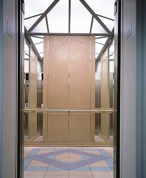
An elevator by B-Pila Design Studio
I also came across this blog post from Douglas Wood, a contributing writer for The Allee Willis Museum of Kitsch. When Wood and his wife went to visit his parents at their condo in a Chicago suburb, they stayed in the condo building’s “guest room.” Which appears to have been decorated in 1985. Check out the indulgent use of the color he refers to as “dusty rose.”
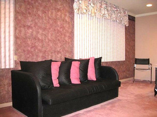
’80s-style seating [Image from The Allee Willis Museum of Kitsch]
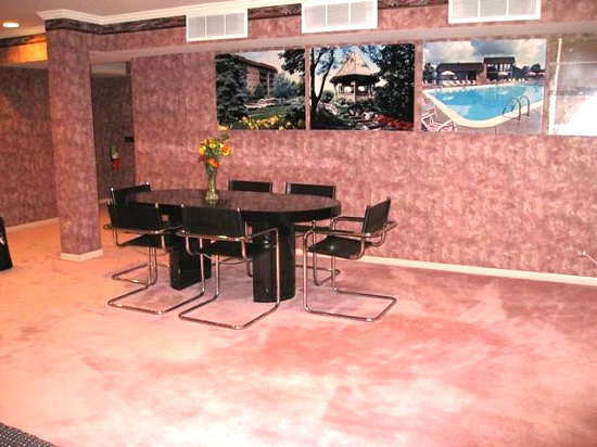
An ’80s-style condo guest room [Image from The Allee Willis Museum of Kitsch]
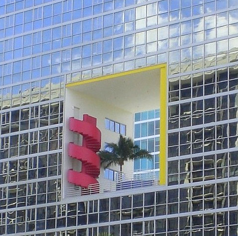
The Atlantis Condos in Miami, Florida [Image from Curbed]









Those interiors in Miami DO scream 1980s to me – the peach, silver and lavender with baby blue, the “art deco” tribute…we have a lot of new apartment buildings going up here in Australia, and they definitely have a lot of the 1980s architectural elements.
Funny how this decade keeps coming back in architecture and interior design. maybe because the 1990s were so bland?
Thanks so much for your comment, Mimi! I’m a big fan of ’80s Deco, so these Miami interiors definitely catch my eye. And of course, I love the Deco Miami exteriors as well…The new apartment buildings in Australia sound amazing–definitely the opposite of bland!