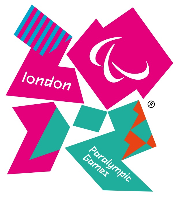
The Logo for the 2012 Paralympic Games
So we know the controversy over the logo for the 2012 Olympic Games has fizzled by now. But in honor of the start of the Summer Olympics, let’s take a few minutes to revel in the the glory that is the London 2012 logo. Seriously–how have we not talked about this yet?! Part Memphis-Milano, part New Wave, this is the logo that people love to hate. Or in our case, love to love!
We’re partial to the logo for the 2012 Paralympic Games, shown above. The color palette and blend of patterns can’t help but evoke Memphis-Milano design of the 1980s. Then there’s the logo for the 2012 Olympic Games, shown below in a variety of colors:
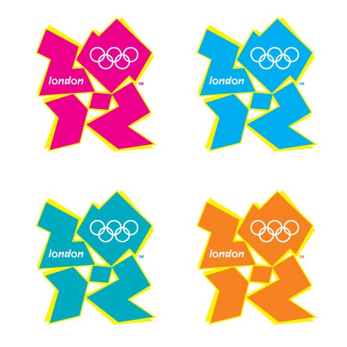
The logo for the London 2012 Olympic Games
Brand designer Wolff Ollins aimed to target youth with a vibrant logo. And vibrant it is! In fact, many criticized this logo for its wild appearance, which was at times compared unfavorably to ’80s and ’90s motifs. Others praised the logos as genius. If the goal was doing something different and getting people to talk, the design was a complete success!
The logo colors above can also be found in the various arenas of the Olympic Games. For example, the Water Arenas feature blues, while shades of magenta and orange can be seen decorating other indoor sports venues. Anyone else smile when the swimmers move past the triangle-infused mural shown below?
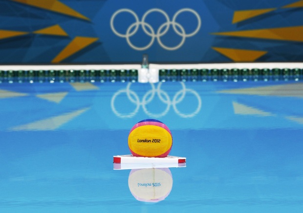
The London 2012 Water Arena (Image from MSNBC.com)
The Olympic logos are a metaphor for ’80s design itself. Just as people have been slow to embrace an ’80s graphic and interior design revival (compared to ’80s fashion, which has been “back” for years), it took people awhile to warm up to the London 2012 logos. Initial responses were shock, revulsion, and even anger. But isn’t this what interesting design is all about? As we’ve seen with the recent explosion of ’80s art and design Tumblrs, people are ready to take a second look at the ’80s in all of their bold glory. In fact, we think the 2012 Olympic logos were ahead of their time…










Leave a Reply