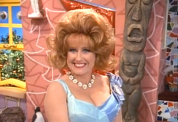
Lynne Marie Stewart as Miss Yvonne in an episode of Pee-Wee's Playhouse
Today we celebrate the stylish world of Pee-wee’s Playhouse. Paul Reubens produced, directed and starred in this popular CBS children’s television show, which combined live action, puppetry and video animation. The program was based on Reuben’s popular stage show that featured his beloved character Pee-Wee Herman. The set of Pee-wee’s Playhouse channeled Mid-Century Modern design, particularly the geometric, Space Age style known as Googie.
The image below illustrates many aspects of Googie: Space-Age motifs (note the rocket on the lavender wallpaper), a plethora of angles, and upward slopes. Mr. Window’s nook couldn’t have been more stylish:
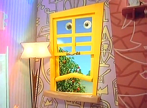
Mr. Window announces the arrival of a visitor
In addition to comic characters, many puppets put their stamp on this whimsical children’s show, which ran from 1986-1990. Below we see Globey in front of the Flowers, one of which was voiced by artist Wayne White, the topic of a new documentary that focuses in part on his years dedicated to Pee-Wee’s Playhouse. Note the plethora of ’50s-style patterns surrounding the puppets:
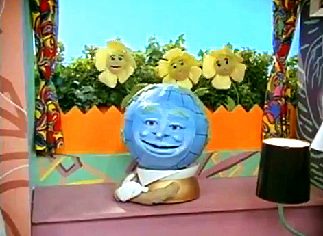
Globey and the Flowers
Sure there were many puppets that graced the screen, but the most beloved character of all was Pee-wee, who taught kids the value of treating others the way they wished to be treated. Pee-wee’s over-the-top humor and magnetic personality stole the show. Below we see Paul Reubens as “Super Pee-wee”:
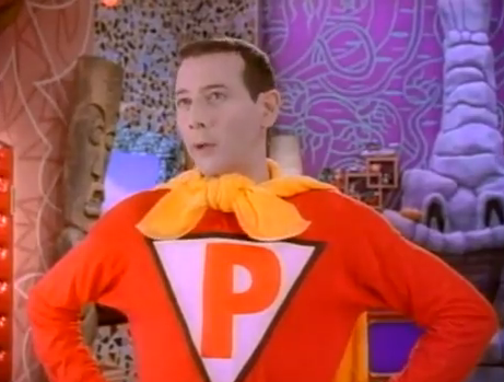
Paul Reubens as Pee-Wee Herman
Next we see more Googie influence (and a touch of Tiki influence). If you think the red cushioned door (below) could double as a ’50s coffee shop booth, you couldn’t be more correct. In fact, Googie design graced many a Mid-Century coffee shop, gas station and motel.
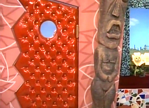
The front door to Pee-Wee's Playhouse
It may have looked like all fun and games, but the artists and designers behind this amazing set worked nonstop in a very primitive studio, channeling every ounce of creative energy into the show. When production moved from New York to LA for the second season, staff members enjoyed a more polished setting, as well as the resources they needed to continue creating amazing work in a more relaxed manner. Below we see the Pee-wee’s Playhouse kitchen in all of its retro glory:
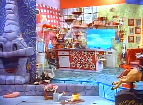
The vibrant Pee-Wee's Playhouse kitchen
We’ll end with a wide shot of the playhouse, which emphasizes geometric forms, as well as kitsch elements like the rocking horse (below, far left) and the glowing abstract shapes that line the back wall. More ’50s than ’80s, the set was retro gone wild. But don’t think the ’80s influence wasn’t there. Bold geometry was a part of cutting-edge ’80s movements and styles, such as Memphis-Milano, and it’s hard to imagine the Playhouse out of the context of the colorful, flashy 1980s:
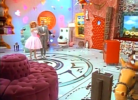
The Pee-Wee's Playhouse set takes center stage in this wide shot
Today’s screen shots were taken from two YouTube videos: Pee-wee’s Playhouse – Innuendo and Adult Humor – Part 1 and Pee-wee’s Playhouse – Innuendo and Adult Humor – Part 2. It’s likely you missed many of these jokes as a child. And it’s likely that few of them would fly in today’s Saturday morning line-up!
Have a vibrant Wednesday…





No mention of the guy who designed the set, awesome underground comics artist Gary Panter? He won three Emmys for that set! You should look at the asthetics of 80s comix, like RAW and Love & Rockets. Check out “The Angriest Dog In The World” by David Lynch!
Is there a picture of the Picturephone?