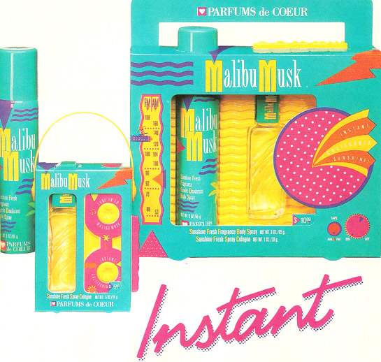
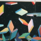
An excerpt from an ad for Malibu Musk perfume
This week Mirror80 pays homage to the wonderful world of teen-targeted media. If you think ’80s graphic and product design had eye-catching appeal, you can bet design efforts were cranked up a few notches to grab the attention of teenagers. Imagine the set of Saved by the Bell, then imagine if it were edible. That’s right–teen products looked good enough to eat (which is a bit scary since many of them were drugstore items). Graphic designers packed advertisements with candy forms and colors. Here are a few of our favorites, taken from the November 1990 issue of Teen Magazine, starting with the ad for Malibu Musk, shown above.
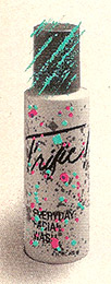
A photo from an ad for T'rific skin care
You’ve gotta love the perfume’s packaging, which mimics a tape deck and a jam box, all the while sticking with bright, beachy colors and shapes that could’ve been lifted from Memphis-Milano collectibles. Who knew Parfums de Coeur could be so edgy?!
Next we turn our attention to the bottle of T’rific facial wash pictured left. Covered in what appears to be a splatter paint pattern fresh from an ’80s sweatshirt, the neon pastels are so comprehensive, they almost hide the bottle’s text. Didn’t we all have a splatter paint item of some sort in the ’80s? A bow? A school bag? A pair of shoes?
But don’t let this lighthearted packaging food you. The ad copy for T’rific featured a giant, all-caps printing of the word”DEEP,” then went on to mention recycling, Greenpeace, saving the world, and making a difference. With all- natural ingredients that were not tested on animals, T’rific was the best of both ’80s flash and environmental responsibility.
And then the was the perfume shaped like an exclamation point! If you want to get technical, the name was printed as follows: ! ex’ cla·ma’ tion. With product design this hard to resist, the details of this fragrance by Coty almost didn’t matter. Still available today, ! ex’ cla·ma’ tion brought simplicity back to ’80s packaging. Can’t you imagine a bottle of this perfume sitting on top of an ’80s Deco dresser?:
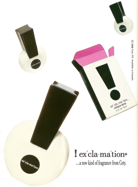
An ad for ! ex' cla·ma' tion perfume
Finally, we shift our gaze to the Dep hair products below. With a gradient effect of dots in the background and bright shapes of hot pink, purple and yellow in the foreground, it’s hard to imagine a teenager passing up this item while browsing the hair care aisle of the local drug store. Ever wonder how the packaging for some of today’s featured products has changed over time? Wednesday’s post will match up “then and now” images, taken from advertisements past and present!
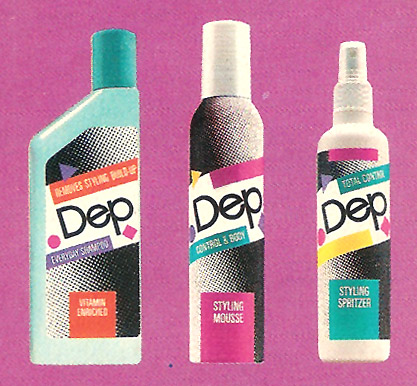
An image from an ad for Dep hair care products
Have a Happy Monday!







Fun! "Malibu Musk" actually sounds kind of gross… like beachy musk… but I love the packaging. I officially want the 80s back.
Growing up in the 80s this stuff brings back memories. I miss the 80s. Was such a fun happy time.