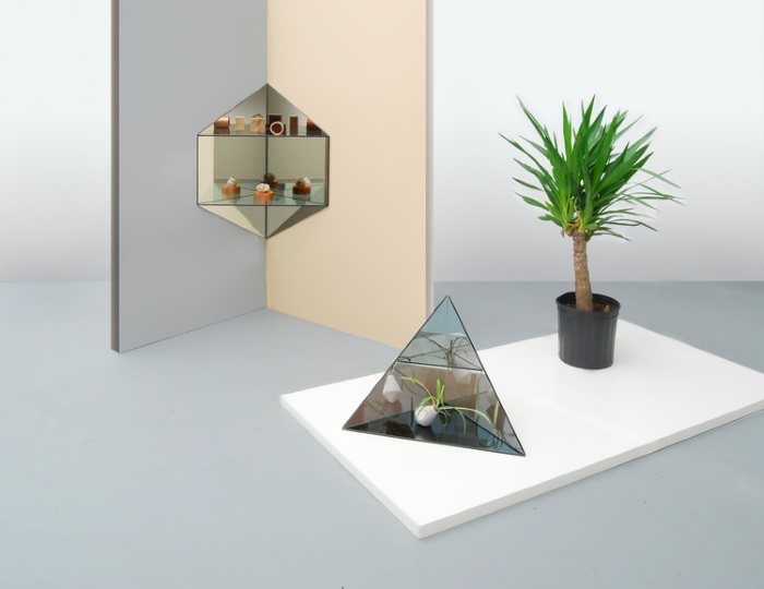
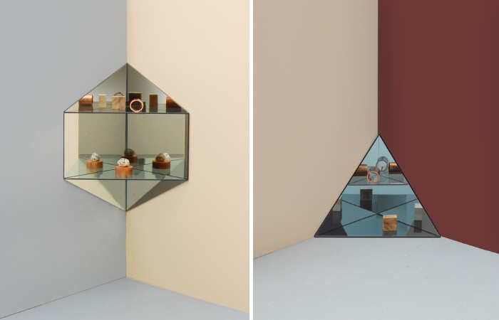
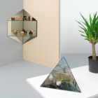
New mirrored shelving from Ladies & Gentlemen Studio
The world of 1980s interior design is a richly complex one. From metallic accents to striking angles and curves, many ’80s motifs are surprisingly modern–even timeless–making them easy to integrate into today’s design. When I first wrote this post six years ago, the ’80s revival hadn’t officially hit the world of design. Only a handful of images featuring 1980s interiors were available online. Not to mention, many people still cringed when hearing the phrase “’80s furniture.” Oh how times have changed, thanks to phenomena like the Memphis-Milano revival, a revolving door of modern pieces with retro flair, and the ’80s Tumblr! Time to update this post with new images that prove 1980s style is reaching a whole new generation of design enthusiasts. Here’s our breakdown of 1980s interior design styles…
’80s Modern
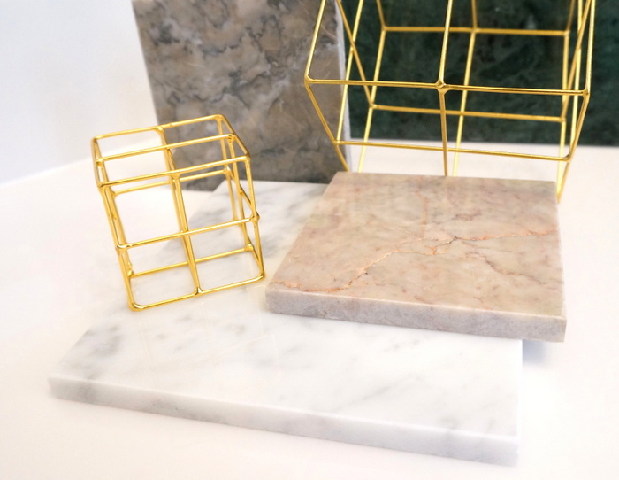
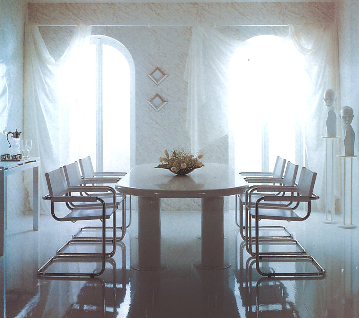
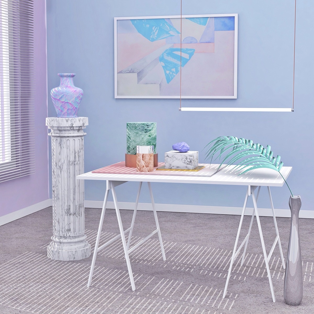
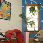
Marble and grids have made a comeback
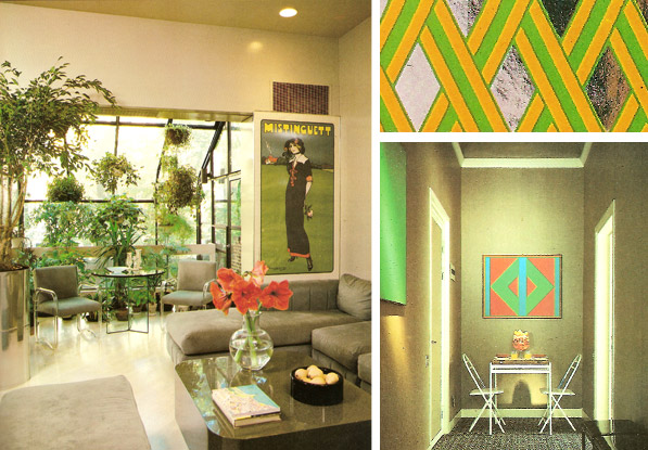
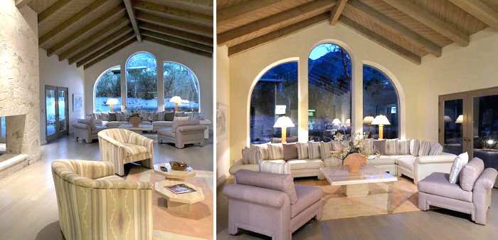
In the ’80s, a modern look often reflected the “less is more” approach, with minimalist spaces showcasing clean-lined furniture. Reflective surfaces, achieved with materials such as mirror, chrome and glass, were used to visually enlarge a room. Grey was a popular unifying hue, as colorful artwork popped on grey walls, while dark, muted colors could combine with gray tones to reinforce a stark, modern look. Another popular ’80s modern hue: white. Contemporary lighting fixtures added finishing touches to a modern space.
Memphis-Milano
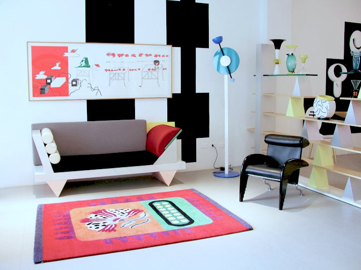
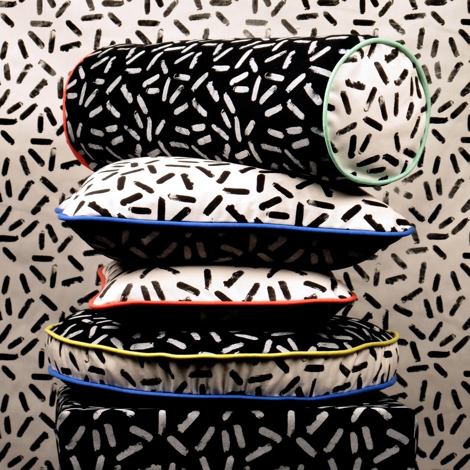
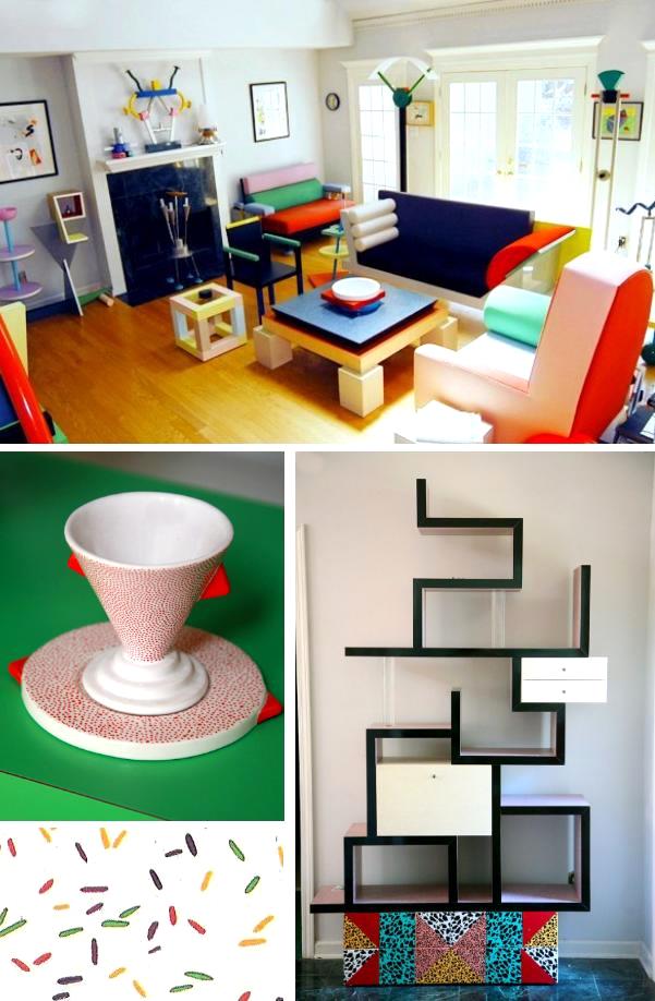
This is the high-end modern stuff, the designer collectibles that auction houses can’t keep in stock. When you view a Memphis-Milano piece, you suddenly realize the inspiration for that Swatch Watch you once owned. Fearless color and form combine in a display of zany artistry. The Memphis-Milano movement challenged the status quo. Italian designers such as Ettore Sottsass and Michele De Lucchi took boldness to a new level with shocking geometric motifs in furniture, textiles, tabletop decor, and even jewelry.
’80s Deco
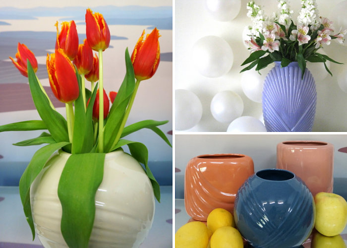
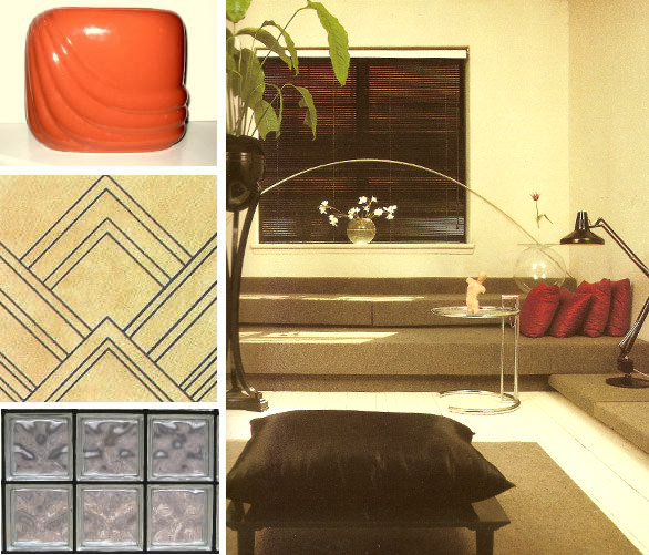
An ’80s Deco vase montage
In the 1980s, an Art Deco revival occurred in the realm of graphic design. Clean-lined fonts with modern curves were prominent, but angles and ’20s/’30s-inspired arches also infiltrated the world of interior design in a style we call ’80s Deco. Art Moderne-style artwork, ceramic curves on ’80s modern vases, and rounded furniture abounded (think circular mirrors and black lacquered headboards with gold trim).
’80s Southwestern
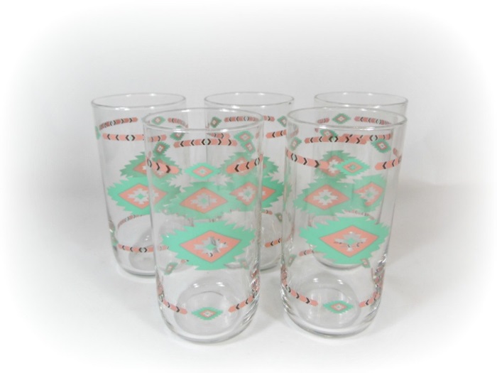
’80s drinking glasses from Etsy shop A2ndlife Vintage
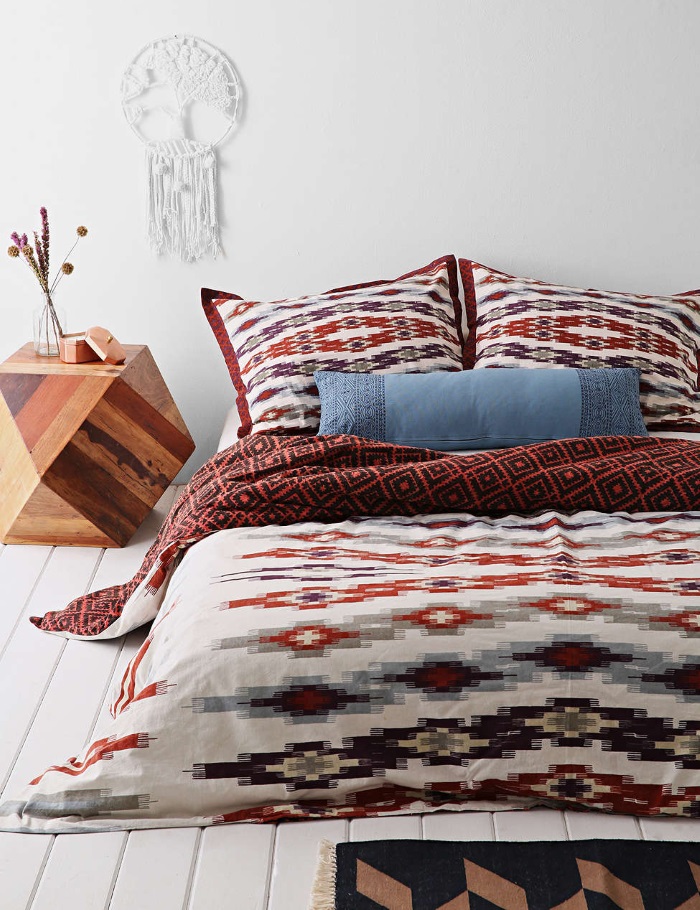
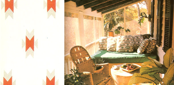
The ’80s Southwestern room thrived on shades of turquoise, peach and mauve. Native American motifs on textiles and stair step-edged furniture completed the vibe. While this 1980s look was once labeled “outdated,” a new generation has welcomed its patterns in the realms of fashion and music. From ’80s Southwestern-themed press-on tattoos at Urban Oufitters to a wolf art revival on both canvas and T-shirt, the look has come back. The more over-the-top, the better. Though the ’80s/’90s tribal revival may have died down, Boho chic doesn’t seem to be going anywhere, giving ’80s Southwestern style a whole new outlet.
’80s Traditional
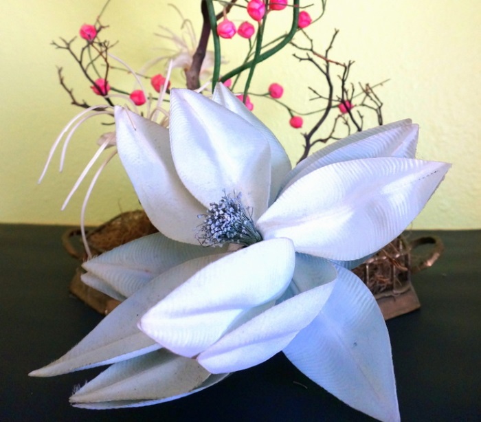
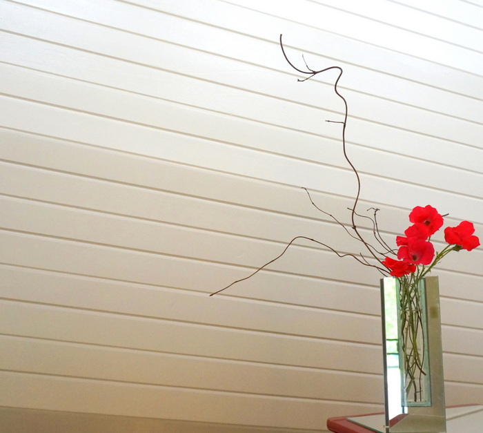
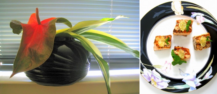
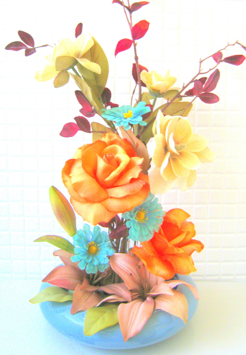
A traditional ’80s floral arrangement with Asian flair
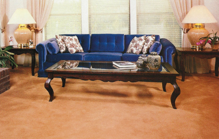
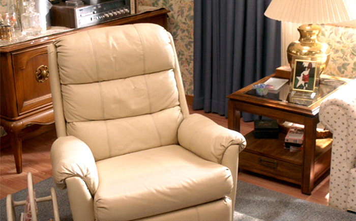
Traditional decor is what most people grew up with in the ’80s. While it would’ve been awesome to live in a high-rise in New York City with a room full of brand spanking new ’80s Modern pieces, the majority of families integrated newer styles with items they already had, such as antiques. In her design-fabulous article “Decor Time Machine: The 80s” (which is accompanied by many wonderful pics), Apartment Therapy writer Catrin Morris recognizes that when it came to interiors in the ’80s, few kids were living “the ‘Less Than Zero’ lifestyle.” While we love the high-end minimalist modern decor of that film, the majority of ’80s homes took a less cutting-edge approach.
’80s Country
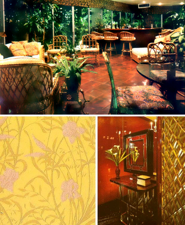
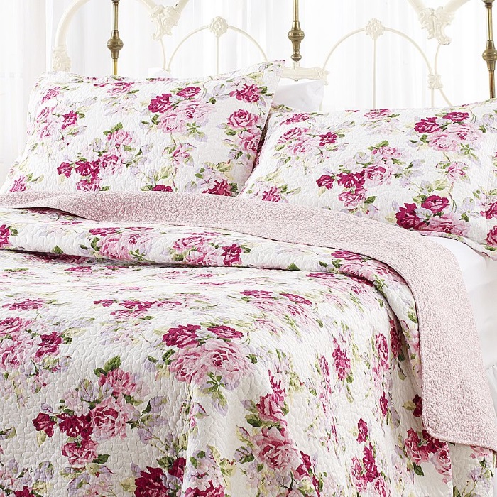
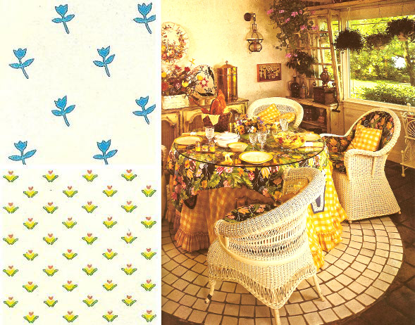
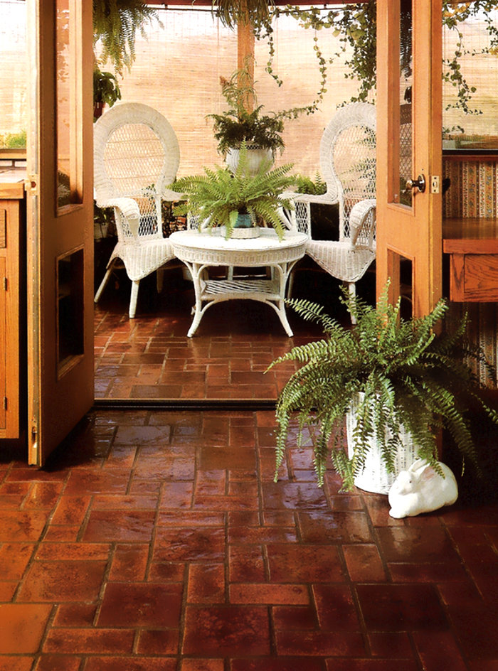
Ah…’80s Country! If you had a Laura Ashley comforter, you were a participant in this fad. While there were some designers reveling in a minimalist, rustic country look–think neatly arranged brown medicine bottles and earthy plank floors–the majority of ’80s Country living rooms likely boasted too much mauve and dusty blue, an over-abundance of wicker and dried flowers, and enough ruffles to gag a scarecrow.
New Developments
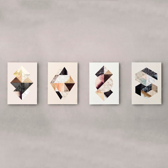
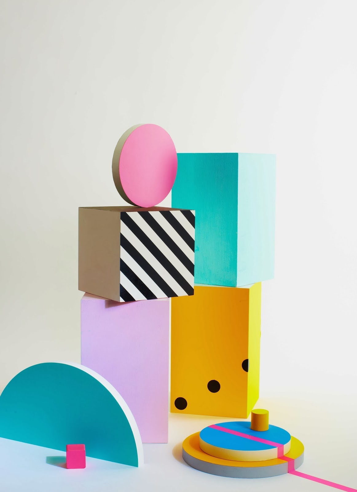
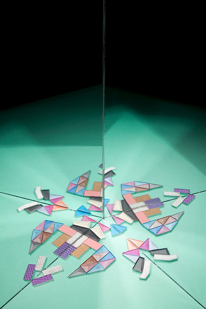
Geometric artwork from Ferm Living
Not only have ’80s design styles such as Deco and Memphis-Milano made a comeback, a whole new batch of ’80s-inspired works have hit the design realm in recent years. Like modern geo style, which is all about striking forms. Pair that concept with a celebration of mixed materials such as wood, marble and metal, and you have an unforgettable mix of sleek elements that blend well with 1980s design finds. Above we see artwork printed on birch plywood from Danish illustrator Kristina Krogh, available through Ferm Living.
Thanks for joining us on our journey through the diverse web of ’80s interior design styles. Tell us which looks you are drawn to, or which ones graced the rooms in your home during the decade of excess.
For more design inspiration, check out Mirror80 on Facebook, Twitter, Tumblr, Pinterest and Instagram!









That was a great, informative article. Now we know where the Ugly 80s came from!
Ugly?never,Never!!
I agree with Ursula– never ugly!!! I have quite a few pieces in my home from the 80s including my old etegere that is diamond shaped and all metal. I love that thing, and will never part with it. I bought it new in 1984. I also have the corner mirrored shelf unit (a similar one) that is in the pic at top, also bought at the same time.
This is a good summary, but don’t forget the so-called “California Look” pioneered by Michael Taylor and his peers. Light, bright, and airy; contemporary lines mixed with rustic textures. This style was all about overstuffed white sofas with pillow backs (arranged domino-style, fluffed with a knife-chop), white walls, linen, rustic pottery and natural wood, and BLEACHED OAK EVERYWHERE. This look inspired the bleached oak floors and cabinets and all-white appliances that stayed with us almost to the new millenium. It can be considered an offshoot of 80’s modern, yet it stands distinct.
Thank you for this important addition, Alex! A distinct style of its own, indeed! And thank you also for reminding me of the glory of the pillow chop : – ) I appreciate your comment!
How about the very very cool grey, black white and chrome appartement of Mickey Rourke in the mowie 9 1/2 week…. I love the blinds !!!! And also the super color ful and artistic app. of Martin Sheen in the movie Wall Street ? I never see any mentions to these amazing places…. I guess its because , especially 9 1/2 week wasnt really a big hit in USA… But still !! Its one of the most beautifully shows of 80ies asthetics:-)
I’m a sucker for “80’s Modern” approach with greys and softer lights. Especially when It’s night out so you can have the blinds down and turn up a gold lamp and it reflects off your glass top table, and not every home office has a computer yet