
An ’80s-inspired illustration by Andrew Guengerich
This week Mirror80 takes a look at the attention-grabbing graphic design styles that emerged during the 1980s, an attention-grabbing decade! While a variety of techniques abounded, today we examine some of the boldest. The image above, recently designed by Andrew Guengerich to evoke the ’80s, was inspired by Trapper Keeper patterns and motifs. We continue by examining 1980s collectibles and media-related items, noting a variety of graphic design styles that captivated the decade’s consumers:
Neon Noir
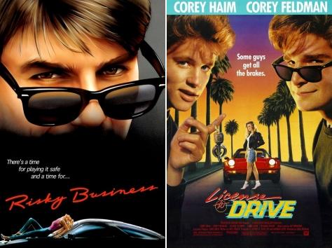
Neon noir-style posters for the 1983 film Risky Business and the 1988 film License to Drive
Mirror80 recently spent an entire week focusing on the genre known as Neon Noir, which delved into the world of crime-filled streets mixed with designer-filled wardrobes. Television shows like Miami Vice, and films such as To Live and Die in L.A., Risky Business and Thief all boasted elements of Neon Noir, some of which were of the graphic design variety. Take the scripted fonts shown above on the movie posters for Risky Business and License to Drive. This script, in a bright color, often against a darker background, became an ’80s graphic design staple. Other Neon Noir design elements: palm trees, sports cars, beautiful women and sunsets.
’80s Deco
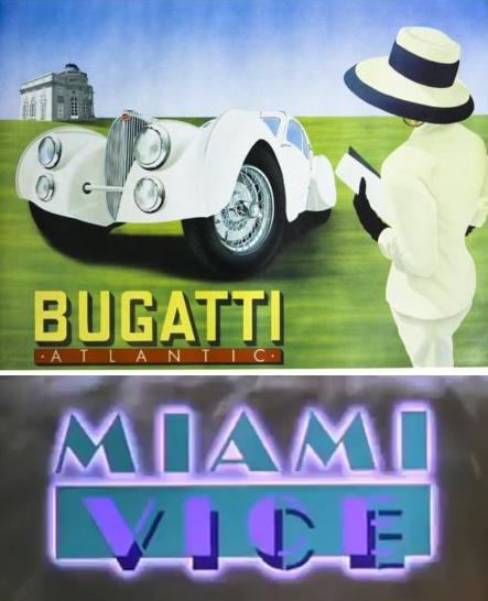
A modern graphic design style flourished in the ’80s, complete with clean, sans-serif fonts and pronounced angles and curves. We call this style ’80s Deco, and just as it crept into homes with its black lacquer furniture and arched ceramic vases, it put its Art Deco-reminiscent stamp on the world of graphic design. In fact, it was a full-blown Art Deco revival! Take renowned poster artist Razzia, who created the image above (top), which referenced the revered 1936 Bugatti Atlantic automobile. Add a still from the opening credits of Miami Vice (bottom), a show that reveled in the pastels and Deco details that are now the heart of Miami Beach. Yep–it’s Art Deco, ’80s-style.
A special thank-you to eBay store Posters Please, which provided the image of the Razzia Bugatti poster above (a hand-signed original). We’ve previously spotlighted this store, with its extensive array of vintage posters, as a 1980s interior design resource.
Memphis-Milano Style
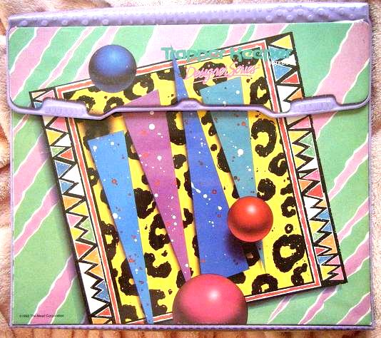
A Memphis-Milano-style Trapper Keeper; Image courtesy of Little Miss Red T-Shirt
In 1981, a crew of Milan-based of designers formed The Memphis Group and set out to shake up the worlds of interior and fashion design with striking color combinations and geometric motifs. Known as Memphis-Milano style, this design trend is now revered as high art and prized by collectors. Eventually it filtered down to many areas of 1980s style, from the opening credits of Saved by the Bell to patterns on clothing, collectibles and yes, Trapper Keepers (shown above).
A special thank you to Lil Miss Red T-Shirt, who provided the image above. Check out her Flickr Photostream, as well as her blog, which spotlights a variety of collectibles. A weekly Flashback Friday post even features vintage treasures, including 80s/90s mementos!
Tropical
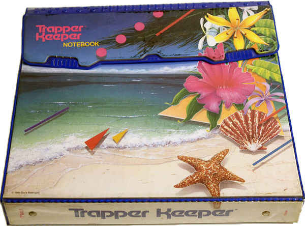
A tropical Trapper Keeper; Image courtesy of BriansCherryPicks
If you owned a pair of Jams, you know about this next style. All things tropical flourished in the ’80s. A bit Neon Noir in its preoccupation with sunsets and palm trees, and a bit Memphis-Milano in the way geometry accompanied its patterns, the ’80s tropical style emerged on artwork, fabric, movie posters and school supplies, such as the Trapper Keeper above. A thank-you to BriansCherryPicks, an eBay store with a wonderful assortment of highly unique vintage items, including Trapper Keepers, mini brass diving helmets and taxidermy items.
’80s Cute

1980s stickers designed by Lisa Frank; Images courtesy of Etsy shop VintageStickerLove
Though by no means an official term ’80s Cute is the name Mirror80 has given to the abundance of heart- and rainbow-infused merchandise that mesmerized children throughout the 1980s. Other ’80s Cute motifs included food items (often sweets), musical notes, flowers, balloons and cuddly animals (hello, teddy bears). In fact, there were entire stores dedicated to housing ’80s Cute products, from Sanrio items to rolls of stickers.
And speaking of stickers…when it came to ’80s Cute, pop artist Lisa Frank was queen of design. In fact, in 1979 at the young age of 24, Frank started her company and proceeded to put her brightly-colored images on products such as toys, school supplies and of course, stickers. Frank’s illustrations have a color and shine that makes them seem as if they could leap from the surface.
The balloon, musical note, and banana split stickers above, available for purchase at Etsy shop VintageStickerLove, are just the tip of the iceberg when it comes to ’80s Cute. Check out VintageStickerLove’s huge assortment of 1980s stickers, including finds by Sandylion and BJ.
Fantasy
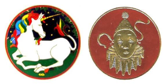
1980s stickers by Illuminations; Images courtesy of Etsy shop VintageStickerLove
Unicorns, clowns, wizards, ballet slippers, checkerboard floors, arched entryways, windows opening to reveal cloud-filled skies… These were all elements of ’80s fantasy-themed graphic design. Once again, the realm of stickers provided a nice product line to carry the style, but don’t think fantasy was featured exclusively on self-adhesive products. The style even emerged in music videos! In addition to abstract motifs such as curlicues and flowing ribbon, there were natural elements that crept in–suns, moons, star-filled skies.
Once again, a special thank-you to Etsy shop VintageStickerLove, which provided the unicorn and clown sticker images above. Both stickers are for sale at VintageStickerLove.
Digital
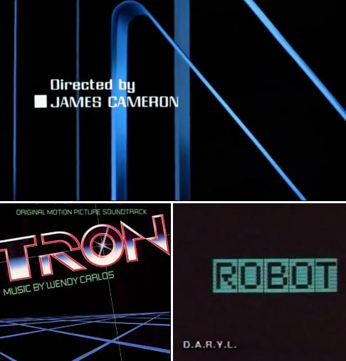
A screen shot from the 1984 film The Terminator (top); Cover art from the soundtrack to the 1982 film Tron (bottom left); A screen shot from the trailer for the 1985 film D.A.R.Y.L. (bottom right)
We can’t forget the science-loving 1980s’ obsession with all things tech. From films like Real Genius to music videos by Thomas Dolby, an ’80s scientific aesthetic emerged. One key trait of this visual style was a “digital look,” which hit the film world in particular with its prevalence of grids, sci-fi-evoking motifs and computer-font-based graphic text. Cover art for the Tron soundtrack, and screen shots from the opening credits of The Terminator and the trailer for the film D.A.R.Y.L. (all shown above) illustrate the digital graphic design style.
Thanks for joining us as we explored the eye-catching world of 1980s graphic design. A special thank-you to Andrew Guengerich for designing our header image, and to Posters Please, Little Miss Red Shirt, BriansCherryPicks, and VintageStickerLove for the use of their design-fabulous images. Stay with us all week as we continue to highlight this unforgettable arena of ’80s style…









Cool post… I had no idea what Memphis Milano was. Or, many of the other styles.. very informative.
I love 80s cute! Those Lisa Frank stickers are adorable.
Thanks for the mention!
Thank YOU for letting me feature your awesome Trapper Keeper photo!
Nice sum-up of the various graphic styles. However I think a quite essential one is missing (though a bit touched by the Tron image) – the chrome metal look featured in tons of toys, video games, movies etc. was huge from the late 70s to the mid 90s (imo, at least). To me those kind of logos were always the epitome of 80s-ness together with neon, flamingos and palm trees (and the recreation of this special look was the major inspiration for my own works).
Hi David! Thank you for making this important addition to the post! Since this post was first written in 2011, there has been so much interest in revisiting ’80s graphic design styles. I’m definitely planning on doing a follow-up that’s more detailed (and that pulls examples from current works, such as Synthwave album covers). Thank you again for your comment.
I was a young Graphic Designer and Illustrator in the 80s. Love the styles in those days. The Newspapers had George Stravinos doing really cool Pencil drawings of Women and men’s fashions. Patrick Nagel had his Stylized women in posters everywhere. We used quite a bit of Airbrush in those days before the computer came on the scene. Bill Nelson used to wow everyone with his colored pencil work. Some of the clothing styles were fantastic too, especially men’s wool jackets. I was wearing one of my old 80s jackets in the mid 90s and was getting stopped by young guys wanting to know where they could buy one.