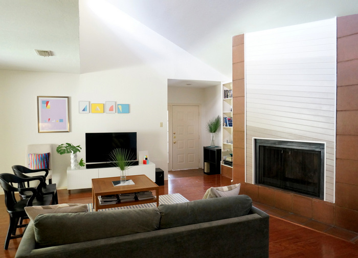
Today I’m sharing a tour of my living room! Over the last couple of years, I’ve posted tours of my home office, bedroom, kitchen and dining room. In fact, it’s almost time to share updates of some of these spaces, as I tend to change the look of my home A LOT. For now I’ll focus on the living room, which is a mix of retro and modern styles…
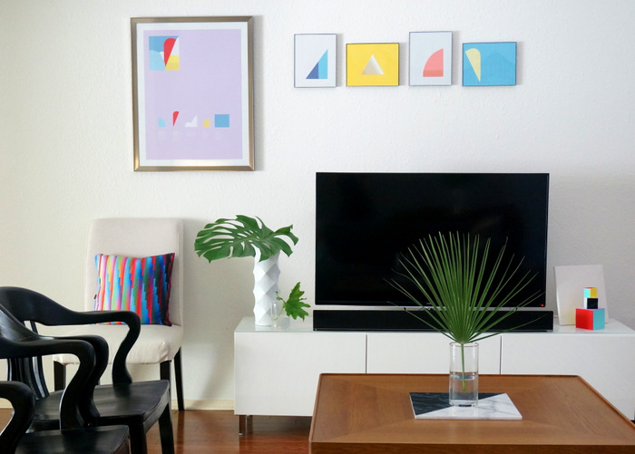
Since I write so much about the ’80s, people are often surprised that my house isn’t completely filled with furniture and decor from that decade. Blame it on my love of DIY projects! I really enjoy creating new pieces that are influenced by ’80s style, and I also really love clean-lined furniture. So often what results is an uncluttered space, peppered with true ’80s accents, as well as brand-new decor inspired by the Decade of Decadence.
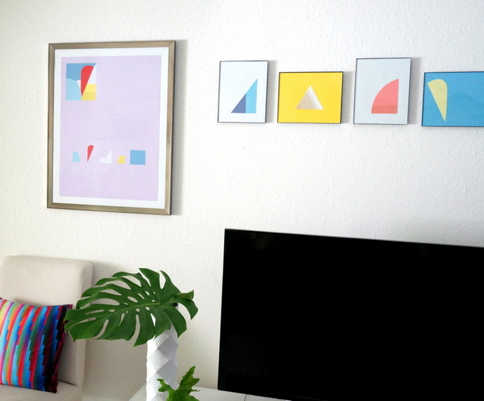
I’ll be sharing some sources as I go… The media console is part of the BESTA modular series from IKEA. We have a lot of IKEA products at our house, because we’re on a budget. And because we truly love the look of many of the brand’s pieces.
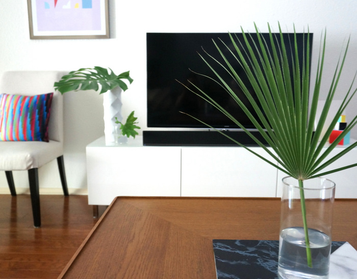
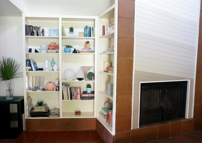
Our good friend Kat gave us the pillow above (by Benjamin Berg), which was purchased through Society6. The tall white vase is a Z Gallerie find from a previous season. Can you tell how much I love tropical leaves?! SO affordable, and they last for weeks. On another note, we were lucky to find a house with so much storage. The living room features a series of built-in shelves. Plenty of space to display treasures old and new!
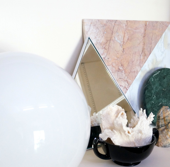
I’ve been really into collecting geometric objects, many of which I find at estate sales. I also love mineral samples, and anything made of marble and stone. The mirror below was a bargain buy from CB2 (no longer available). The pink and white marble tile is a DIY project, created with affordable tile from the flooring store, as well as marble contact paper. You can read about it here. I ordered the tan stone obelisk through the amazing Etsy shop of Curtis Bort.
So let’s talk about the fireplace! When my husband and I first looked at the house, this was the feature I fell in love with. Diagonal slanted wood from 1981? Come on! It was medium brown. I thought about leaving it, but here’s the deal: the carpet was blue, and it definitely needed to be ripped out. And we had to match our new flooring to the wood in an adjacent room. And look at the tile around the fireplace! Again, brown. I definitely needed some color variety to showcase this special feature.
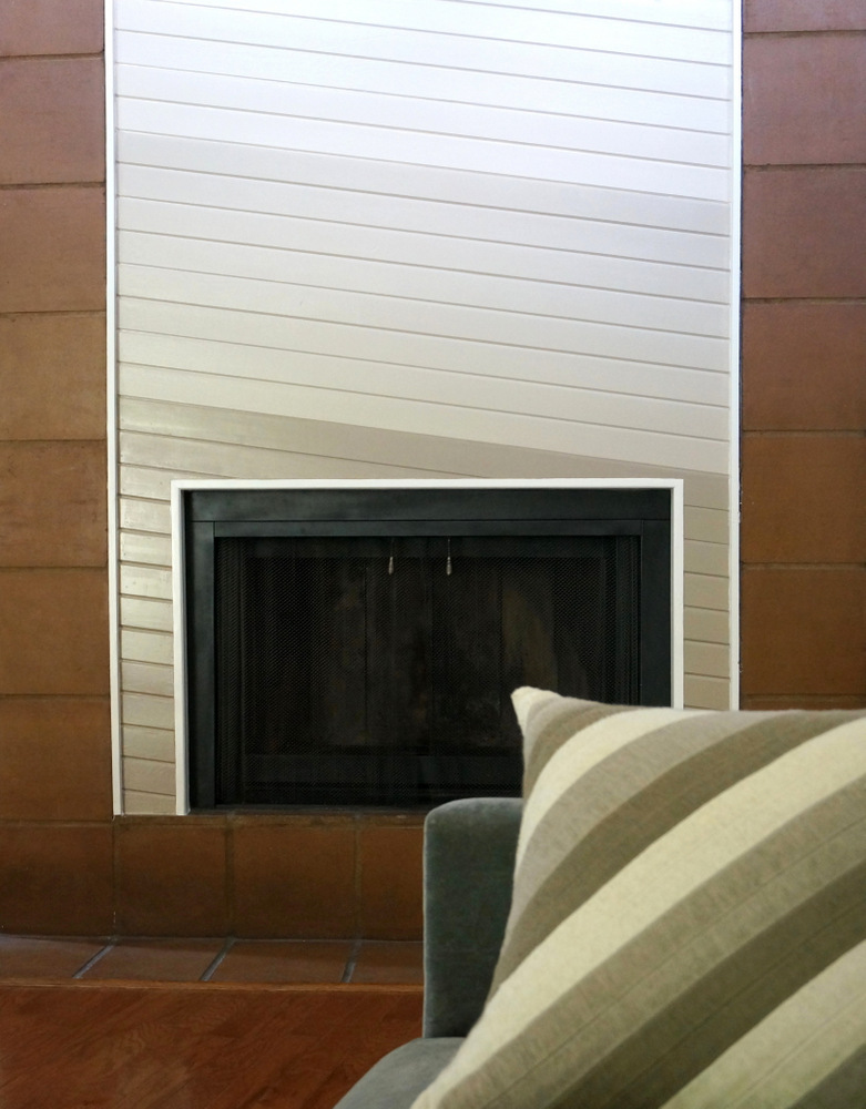
So I painted the fireplace in a gradient-style progression from taupe to white. I know the ombre trend won’t last forever, but I’ve always loved the gradient style of retro eye shadow packaging. I decided to take a chance, and I haven’t looked back! I was lucky to find some pillows featuring diagonal stripes at Crate & Barrel (three years ago), and they helped tie everything together. Here’s another view of the living room, which gives you a glimpse of the dining room as well (the garland is from a recent celebration we had at the house–I can’t bring myself to take it down):
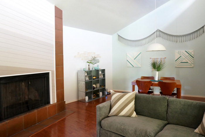
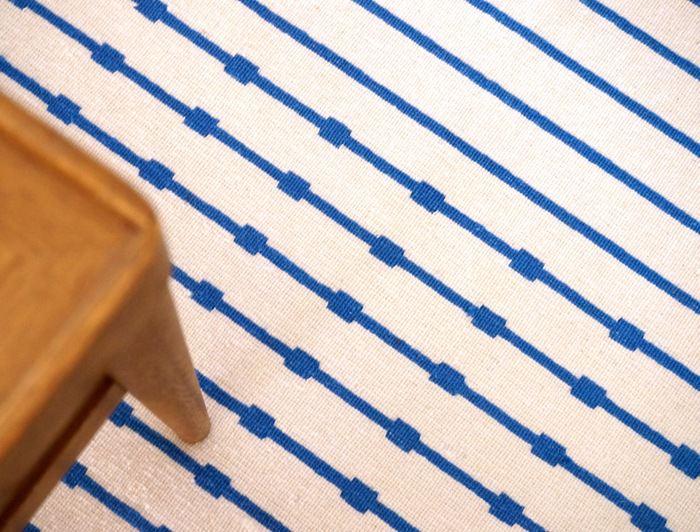
The living room rug is from IKEA (sadly it’s no longer available). I had a cotton dhurrie rug in this room for about a year, and it was gradually shredded and dirtied by foot traffic. No more cotton dhurries for me! So I went with a wool dhurrie this time. I spent hours researching options, and I painstakingly looked through each and every rug on multiple websites. Then during a trip to IKEA, my husband pointed to this rug and said, “How about that one?” And I thought, “How did I miss that?…It’s the one!”
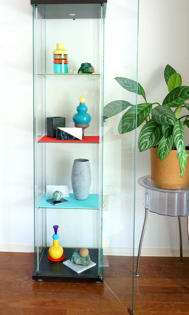
Last but not least, the corner of the living room features a display case, again from IKEA. I love filling it with fun, still life-style vignettes, often created by stacking random items, such as vases and colorful finds from the dollar store. You can learn more about specific pieces in this post, and I share some whimsical totem-like creations in this “Stackables” photo shoot!
There’s still a lot of work to do in our living room. As you can see from the photos, some of our furniture (purchased before we moved into this house) is the same color as the floor. It would be great to introduce some variety into the mix. I’m thinking a really vibrant coffee table?! If you have questions about any of the items featured in today’s post, please don’t hesitate to ask in the comments section below. Thanks for letting me share! XOXO, Kate









Wow! Thanks for share your place with us. Its sooo ispiring, and clean! In my bedroom, I try make a style classic, but never works. haha!
You love crystals too, ahn?!
And your bookcase…. <3 I will imitate! hahhhaha What a shame… Here (in Brazil), we could not find accessories like those. 🙁
Sophia, your kind words have put a smile on my face! Thank you for your comments. Trust me, the living room isn’t always super-clean 😉 Thank you again!!!
Your really have an inspirational house! I see that your bring outdoor palm plant indoor. Have you ever tried Chamaerops?
Thank you so much, Sarah! I have never tried Chamaerops and am so glad to know about this palm! Thank you again.
It’s a tiny palm tree. My parents have 2 Chamaerops and they are frost-resistant.
You need to try it! it could be perfect for your living room.
Wow – looks brilliant! You combined the look of back then with modern touches, creating a truly modern-retro style. Love it!
Thank you, David! This comment makes my day. I’ve definitely enjoyed styling this room over the last few years. Have a wonderful weekend ahead!
I really love the way your living room looks!!! I’m working on mine now, and using yours for inspiration. I don’t have vaulted ceilings, though, but my new flooring is very similar to yours. We had fun installing it, and I painted the living room a similar ombre that you used on the fireplace.