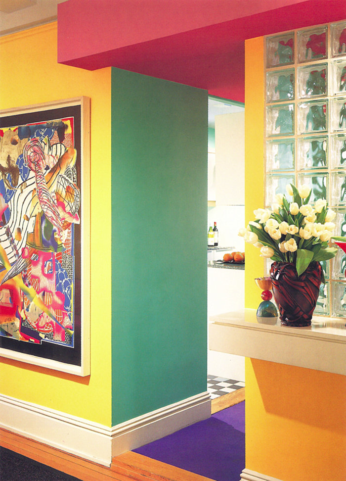
There are many ’80s design trends that influence my style as I attempt to infuse my place with personality (stripes, borders and plants, to name a few). Today I’m shining the spotlight on one irresistible, magical 1980s formula for success: vibrant artwork + a checkered floor + lots of plants = design perfection!
Even if you don’t adopt this look in your home, it can inspire a range of vignettes, such as tablescapes. In fact, this little design recipe was the inspiration for one of my recent tablescape photo shoots–there’s a sneak peek at the bottom of the post, and I’ll be sharing all the pics on Thursday. But I get ahead of myself! Let’s stop and take a look at some AMAZING, vibrant 1980s interiors for your design inspiration… [image above of the Kraus Apartment, 1988, via Zonkout]
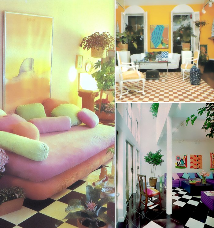
How retro-fabulous are the images above?! On the left, we have a pic from the Better Homes and Gardens New Decorating Book (1981). At the top right, it’s a photo from my design bible, The Decorating Book by Mary Gilliatt (1981). On the bottom right is an image from the House Beautiful archives (the September 1980 issue).
It turns out the very early ’80s was a fruitful time for checkered floors, radiant modern art and bold houseplants. Whether the walls were white or brilliant yellow, the result was spectacular! Let’s now take a closer look at some primary hues and unforgettable artwork…
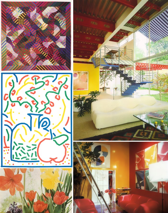
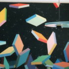
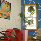
At the top left, we have work by Michael James via 80s Art. Below that, we see new artwork by Jordy van den Nieuwendijk via deargenekelly. An excerpt from a 1976 photo from Better Homes and Gardens’ Favorite Houseplants via Supreme Interiors makes a retro statement at the bottom left of the montage. At the top right, we see the power of primary colors and architecture by David Hovey via Zonkout. At the bottom right is another fabulous primary-hued interior, featured at deargenekelly. Have you embraced the abstract forms and bold hues?!
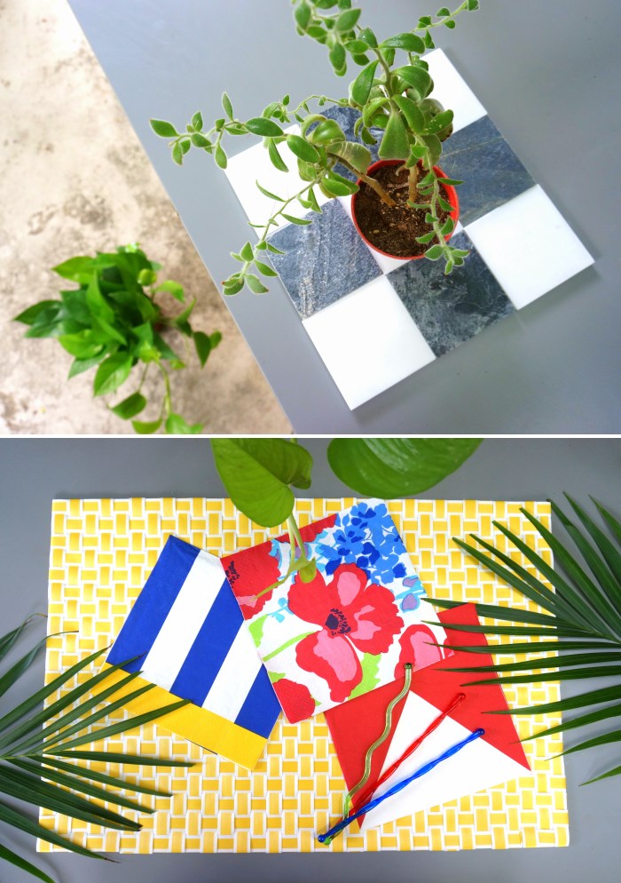
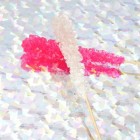
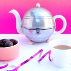
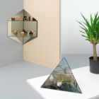
Above we see a couple of snapshots from my weekend photo shoot. Today’s featured checkered tile/houseplant/vibrant art combo was the design inspiration behind my tablescape. I’ll be sharing all of the photos on Thursday, so stay tuned!




Leave a Reply