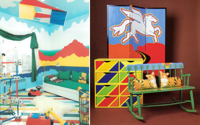
Today we shine the design spotlight on children’s bedrooms of the ’70s and ’80s. If you were a kid during this time and your room didn’t look like one of these, don’t fret. Interestingly enough, my childhood bedroom DID involve bright colors, until I was old enough to “redo” it in the ’80s country style, complete with pink walls and a floral comforter. Maybe I should have taken my cue from one of today’s featured spaces! Read on as we explore top trends in retro kids’ rooms…
What are some of these trends?
- clouds
- diagonal lines and stripes
- primary colors
- landscape motifs (especially painted onto walls)
- eye-catching window treatments
At the top of the post (left), we see a room from Mary Gilliatt’s The Decorating Book. I’ve said it once, and I’ll say it again: this book from the early ’80s is my design bible. A few highlights of the featured room are mountain- and cloud-painted walls, a painted floor, and a large kite that hangs from the ceiling. Also at the top of the post (right) is an image from The LA Times California Home Book, courtesy of my favorite ’70s/’80s design Tumblr, Supreme Interiors (formerly drydockshop).
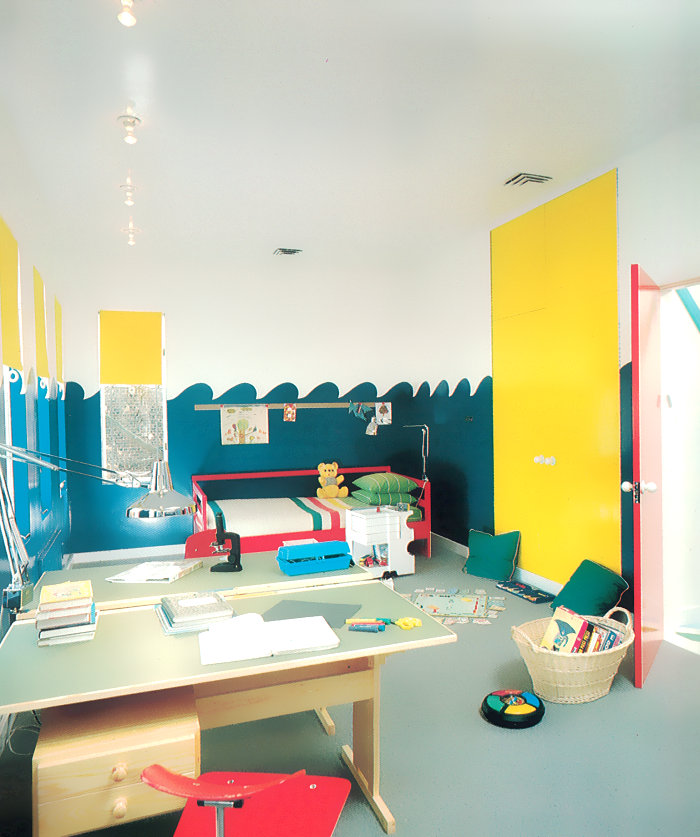
If you turn your eyes to the image just above this paragraph, you can see what it looks like when a Simon game (on the floor) comes to life through the color scheme of a room! And yes, those are ping-pong table tops over desk bases! This fabulous space is also from The Decorating Book.
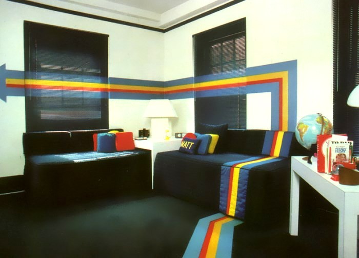
Above we see another image from Tumblr Supreme Interiors (original source: The New Complete Basic Book of Home Decorating from 1977). This room highlights an interesting trend of the 1970s: supergraphics! Yes, we’re talking about stripes, lines and other designs that spanned a variety of surfaces, creating dimension and eye-catching detail. Read more about this trend at AnOther in a piece authored by none other than Supreme Interiors!
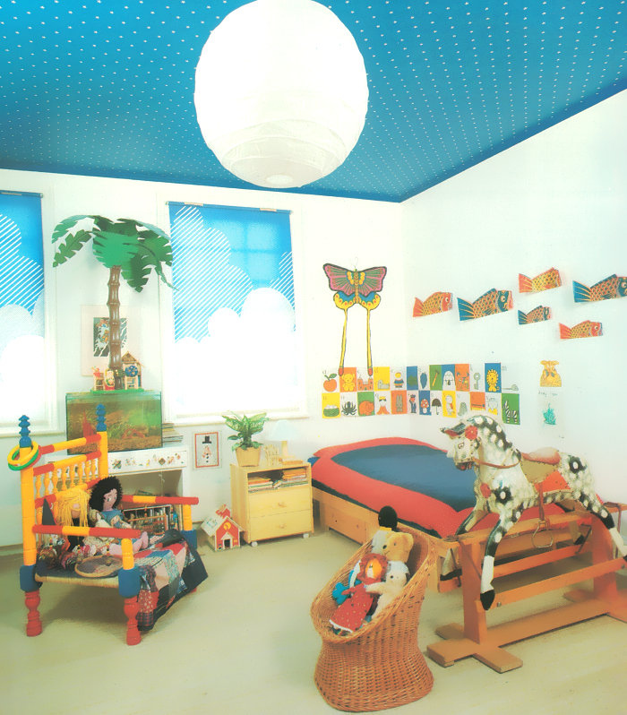
Our last featured image is a gem from The Decorating Book, and I’m completely obsessed with the cloud-themed roller shades. The ceiling is amazing too, but I’m more likely to add something to my wall than to wallpaper my ceiling. In fact, I’m planning on attempting to duplicate the cloud pattern (love those diagonal lines) on a series of canvases with the help of painter’s tape! About the room above—did you notice the night and day theme? The ceiling represents the starry sky and the white paper shade represents the moon, while the cloudscape shades represent daytime sky, of course!
Hope you’ve enjoyed today’s post. Have a colorful weekend…






Leave a Reply