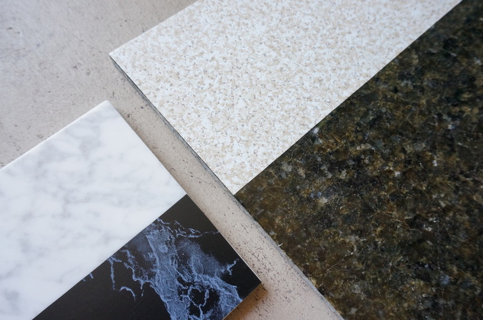
Today’s DIY project is an adaptation of our original marble tile art project. Kate here, and my kitchen was in desperate need of some ’80s Modern style. Especially since the kitchen has many ’80s features already (the house was built in ’81). What a perfect opportunity for a DIY project! Many of you know about my obsession with marble tile. I’m a regular at Floor & Decor, where I’m constantly picking up tiles of all sizes to use in art projects. Today I thought we’d get a little crazy…with granite! Still with me?–ha!
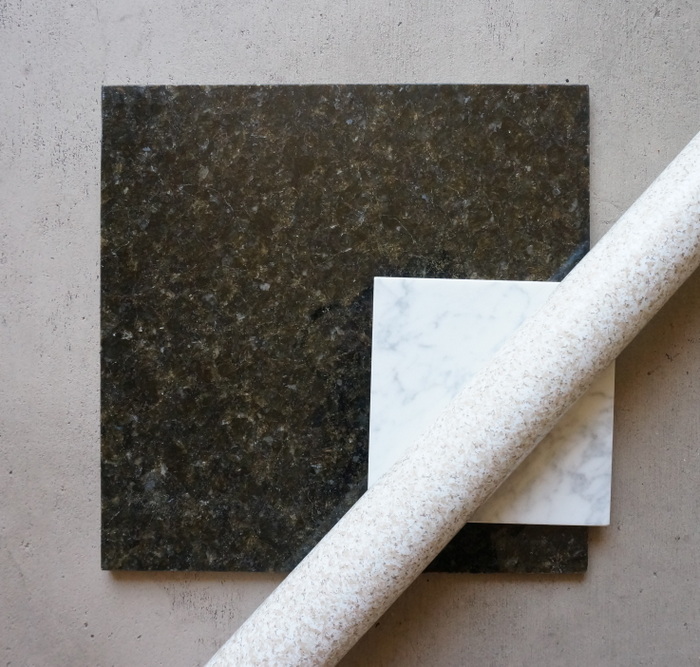
Here’s what you’ll need to get started:
- the tiles of your choice
- contact paper (I selected a granite-style pattern)
- scissors
- a pencil
- a credit card (I’ll explain this one in a minute)
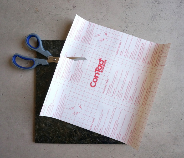
The contact paper has handy lines on the back that help with tracing and measuring. This makes the project much easier! Start by cleaning your tile. You want to make sure the surface is free of grit and other particles that can get trapped under the contact paper and leave lumps. Next I set the tile on top of the paper (the lined side), then marked the corners with a pencil. I then used the grid on the paper to guide me as I connected the corners. I was left with a sketch of a perfect square!
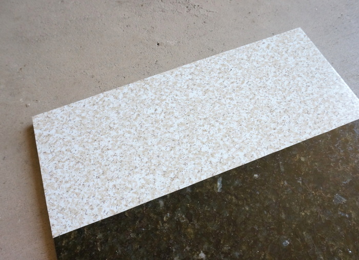
I then cut out the square I had drawn–it was the same size as the tile. Now you can cut this square in half or thirds (or whatever size you like) so you’re left with a wide strip. Unlike the last tile project, in which a diagonal design was created, this project features straight horizontal and vertical lines. Once you have a portion of contact paper cut, it’s time to adhere it to the tile.
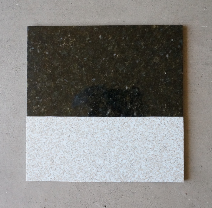
Peel off the backing of the contact paper, and then neatly position it in place on the tile. Don’t worry if you don’t get it right–it’s super easy to peel off and re-position! Here’s a helpful hint: use a credit card to smooth over the contact paper as you stick it to the tile. This prevents air bubbles from forming!
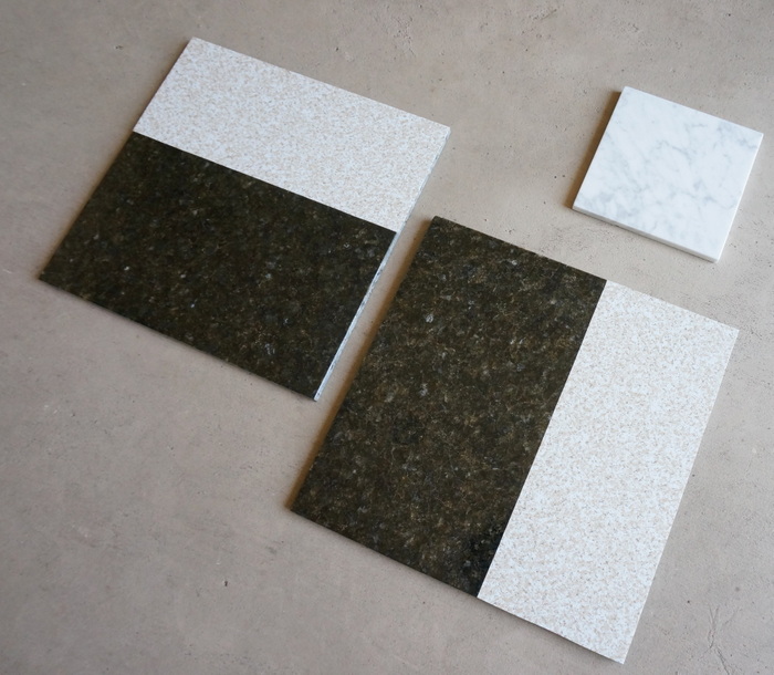
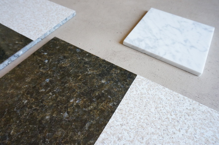
Here’s a close-up of the tile. Since the paper has quite a bit of tan and beige in the design, I made sure I picked a tile that also had a touch of brown. I’m happy with the results!
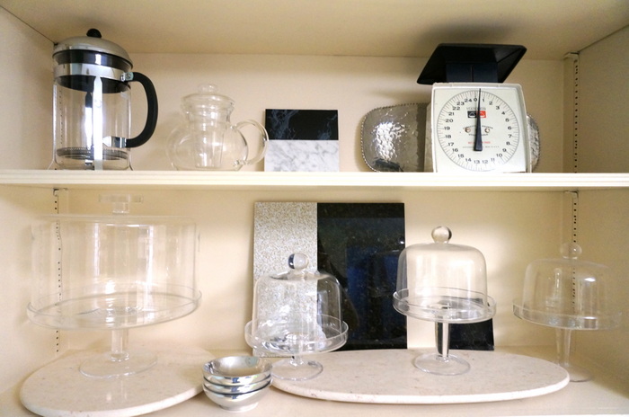
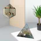
Here are some pics from my kitchen! As you can see, the shelving is a shade of cream. I’ve thought about painting it, but for now, I think the tile helps the glass pieces to stand out.
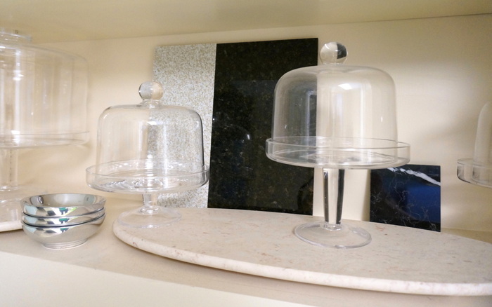
Here’s another shot of the shelving. As you can see, I incorporated a marble version of the project (the small two-tone tile), as well as a small black marble tile (bottom shelf, on the right):
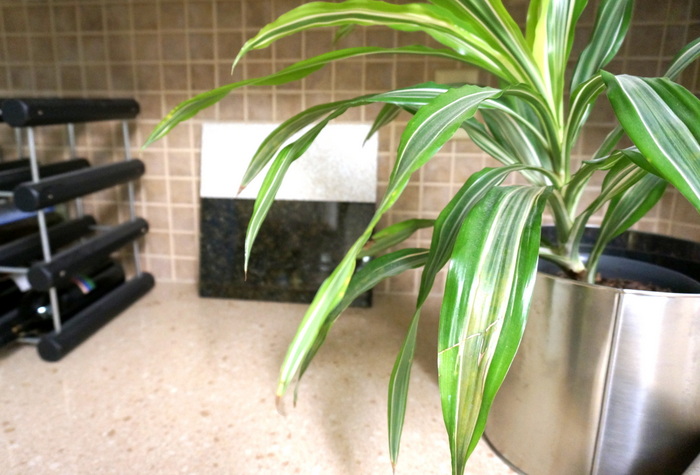
I put the second large tile on the counter (which is speckled like the contact paper). Hey, if you have a tan and beige kitchen with black appliances, you’ve gotta go with it and play up the ’80s style, right?!
Thanks for joining me on my latest marble tile adventure! I hope you have a great weekend…







Leave a Reply