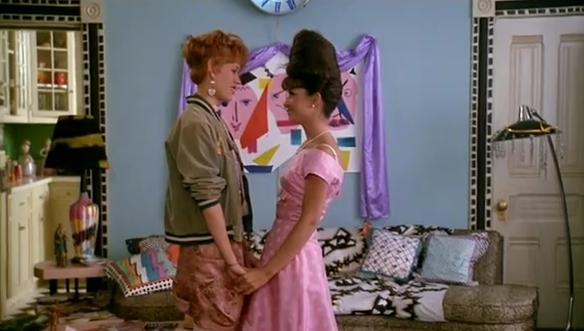
The '80s meet the '60s in this still from the 1986 film Pretty In Pink
Have you ever watched one of the movies you loved as a kid and been shocked by how well it held up–in story, “look,” or entertainment value? While recently re-watching both Pretty in Pink (1986, dir. Howard Deutch) and Earth Girls Are Easy (1988, dir. Julien Temple), I was struck by one major factor: the production design. Both films combine the bold pizazz of ’80s Memphis-Milano style with the hues and clean lines of ’50s/’60s Modern design.
And then it hit me! When a 1980s interior design revival hits–and it WILL hit–this modern eclectic style is one way the ’80s redux will manifest itself. Some say nostalgia comes in 30-year cycles. Remember how films like Back to the Future and Peggy Sue Got Married emerged in the ’80s, making viewers yearn for the days of malt shops and poodle skirts? Similarly, 1983 marked the publication of the book Mid-Century Modern: Furniture of the 1950s by Cara Greenberg.
It makes sense that the Mid-Century look would be rediscovered in the ’80s, as enough time would have passed to gain some healthy distance, and people who came of age in the 1950s and ’60s would be wistfully craving a flashback. Even the B-52s knew the value of mixing a bit of old with a bit of new. It’s no coincidence that their music was featured on the soundtrack for Earth Girls Are Easy.:
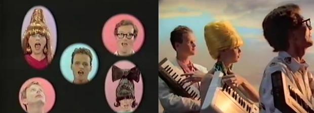
Stills from the video for the B-52's 1983 track "Song for a Future Generation"
With the help of stills from both Pretty in Pink and Earth Girls Are Easy, we take a look at some interior design strategies to celebrate the inevitable fusion of ’80s Modern and Mid-Century styles:
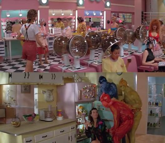
Pastels pop in these stills from Earth Girls Are Easy
1. Boldly combine pastels for a retro-fabulous effect
There’s something about the cheeky use of pastels. The members of the ’80s design collective the Memphis Group knew the power of candy colors, especially when combined with black and white patterns. In this sense, the checked floor in the top image takes on an ’80s aura as much as a ’50s one, especially when joined with the Memphis-style colors and lines of the beauty shop setting. The bottom image proves there’s power in numerous pastels in the kitchen. In fact, the aliens in Earth Girls Are Easy frequently stand out against pastry-hued backgrounds, much as the primary colors of Memphis design items were striking against the pastels that shared their space.
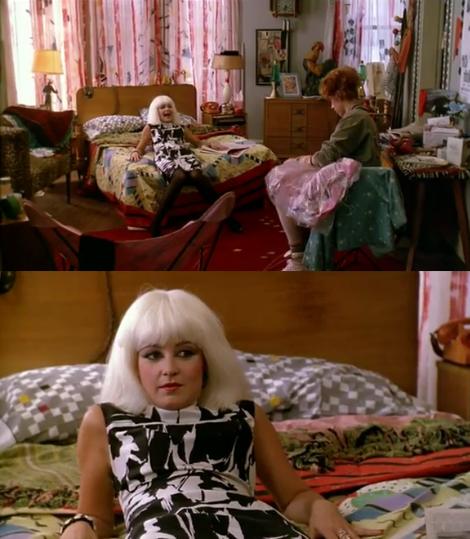
Retro fabrics are abundant in these stills from Pretty in Pink
2. Mix ’50s and ’60s fabrics with ’80s geometric and tribal textiles
The geometry of Mid-Century textiles bears a striking resemblance to the abstract whimsy of ’80s fabric patterns. In the above stills from Pretty In Pink, an assortment of fabrics effortlessly combine, some ’80s, others possibly from the ’50s or ’60s. The boldness of each pattern is nicely showcased against the backdrop of clean-lined Mid-Century modern furniture.
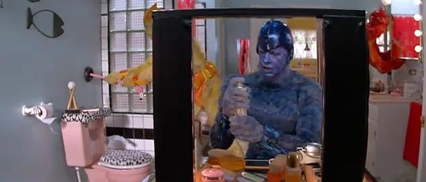
Glass block and animal print are showcased in this retro-style bathroom from Earth Girls Are Easy
3. Use timeless retro flourishes to unite ’80s style with Mid-Century design
Accents such as glass block (covering the window above) and animal prints are both ’50s AND ’80s, making them excellent unifiers when combining ’80s and Mid-Century items in the same space. Don’t hesitate to use them, especially when attempting to blend both ’50s and ’80s touches that may not seamlessly overlap upon first glance.
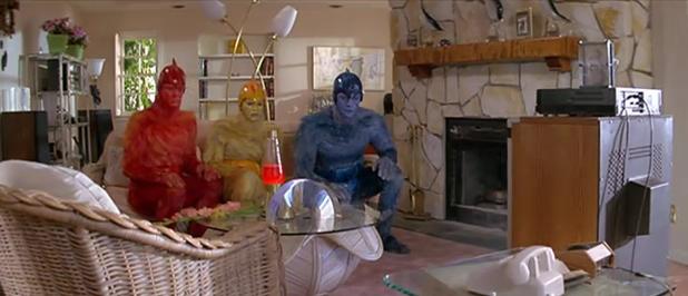
Metallic touches on lighting and shelving add shine to this living room from Earth Girls Are Easy
4. Add interest with metallic accents
Have you ever visited a vintage furniture store and had a hard time pinpointing the date of the chrome lighting? That’s because metallic lamps and light fixtures have a timelessly modern look. Even the once-abhorred brass of the ’80s is beginning to resurface in an interesting way. Don’t shy away from the shine of the metallic. From lighting to furniture, the glow of a metal base brings out the best in a room featuring modern design from several decades.
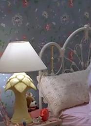
A tropical modern lamp gives traditional wallpaper a much-needed punch in this still from Earth Girls Are Easy
5. Jazz up traditional decor with retro modern touches
If traditional is your style of choice, don’t hesitate to infuse it with playful vintage touches, such as this palm tree-reminiscent lamp. The lemon yellow hue sings against the slate blue floral wallpaper, and you almost forget the room is frilly when the lighting is this bold.
Earth Girls Are Easy and Pretty in Pink were ahead of their time in the interior design realm. Not only did each film showcase the best of the ’80s, but both pieces zoned in on the ’80s trends that referenced the ’50s (such as Memphis-Milano design), then dipped back into the palette of ’50s style to complete the look. The result: an eclectic blend of both retro and modern. Hats off to production designers John W. Corso (Pretty in Pink) and Dennis Gassner (Earth Girls Are Easy) and their team of set decorators!
Now that over 25 years have passed, both the ’50s and the ’80s are retro. It’s time to revisit their magical blend!




I love the pastel colours! I Have never seen these movies, now I have to!
I noticed that three-decade pattern in interior design, too. I'd love to redecorate our perth patio using this 60's meets the 80's theme. Pastels are so pleasing to the eye.
All these years later, I find myself researching 1950s ➜ 1980s couches and have landed back on Mirror80! Thanks Kate for this post, all these years later it’s a helpful style/design reference.